Afraid of Neon? 8 Butter Yellow Kitchen Cabinet Ideas That Look Timeless
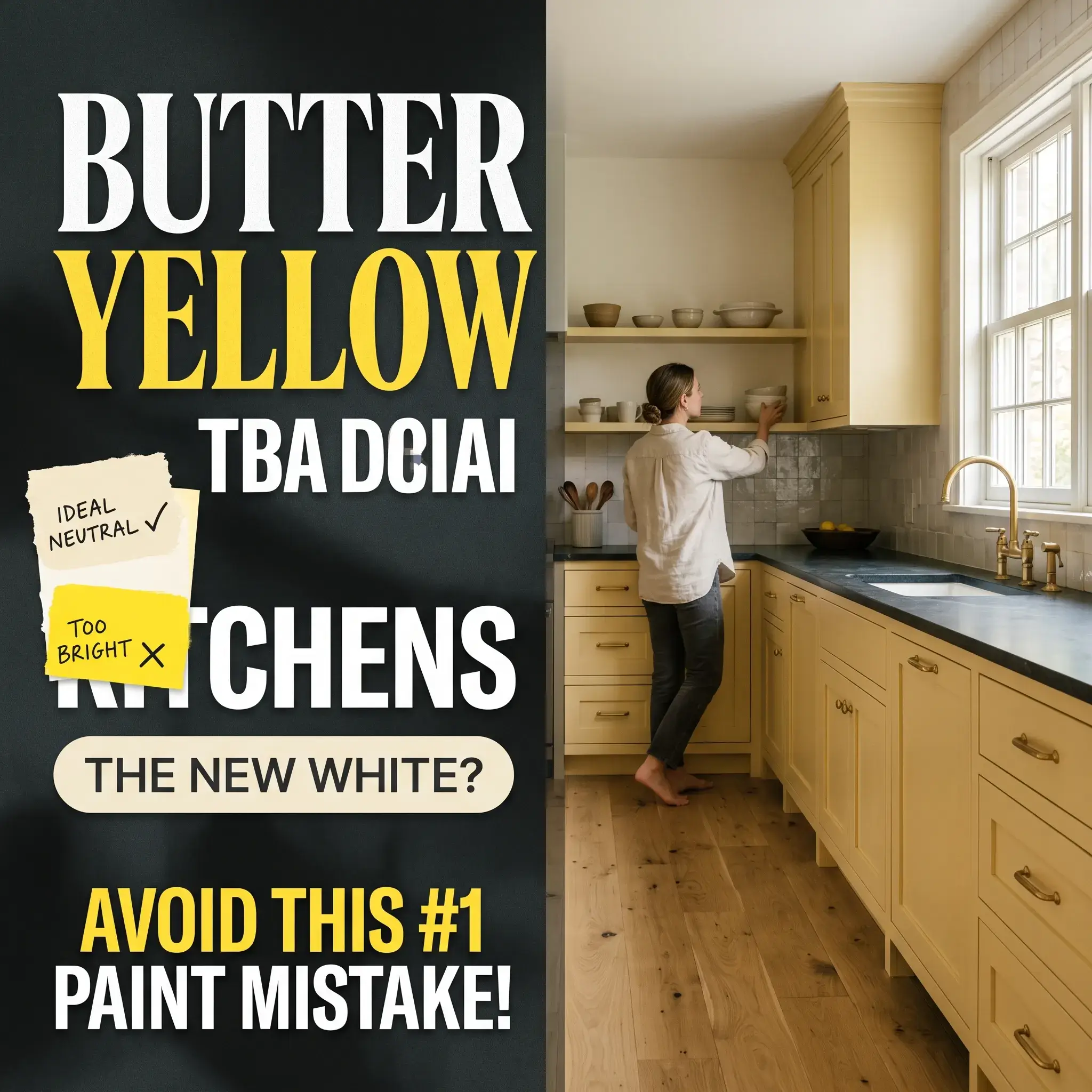
All-white kitchens often feel cold and sterile. Cool gray cabinets can look gloomy under flat daylight.
Homeowners across the United States are choosing butter yellow cabinetry to bring warmth back into their homes. Yet, yellow can make people nervous. Nobody wants cabinets that look like a bright school bus, a neon marker, or dated harvest gold.
Butter yellow works because it functions as an expansive neutral. The best shades contain drops of ochre, raw umber, and cream. These earth pigments soften the tone, letting it capture natural daylight without hurting your eyes.
Below are 8 butter yellow kitchen cabinet ideas you can build in real life. Each concept includes exact paint recommendations, finish pairings, and image specifications.
8 Butter Yellow Kitchen Cabinet Ideas for Real Homes
1. English Country Joinery with Honed Soapstone
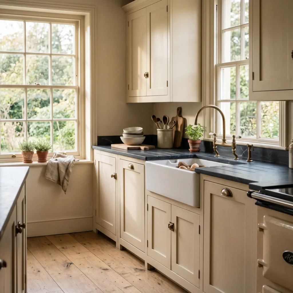
Inset shaker doors painted in a soft buttermilk tone bring quiet history into older homes. Pairing this warm cabinetry with dark, matte soapstone worktops grounds the entire room. The dark counter absorbs bright light, which keeps the yellow from looking washed out.
- Featured Products in Design:
- Cabinet Paint: Farrow & Ball Farrow’s Cream (No. 67)
- Countertop: Honed Charcoal Soapstone slabs
- Cabinet Hardware: deVOL Unlacquered Brass Cup Pulls and Catch Latches
- Sink: Shaw’s Original 30-inch Fireclay Apron-Front Sink
- Faucet: Perrin & Rowe Ionian Bridge Faucet in Unlacquered Brass
2. Two-Tone Contrast with Natural White Oak
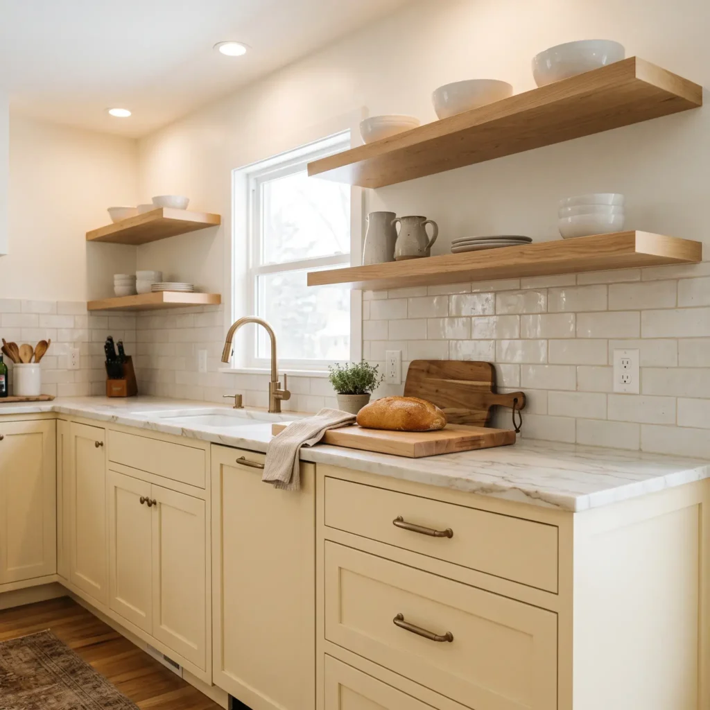
If you hesitate to paint every cabinet yellow, split the space. Paint the base cabinets in butter yellow. Install natural white oak open shelves or upper cabinets above them. This layout keeps sightlines open while adding organic wood grain near the floor.
- Featured Products in Design:
- Base Cabinet Paint: Sherwin-Williams Butter Up (SW 6681)
- Upper Shelving: Solid White Oak floating shelves with concealed brackets
- Countertop: Calacatta Gold Honed Quartz or Marble
- Hardware: Rejuvenation Mission Drawer Pulls in Burnished Antique Bronze
- Backsplash: Cloe 2.5×8 inch White Glazed Ceramic Subway Tile
Check out more Home Decor Ideas By Color
3. Warm Modern Flat-Slab Millwork
Butter yellow is not limited to historic cottages. Modern kitchens benefit from flat-panel slab cabinet doors painted in a muted pale straw tone. The absence of decorative moldings highlights the clean geometry of the room, while the yellow tone softens cold stone surfaces.
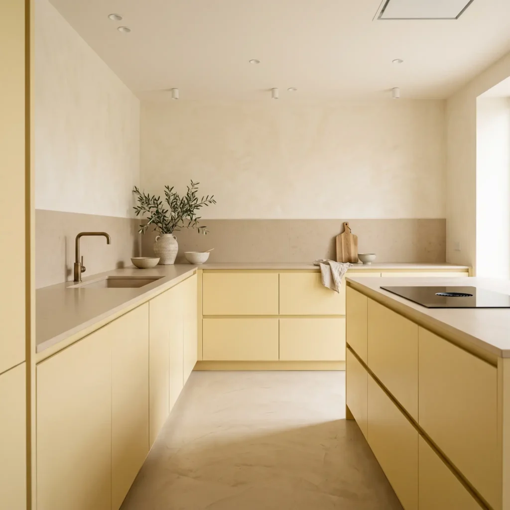
- Featured Products in Design:
- Cabinet Finish: Benjamin Moore Philadelphia Cream (HC-30) in Satin Enamel
- Countertops: Caesarstone Fresh Concrete or Pure White Quartz
- Walls: Portola Paints Roman Clay in Limewash Ivory
- Fixtures: Kohler Purist Single-Handle Semi-Professional Faucet in Matte Black
4. Statement Buttermilk Island with Oxblood Accents
Use butter yellow as a focal point rather than across every wall. Paint perimeter cabinets in warm off-white, then build a large central island painted in rich buttermilk yellow. Add counter stools finished in deep oxblood red or dark walnut to create immediate depth.
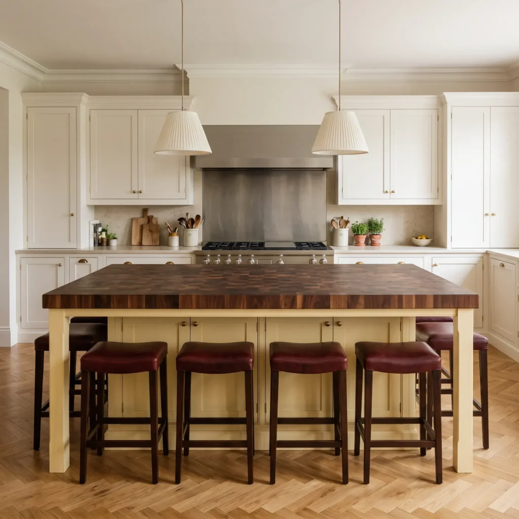
- Featured Products in Design:
- Island Cabinet Paint: Benjamin Moore Hawthorne Yellow (HC-4)
- Perimeter Cabinet Paint: Benjamin Moore Alabaster or Swiss Coffee
- Island Counter: John Boos End-Grain American Black Walnut Butcher Block
- Pendants: Visual Comfort Thomas O’Brien Goodman Small Hanging Lights
- Stools: Dark Walnut Counter Stools with Burgundy Leather Cushions
5. Cottage Beadboard with Handcrafted Zellige Tile
Vertical beadboard details on cabinet doors give a kitchen an authentic, lived-in feel. Combine butter yellow beadboard doors with pearlescent white Zellige tiles. The hand-molded clay tiles reflect light unevenly, which breaks up broad blocks of color and adds visual texture.
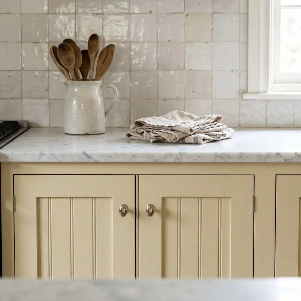
- Featured Products in Design:
- Cabinet Paint: Farrow & Ball Pale Hound (No. 71)
- Backsplash: Zia Tile Pure White 4×4 inch Moroccan Zellige Tile
- Countertop: White Carrara Marble with soft gray veining
- Hardware: Armac Martin Cotswold Mushroom Knobs in Polished Nickel
- Sink Accessories: Farmhouse Pottery Vermont handmade ceramic crocks
6. Transitional Shaker with Polished Nickel Hardware
Warm yellow cabinets paired with brass can sometimes look overly warm. If your kitchen receives strong western sunlight, balance the warmth with cool, reflective polished nickel hardware. Polished nickel carries a subtle warm silver undertone that complements yellow without clashing like modern chrome.
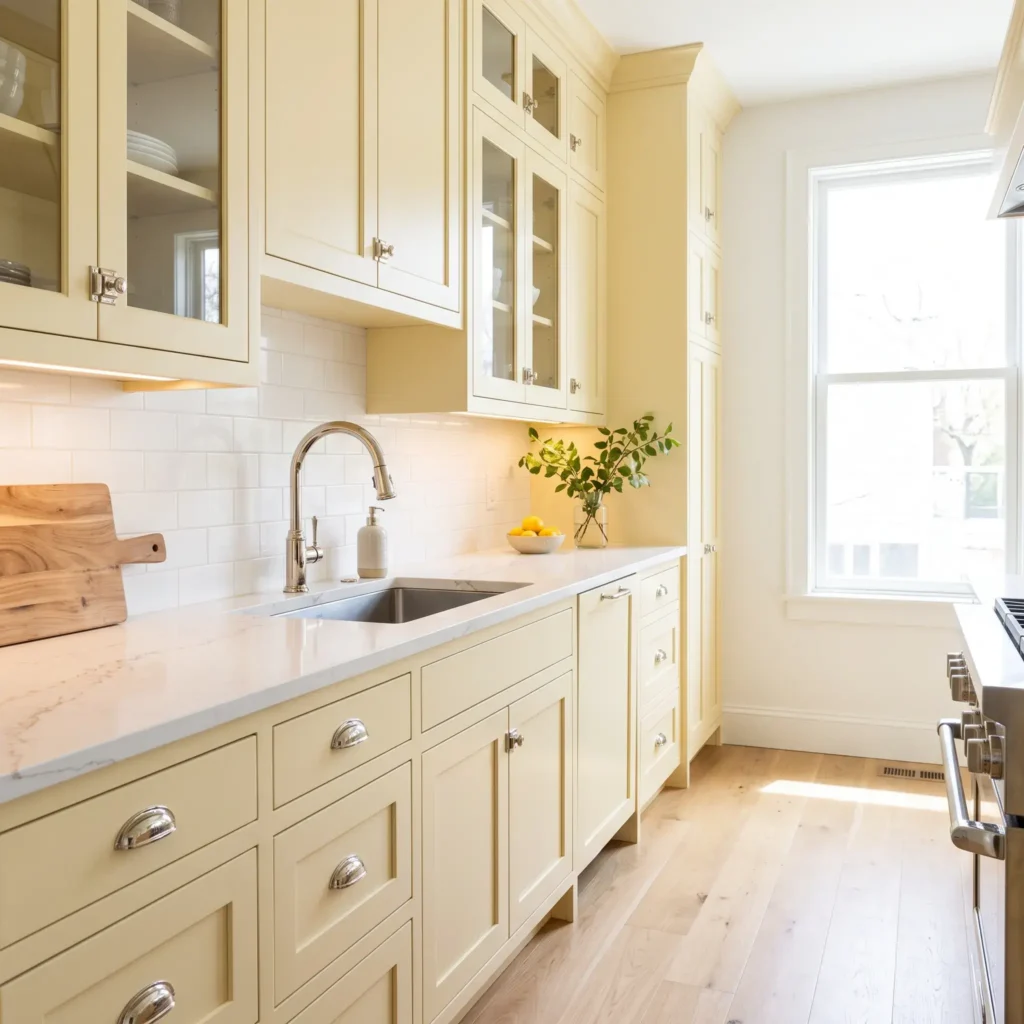
- Featured Products in Design:
- Cabinet Paint: Sherwin-Williams Banana Cream (SW 6673)
- Hardware: Restoration Hardware Aubrey Pulls and Turn Latches in Polished Nickel
- Countertop: Silestone Ethereal Glow Quartz
- Faucet: Waterstone Annapolis Gantry Pulldown Faucet in Polished Nickel
- Lighting: Kichler 3000K Low-Profile LED Under-Cabinet Light Bars
7. Retro Mid-Century with Reeded Glass Inserts
Butter yellow fits naturally into mid-century kitchen renovations. Use butter yellow frames on upper cabinets and install vertical reeded glass inserts. The textured glass obscures dishes while bouncing light, producing a warm vintage bistro look.
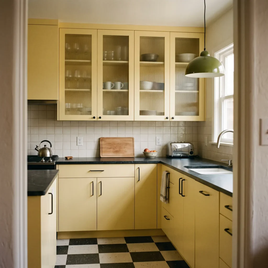
- Featured Products in Design:
- Cabinet Paint: Benjamin Moore Weston Flax (HC-5)
- Glass Inserts: 1/4-inch Tempered Fluted Reeded Glass Panels
- Hardware: Schoolhouse Edge Pulls in Matte Black
- Countertop: Honed Virginia Mist Black Granite
- Flooring: Forbo Marmoleum Modular Tiles in Black and Cream Check
8. Small Kitchen Color-Drenching in Soft Pale Straw
Small kitchens often feel cluttered when you use contrasting wall and cabinet colors. Color-drenching fixes this problem. Paint your cabinetry, baseboards, window trim, and drywall in the same pale straw shade. This technique blurs the boundaries of the room, making a narrow kitchen feel significantly larger.
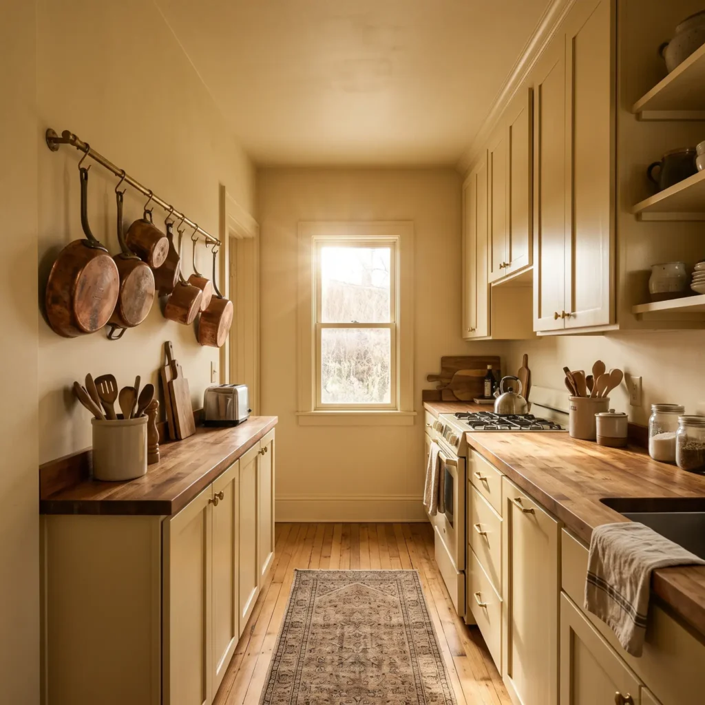
- Featured Products in Design:
- Cabinet Paint: Benjamin Moore Waterbury Cream (HC-31) in Advance Satin
- Wall Paint: Benjamin Moore Waterbury Cream (HC-31) in Regal Select Matte
- Countertop: Hard Rock Maple Edge-Grain Butcher Block with mineral oil
- Storage: deVOL Aged Brass Hanging Pot Rack with S-Hooks
- Flooring: Terracotta Hexagon Floor Pavers
Proven Butter Yellow Paint Colors and Formulas
Choosing yellow paint from a small chip card can lead to mistakes. Yellow expands once painted across full cabinet panels. A shade that looks like cream on a tiny sample can look intense across eight feet of millwork.
Pay attention to the Light Reflectance Value, known as LRV. The target range for butter yellow cabinets sits between 60 and 75. Formulas above 78 wash out under direct sun. Formulas below 55 turn into heavy mustard or tan.
| Paint Brand | Color Name & Code | LRV | Base Undertones | Best Application |
|---|---|---|---|---|
| Benjamin Moore | Philadelphia Cream (HC-30) | 69.1 | Muted warm cream, soft gold | Large perimeter runs; behaves like a warm neutral |
| Benjamin Moore | Weston Flax (HC-5) | 76.0 | Golden straw, warm beige | High ceilings; brings brightness without glare |
| Benjamin Moore | Waterbury Cream (HC-31) | 57.8 | Deep amber, raw umber | South-facing rooms; heavy pigments resist sun washout |
| Benjamin Moore | Hawthorne Yellow (HC-4) | 68.0 | Historic yellow ochre | Classic shaker cabinetry; historic farmhouse appeal |
| Farrow & Ball | Farrow’s Cream (No. 67) | 72.0 | Buttermilk, soft beige | Traditional kitchens; rich depth without candy yellow tones |
| Farrow & Ball | Sudbury Yellow (No. 51) | 67.0 | Earthy ochre, golden amber | Standalone larders, hutches, and statement islands |
| Farrow & Ball | Pale Hound (No. 71) | 71.0 | Straw, muted green-gold | Rooms with shifting daylight; soft antique look |
| Sherwin-Williams | Butter Up (SW 6681) | 74.0 | Creamy pastel butter | Spaces with poor natural light; lifts dark corners |
| Sherwin-Williams | Banana Cream (SW 6673) | 75.0 | Dairy custard, warm yellow | Family kitchens wanting noticeable cheerful warmth |
| Little Greene | Oak Apple (No. 63) | 64.0 | Raw umber, rich country butter | Historic homes; deep earth bases prevent neon tones |
Countertop and Hardware Pairing Guide
Yellow is an active color. Your horizontal countertops and vertical hardware must either ground the cabinets or provide balanced contrast.
| Aesthetic Style | Countertop Choice | Hardware Finish | Why It Works |
|---|---|---|---|
| Dark & Grounded | Honed Charcoal Soapstone or Virginia Mist Granite | Unlacquered Brass or Burnished Bronze | Matte black surfaces absorb excess light and prevent yellow from looking washed out. |
| Soft & Luminous | Calacatta Gold Marble or Warm-Veined Quartz | Polished Nickel or Aged Pewter | Pale stone with gold veining blends yellow casework into white walls without harsh lines. |
| Warm Organic | End-Grain Walnut or Oiled White Oak | Matte Black Iron or Antique Brass | Solid timber introduces natural wood grain that complements yellow ochre undertones. |
Countertop Selection Rules
- Avoid high-gloss polished stone. High-gloss counters create harsh reflections. That glare bounces yellow pigment back onto adjacent walls, creating an unwanted yellow cast. Select honed, leathered, or matte surfaces.
- Honed soapstone and slate absorb light. These dark stones anchor light cabinetry and give the room visual weight.
- If you want white stone, select Calacatta Gold or Carrara. Look for slabs with taupe, caramel, or gray veining. Avoid pure blue-white synthetic stone, which makes butter yellow look dirty.
Hardware Finish Strategy
- Unlacquered brass shares the warm tonal family of yellow. It lacks a clear lacquer coat, so it patinas naturally from touch and air. The resulting dark finish keeps the kitchen looking classic and calm.
- Polished nickel has silver tones warmed by copper undertones. It cools down warm yellow without the cold blue cast of regular chrome.
- Matte black and dark bronze hardware create clean structure. Use black pulls if you want a clean farmhouse or transitional look that matches black window frames or light fixtures.
How Lighting Changes Butter Yellow (And How to Fix It)
Light controls how you perceive yellow paint. The same cabinet paint can look pale cream at dawn, bright yellow at noon, and greenish at night under poor lighting.
Natural Window Direction
- North-Facing Kitchens: Northern light is cool, indirect, and blue-shifted. This cool light can bring out gray or green tones in pale yellow. Use paint formulas fortified with ochre or faint red pigments, such as Benjamin Moore Waterbury Cream.
- South-Facing Kitchens: Southern light brings intense, warm rays through the afternoon. This exposure amplifies yellow saturation. To keep your kitchen calm, choose lower-saturation buttercreams tempered with beige or gray undertones.
Artificial Bulb Rules
Standard LED ceiling bulbs can ruin yellow paint jobs. Follow these lighting rules:
- Avoid 4000K and 5000K daylight bulbs. Cool white bulbs cast blue light onto yellow paint. Blue light mixed with yellow pigment produces a green cast. Your cabinets will look sick.
- Avoid 2200K amber bulbs. Overly orange light turns soft buttermilk into dark mustard at night.
- Standardize on 3000K Soft White bulbs with a 90+ CRI rating. A 3000K temperature maintains true daytime color after dark. A high Color Rendering Index (CRI above 90) displays the paint formula accurately without distorting the finish.
Cabinet Paint Durability and Sheen Specs
Cooking produces grease, heat, and steam. Kitchen cabinets require a hard, scrubbable paint film.
- Choose Satin Enamel (25 to 35 Gloss Units): Satin enamel delivers the best balance for kitchen cabinetry. It resists fingerprints, cleans easily with dish soap, and wipes clean without leaving shiny rub marks.
- Avoid Semi-Gloss: While durable, high-gloss and semi-gloss enamels reflect too much glare off cabinet face-frames, making the yellow color look harsh.
- Avoid Eggshell and Matte on Doors: Flat finishes absorb grease and skin oils around cabinet handles. Cleaners will rub the paint film away within months. Keep eggshell and matte finishes on your drywall surfaces only.
Frequently Asked Questions
Are butter yellow kitchen cabinets timeless or just a passing trend?
Butter yellow cabinets remain timeless when paired with traditional architectural details and classic materials. English country houses have used pale buttermilk woodwork for centuries. The look becomes dated only when homeowners pair high-saturation yellow with trendy synthetic finishes or modern laminate surfaces. Stick to shaker doors, natural stone, and living brass to ensure your kitchen ages gracefully.
What wall color goes best with butter yellow cabinets?
Pair butter yellow cabinets with warm off-white wall paint. Top choices include Sherwin-Williams Alabaster, Sherwin-Williams Dover White, and Benjamin Moore Swiss Coffee. Avoid cool, blue-based bright white paints. Stark white walls create harsh visual contrast, which makes butter yellow cabinets look dingy or yellowed by smoke.
What flooring works best with pale yellow cabinets?
Natural wood flooring provides the most reliable foundation. Wide-plank white oak or reclaimed pine adds organic texture that balances yellow paint. For tile flooring, choose unglazed terracotta pavers, honed limestone, or a traditional charcoal-and-cream checkerboard pattern.
Why do my yellow cabinets look green under LED lights?
Your light bulbs likely feature a cool color temperature between 4000K and 5000K. These bulbs emit blue-heavy light spectrums. When blue artificial light hits yellow pigment, human eyes register a greenish cast. Replace all ceiling cans and under-cabinet fixtures with 3000K warm white LED bulbs that carry a 90+ CRI rating.
Making the Final Decision
Do not order cabinet paint from a printed brochure or digital screen. Purchase sample pots of your top three colors.
Paint two coats onto large pieces of foam core board or scrap wood panels. Move these sample boards around your kitchen for three days. Check the color at dawn, under direct noon sun, and at night with your kitchen lights turned on.
Once you confirm the color holds its creamy, calm tone across every hour of the day, you can order your cabinetry paint with complete confidence.