7 Green Kitchen Cabinet Combinations Worth Stealing
Green cabinetry brings biological balance and grounding color into the home. It replaces sterile, all-white kitchens with enduring character. Yet, selecting the wrong shade can leave a room feeling dark, cold, or muddy.
A successful green kitchen balances cabinet pigments with countertop minerals, timber species, metal finishes, and natural light. Below are seven practical, highly refined green cabinet combinations complete with exact specifications, material schedules, and design details you can implement in your remodel.
7 Green Kitchen Cabinet Combinations to Recreate
1. The English Country Scullery
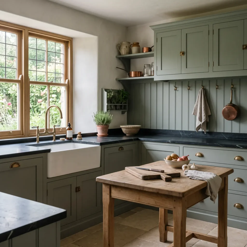
This combination pairs muted, blue-tinted green with traditional British joinery and honest materials. It creates a collected, heritage feel that ages gracefully.
- Cabinet Paint: Farrow & Ball Green Smoke (No. 47), eggshell finish
- Cabinet Profile: Inset Shaker with a subtle inner bead
- Countertops: Honed Charcoal Soapstone treated with mineral oil
- Wood Accents: Raw, scrubbed English oak on an island or standalone larder
- Hardware: Unlacquered aged brass cup pulls and classic mushroom knobs
- Backsplash: Painted tongue-and-groove beadboard matching the cabinets
- Flooring: Tumbled French limestone pavers
- Lighting: Fluted milk glass pendants with warm brass hardware (3000K)
Design Rule: Soapstone naturally darkens with age and mineral oil applications. Its soft, pale green veins echo the muted tones of Green Smoke, while unlacquered brass prevents the space from feeling somber.
Products Featured in This Design:
- Paint: Farrow & Ball Green Smoke (No. 47), Estate Eggshell
- Perimeter Countertops: Vermont Soapstone, honed finish
- Hardware: Armac Martin Queslett unlacquered brass cup pulls and knobs
- Sink & Faucet: Shaw’s Original apron-front fireclay sink with Perrin & Rowe aged brass bridge faucet
- Lighting: Original BTC task pendants in fluted milk glass
2. The Organic Modern Farmhouse
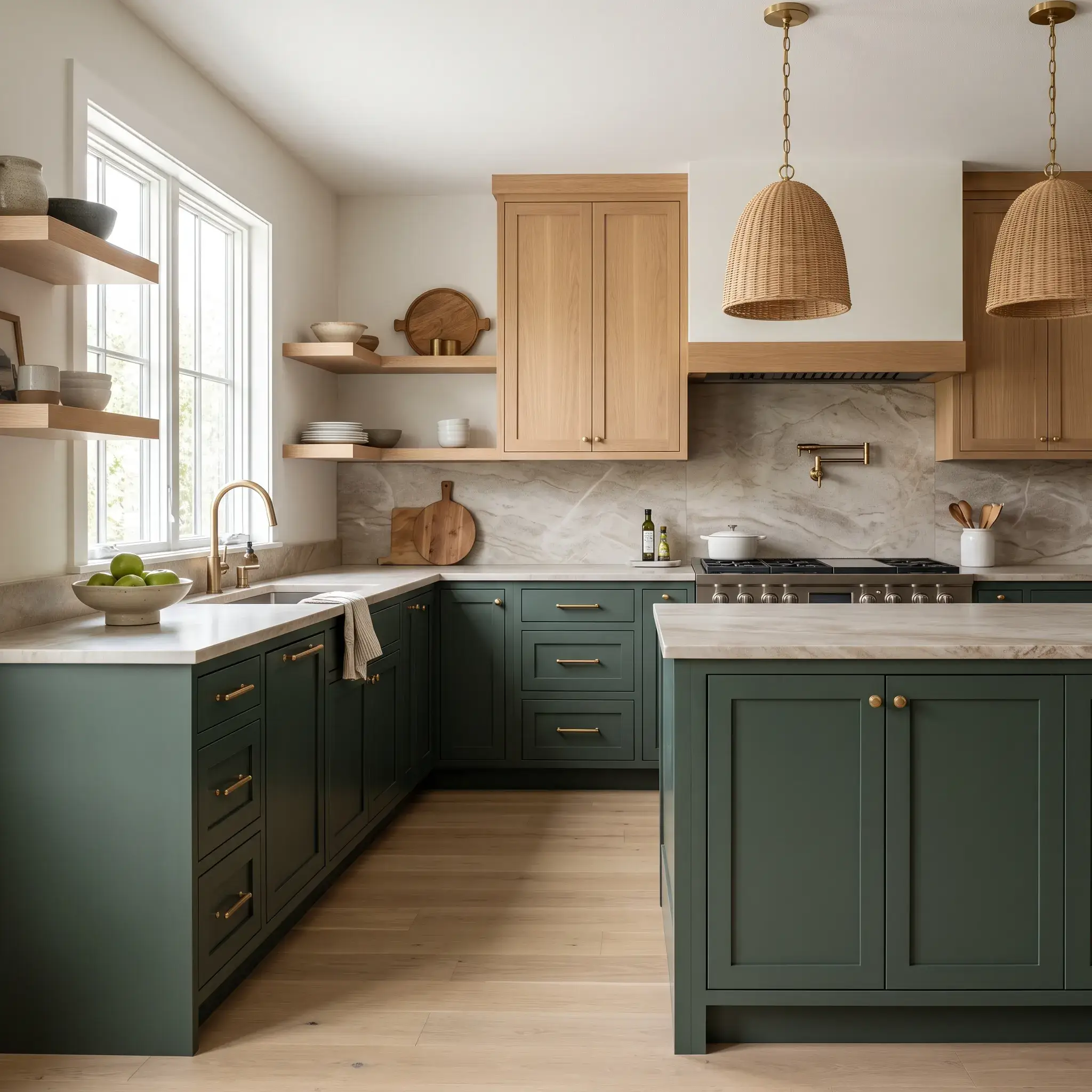
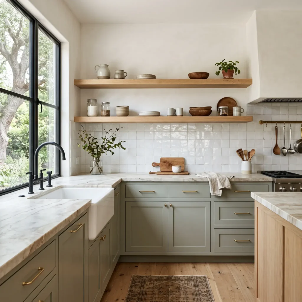
Clean, rectilinear lines meet earthy warmth. This scheme softens a contemporary layout using pale gray-green cabinetry alongside honey-toned timber.
- Cabinet Paint: Sherwin-Williams Evergreen Fog (SW 9130), satin finish
- Cabinet Profile: Slim-rail modern Shaker
- Upper Strategy: Open floating shelves and range hood clad in rift-sawn white oak
- Countertops: Leathered Taj Mahal Quartzite with a clean, mitered edge
- Hardware: Satin brass slim bar pulls paired with a matte black high-arc faucet
- Backsplash: Handcrafted square 4×4 white Moroccan Zellige tile
- Flooring: Wide-plank European white oak with a matte clear coat
- Lighting: Spun-brass minimalist cone down-pendants (3000K, 90+ CRI)
Design Rule: Evergreen Fog carries a Light Reflectance Value (LRV) of 30. Its slate-gray undertone acts like a neutral. Pairing it with rift-sawn oak upper surfaces keeps visual weight on the floor and reflects light toward the ceiling.
Products Featured in This Design:
- Paint: Sherwin-Williams Evergreen Fog (SW 9130), Emerald Urethane Trim Satin
- Countertops: Brazilian Taj Mahal Quartzite, leathered finish
- Tile: Zia Tile Moroccan Zellige in Pure White, 4×4-inch square
- Hardware: Rejuvenation Bowman satin brass cabinet pulls
- Plumbing: Kohler Purist matte black semi-professional kitchen faucet
Check out more Modern Kitchen Ideas
3. The Moody Classical Estate
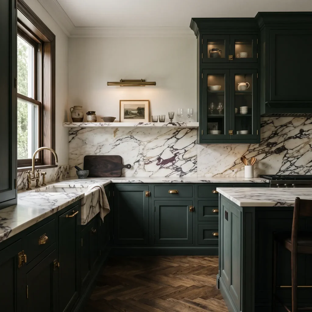
Saturated, near-black greens deliver architectural drama in rooms with ample natural light or tall ceilings.
- Cabinet Paint: Benjamin Moore Salamander (2050-10) or Pewter Green (SW 6208)
- Cabinet Profile: Traditional recessed Shaker with bolection moldings
- Countertops & Backsplash: Full-height continuous honed Calacatta Viola marble
- Hardware: Heavy burnished unlacquered brass rim latches and knurled knobs
- Wood Accents: Dark smoked oak parquet flooring in a herringbone pattern
- Perimeter Walls: Painted in a 50% tint of the cabinet formula in flat matte
- Lighting: Brass picture lights mounted over stone ledges, warm LED under-cabinet strips (2700K to 3000K)
Design Rule: Deep greens with an LRV under 15 absorb ambient light quickly. Avoid standard white subway tile here. Use a dramatic, high-contrast marble like Calacatta Viola with deep cabernet and charcoal veining to establish an intentional focal point.
Products Featured in This Design:
- Paint: Benjamin Moore Salamander (2050-10), Advance Satin
- Stone: Honed Calacatta Viola Italian marble slab
- Hardware: House of Antique Hardware burnished brass cupboard turns and icebox latches
- Pot Filler: Waterworks Henry wall-mounted brass pot filler
- Lighting: Visual Comfort cabinet picture lights in hand-rubbed antique brass
4. Mid-Century Modern Olive & Walnut
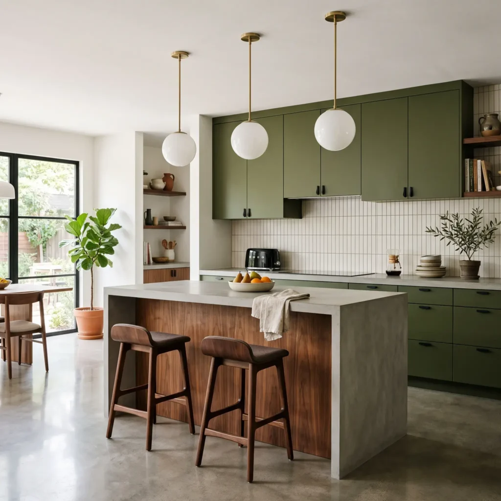
Olive greens lean heavily on yellow and brown bases. They connect naturally with rich, mid-century wood species like American walnut.
- Cabinet Paint: Sherwin-Williams Basil (SW 6194) or Benjamin Moore Tate Olive (HC-112)
- Cabinet Profile: Full-overlay flat slab doors with seamless grain matching
- Accent Millwork: Book-matched natural American walnut for the island or tall pantry runs
- Countertops: Matte aggregate terrazzo or light gray concrete-look composite
- Hardware: Integrated J-groove finger pulls or concealed matte black edge pulls
- Backsplash: Vertically stacked bone-white finger tiles (kit-kat tiles)
- Flooring: Smooth polished concrete or large-format terrazzo tile
- Lighting: Hand-blown milk glass globe pendants with black cord suspensions (3000K)
Design Rule: Yellow-greens and walnut occupy neighboring positions on the color wheel. This creates a calm, analogous relationship that keeps slab millwork looking inviting rather than industrial.
Products Featured in This Design:
- Paint: Sherwin-Williams Basil (SW 6194), ProClassic Interior Acrylic Enamel
- Veneer: Plain sliced natural American walnut with a low-sheen poly seal
- Countertop: Caesarstone Fresh Concrete or light terrazzo slab
- Tile: Daltile Vertuo matte off-white mosaic kit-kat tiles
- Lighting: Cedar & Moss Alto globe pendant in matte black and brass
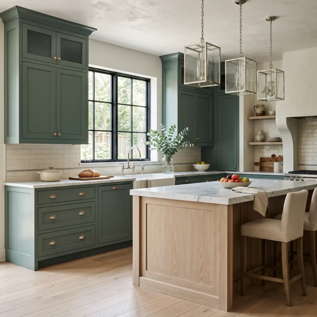
5. Transitional European Elegance
This pairing balances soft gray-green cabinetry with cool white stone and polished nickel. It works well in bright, suburban renovations and historic city apartments alike.
- Cabinet Paint: Benjamin Moore Caldwell Green (HC-124) or Farrow & Ball French Gray (No. 18)
- Cabinet Profile: Beveled Shaker with reeded glass inserts on select upper doors
- Island Treatment: Cerused, sand-toned white oak island base
- Countertops: Honed Bianco Carrara marble with a demi-bullnose edge
- Hardware: Polished nickel cup pulls, mushroom knobs, and matching cremone bolts
- Backsplash: Handmade cream subway tile with off-white grout and a thin marble pencil trim
- Flooring: Pale French oak laid in a straight plank pattern
- Lighting: Clear glass lantern pendants with polished nickel frames (3000K)
Design Rule: Polished nickel has a warm, yellow undertone that chrome lacks. It bridges cool blue-green paint formulas and gray Carrara marble veining without making the kitchen feel sterile.
Products Featured in This Design:
- Paint: Benjamin Moore Caldwell Green (HC-124), Advance Satin
- Stone: Honed Bianco Carrara marble slab
- Hardware: Restoration Hardware Aubrey polished nickel pulls and latches
- Sink: Rohl Allia fireclay single-bowl undermount sink
- Lighting: Visual Comfort Morris small lantern in polished nickel
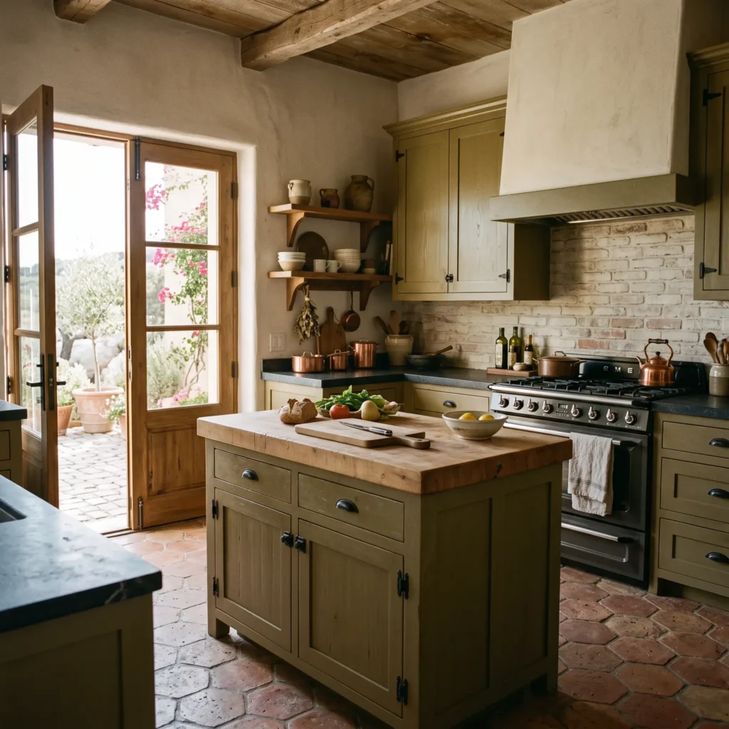
6. The Rustic Tuscan Hearth
Unglazed terracotta and warm olive millwork bring rich texture to cottage, Spanish colonial, and Mediterranean kitchens.
- Cabinet Paint: Benjamin Moore Tate Olive (HC-112) or Sherwin-Williams Palm Leaf (SW 7735)
- Cabinet Profile: Thick-frame rustic Shaker with visible wood grain texture
- Countertops: Solid end-grain maple or walnut butcher block on the island, paired with honed soapstone on perimeter cooking runs
- Hardware: Forged black iron drop handles and rustic surface-mounted latches
- Backsplash: Antiqued handmade ceramic tile or exposed brick with a light limewash
- Flooring: Hexagonal or square reclaimed terracotta floor tiles with wide mortar joints
- Lighting: Hand-forged wrought iron chandeliers or downlights (2700K to 3000K)
Design Rule: Terracotta sits opposite green on the color wheel. The natural burnt orange clay intensifies olive green without feeling neon or mismatched.
Products Featured in This Design:
- Paint: Benjamin Moore Tate Olive (HC-112)
- Floor Tile: Reclaimed antique French terracotta hex tiles
- Island Top: John Boos commercial end-grain maple butcher block, mineral oil finish
- Hardware: Ashley Norton dark bronze and wrought iron drop handles
- Cooktop Area: Custom plaster range hood over unglazed zellige-style clay brick
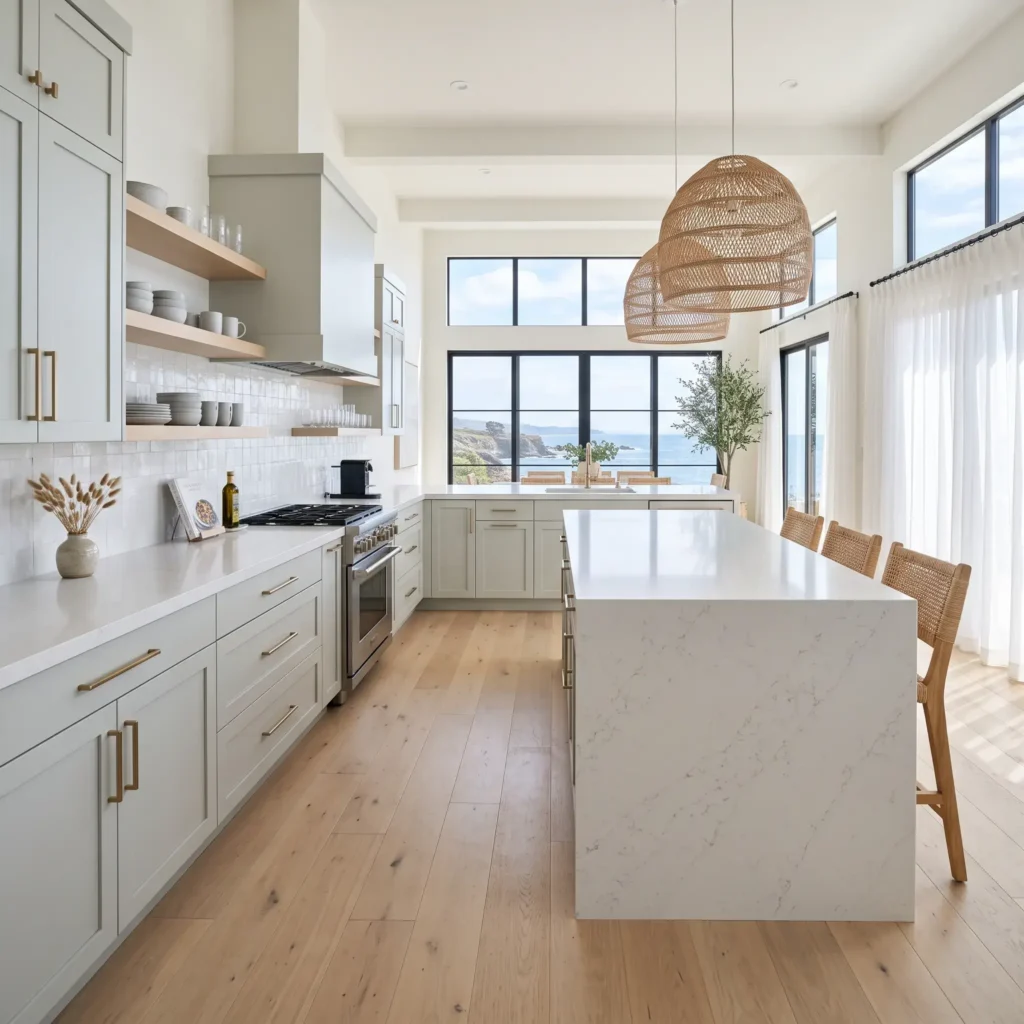
7. Crisp Coastal Sage & Quartz
A light-filled combination suited for compact footprints, galley kitchens, or homes near the water.
- Cabinet Paint: Benjamin Moore October Mist (1495), satin finish
- Cabinet Profile: Flat slab or thin shaker doors with a concealed magnetic touch-latch or understated hardware
- Countertops & Backsplash: Pure white engineered quartz with delicate gray threads
- Accent Millwork: Natural blonde ash or bleached maple floating shelves
- Hardware: Brushed champagne bronze or brushed satin brass pulls
- Flooring: Light natural birch or bleached oak wide planks
- Lighting: Woven rattan or white ceramic dome pendants (3000K)
Design Rule: October Mist features a high LRV of 46.54. Because it reflects nearly half of incoming light, it bounces daylight through smaller kitchens and prevents walls from closing in on the cook.
Products Featured in This Design:
- Paint: Benjamin Moore October Mist (1495)
- Countertops: Silestone Ethereal Glow or Caesarstone Empira White
- Hardware: Emtek select bar pulls in satin brass with knurled stems
- Lighting: Serena & Lily woven wicker pendant shades
- Sink: Blanco Silgranit white composite undermount sink
Technical Specifications: Paint Undertones, LRV, and Light
Every green paint is built on an underlying base color. Identifying that base ensures the cabinetry complements your lighting and surrounding materials.
| Paint Shade | Manufacturer | LRV | Dominant Undertone | Best Light Exposure | Ideal Companion Material |
|---|---|---|---|---|---|
| October Mist (1495) | Benjamin Moore | 46.54 | Silvery yellow-gray | Any exposure; ideal in low-light rooms | Quarter-sawn White Oak, Pure White Quartz |
| Evergreen Fog (SW 9130) | Sherwin-Williams | 30.00 | Slate gray with blue-green | South and East light | Rift-sawn Oak, Creamy Zellige |
| Green Smoke (No. 47) | Farrow & Ball | ~19.00 | Smoky blue-gray | South and West light | Oiled Soapstone, Aged Unlacquered Brass |
| Caldwell Green (HC-124) | Benjamin Moore | 16.27 | Cool blue-cast slate | South and East light | Honed Carrara Marble, Polished Nickel |
| Basil (SW 6194) | Sherwin-Williams | 15.00 | Warm botanical olive | South and West light | Natural American Walnut, Brass |
| Peale Green (HC-121) | Benjamin Moore | 14.51 | Deep forest with yellow base | South light (needs good daylight) | Calacatta Gold Marble, Honey Oak |
| Pewter Green (SW 6208) | Sherwin-Williams | 12.00 | Cool charcoal-tinted green | South and West light | Taj Mahal Quartzite, Matte Black |
| Essex Green (HC-188) | Benjamin Moore | 5.64 | Blackened forest | South light or bright open layouts | Calacatta Viola Marble, Unlacquered Brass |
How Light Direction Changes Green Paint
- North-Facing Rooms: Northern light is cool and blue. It pulls blue tones out of gray-greens, which can cause pale sages to look chilly or flat. Counter this by choosing greens with yellow or brown undertones, such as Benjamin Moore Tate Olive or Peale Green.
- South-Facing Rooms: Southern light provides warm, golden daylight all day. This light balances cool, slate-based greens like Sherwin-Williams Pewter Green or Farrow & Ball Green Smoke without skewing them muddy.
- Artificial Lighting Standards: Choose LED fixtures between 3000K and 3500K for green cabinetry. Bulbs rated at 2700K emit heavy amber light that turns sage green into a murky yellowish brown. Bulbs rated at 4000K or above cast a clinical blue light that drains the warmth from natural stone and wood. Choose bulbs with a Color Rendering Index (CRI) of 90 or higher to preserve true pigment depth.
Two-Tone Cabinet Architecture: Balancing Color and Wood
Two-tone millwork prevents heavy greens from overpowering a kitchen footprint. Designers use two primary layout strategies:
1. The Vertical Split (Dark Bases, Light Uppers)
Place saturated greens on base units and kitchen islands. Paint upper cabinets in a soft off-white, such as Benjamin Moore White Dove or Sherwin-Williams Alabaster. Alternatively, replace upper cabinets entirely with clear-finished white oak floating shelves. This setup anchors the room while bouncing natural light around food preparation areas.
2. Perimeter vs. Island Separation
Paint the perimeter runs in a muted neutral (greige, parchment, or putty) and finish a large central island in deep forest green or olive. If you want a traditional European feel, reverse that formula: envelop the perimeter in rich dark green and install a standalone island built from raw, clear-waxed oak or dark walnut.
Wood Matching Guidelines
- White Oak (Rift-sawn or Quarter-sawn): Features cool wheat undertones and straight grain. It pairs naturally with soft sages (Evergreen Fog) and earthy olives (Tate Olive).
- American Walnut: Features cool, purplish-brown heartwood. It complements deep forest greens and blackened emeralds (Salamander, Essex Green).
- Red Tones (Cherry, Red Oak): Avoid pairing red-toned woods with cool, blue-based greens, as the undertones clash. Reserve red timbers for warm mosses and chartreuse-tinted greens.
Countertop Selection Guide for Green Cabinets
Countertops create the primary horizontal surface that intersects your cabinetry. Stone choices should balance durability, background color, and veining.
- Taj Mahal Quartzite: A durable metamorphic stone. Its warm cream, taupe, and amber ribbons soften cool sages and bridge transitions to natural oak flooring.
- Oiled Charcoal Soapstone: Non-porous and chemically inert. It resists acid etching from citrus, tomatoes, and vinegar. Its charcoal surface and pale veins create a historic, tactile pairing for olive and forest cabinetry.
- Honed Calacatta Marble: Features dramatic charcoal and warm gold ribbons across an off-white field. It pairs naturally with rich botanical greens and unlacquered brass. Always specify a honed or leathered finish, as high polish shows acid etching quickly.
- Engineered Quartz: Practical for high-traffic kitchens. Clean white slabs provide crisp contrast against deep hunter green, while warm, alabaster-toned composite stones soften pale sage palettes.
Hardware and Metal Finish Curation
Hardware provides the visual punctuation on painted cabinetry. Use an 80/20 mixed-metal ratio to prevent a showroom look:
- Primary Metal (80%): Use one metal for cabinet knobs, drawer pulls, and appliance latches. Unlacquered brass and hand-burnished bronze are natural choices for dark forest and olive greens because warm yellow metals sit opposite blue-green on the color wheel.
- Secondary Metal (20%): Select an accent finish for your main sink faucet, range pot filler, or island light fixtures. Matte black iron frames cabinet geometry on modern Shaker doors. Polished nickel provides a soft, warm silver shine that flatters smoky blue-greens.
4 Common Green Cabinet Mistakes to Avoid
- Choosing Color from a Tiny Swatch: Paint pigments multiply in intensity across an entire wall of cabinetry. A swatch that looks gently saturated in your hand will read far brighter across twenty cabinet doors. Always test sample boards in your kitchen and look for formulas grounded with deliberate gray, brown, or black bases.
- Ignoring Cabinet Paint Sheen: Flat matte finishes look powdery in photos, but they absorb cooking oils and burnish when scrubbed. High-gloss finishes highlight every timber defect and joint line. Select a satin or low-luster eggshell finish for balanced light reflection and easy cleaning.
- Clashing Wood Floor Undertones: Golden builder-grade oak floors will clash with cool, slate-based green cabinetry. If you have warm golden floors, stick to yellow-based greens like olive, moss, or palm leaf.
- Overpowering a Small Kitchen: Floor-to-ceiling dark green cabinetry in a tight galley kitchen can feel constrictive. In smaller rooms, limit saturated green to base cabinets, use light-reflective backsplashes like Zellige tile, and keep upper surfaces bright.
Frequently Asked Questions
What is the most timeless green paint for kitchen cabinets?
Muted gray-greens like Sherwin-Williams Evergreen Fog (SW 9130) and smoky heritage tones like Farrow & Ball Green Smoke (No. 47) offer the greatest longevity. Because they contain generous amounts of gray and black pigment, they function as colorful neutrals rather than trendy accents.
Do green kitchen cabinets hurt home resale value?
No, provided you select an architectural shade with grounded undertones. Soft sages and deep forest greens paired with natural stone and wood are widely accepted by buyers. Bright, neon greens or highly saturated chartreuse can deter buyers and require repainting before resale.
What color walls go best with green kitchen cabinets?
Warm, complex off-whites work best. Benjamin Moore White Dove (OC-17), Sherwin-Williams Alabaster (SW 7008), and Benjamin Moore Soft Chamois (OC-13) soften transitions. Avoid cool, blue-tinted stark whites, which make green cabinetry look harsh and detached.
What countertop looks best with sage green cabinets?
Honed white quartzites with warm veining (such as Taj Mahal) and honed Carrara marble pair seamlessly with sage green. For a crisper modern look, pure white engineered quartz provides clean, low-maintenance contrast.
Should kitchen hardware match the faucet in a green kitchen?
They do not need to match. Using an 80/20 mixed-metal ratio adds visual depth. For example, pair unlacquered brass cabinet pulls with a matte black or polished nickel bridge faucet to create a balanced, curated scheme.