7 Two-Tone Kitchen Hardware and Lighting Pairings That Never Clash
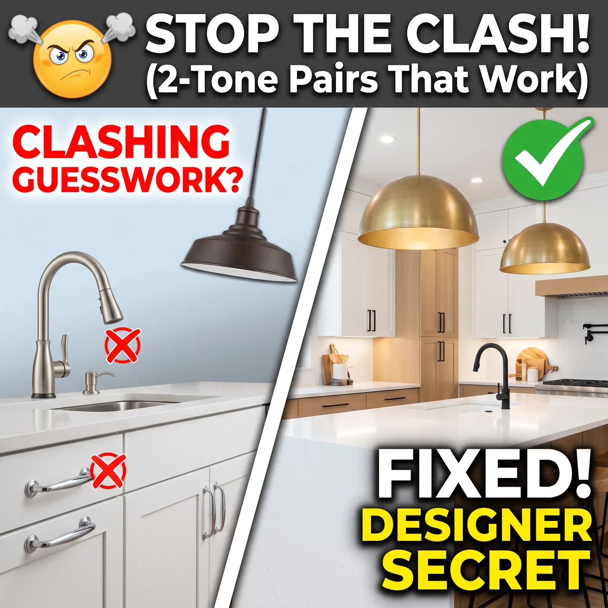
Upgrading your kitchen hardware and light fixtures brings a common fear. Nobody wants to spend thousands of dollars on brass pendants and black handles only to realize the space looks messy.
Matching every fixture in the same finish can make a kitchen look flat and sterile. Mixing two metal finishes adds depth, warmth, and character. When done without a plan, however, mixed metals look like an ordering mistake.
To keep your kitchen cohesive, you need clear contrast, balanced undertones, and proper placement. Below are seven practical two-tone pairings you can use in your home, followed by the rules that make them work.
7 Practical Two-Tone Pairings for Your Kitchen
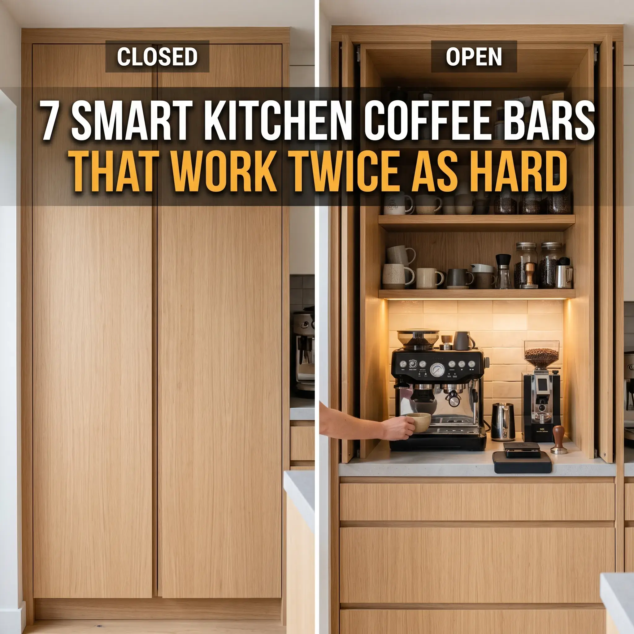
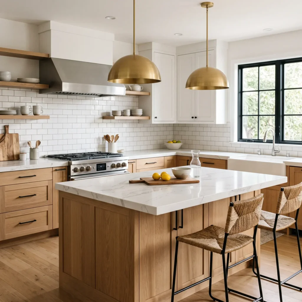
1. The Modern Transitional: Matte Black Pulls with Satin Brass Pendants
This combination pairs a crisp neutral base with soft, radiant warmth. Matte black cabinet pulls ground your lower cabinetry and outline your millwork. Satin brass pendants overhead draw the eye upward. They bring rich warmth to white, taupe, or natural white oak cabinets.
Matte black absorbs light, while satin brass diffuses it softly. This contrast ensures the two metals never fight for attention. Keep all perimeter cabinet handles black. Let your lighting serve as the warm focal point above the island.
- Dominant Finish (70%): Matte Black across cabinet pulls, appliance handles, and window hardware.
- Accent Finish (30%): Satin Brass across island pendants and counter stool frames.
- Ideal Cabinet Colors: Warm off-white, natural white oak, and muted olive green.
Products Used in This Look
- Cabinet Pulls: Amerock Monument 5-1/16 Inch Matte Black Drawer Pulls
- Island Lighting: Rejuvenation Haleigh 18 Inch Satin Brass Dome Pendants
- Wall Sconces: Visual Comfort Boston Single Arm Sconce in Hand-Rubbed Antique Brass
- Kitchen Faucet: Delta Trinsic Single-Handle Pull-Down Faucet in Matte Black
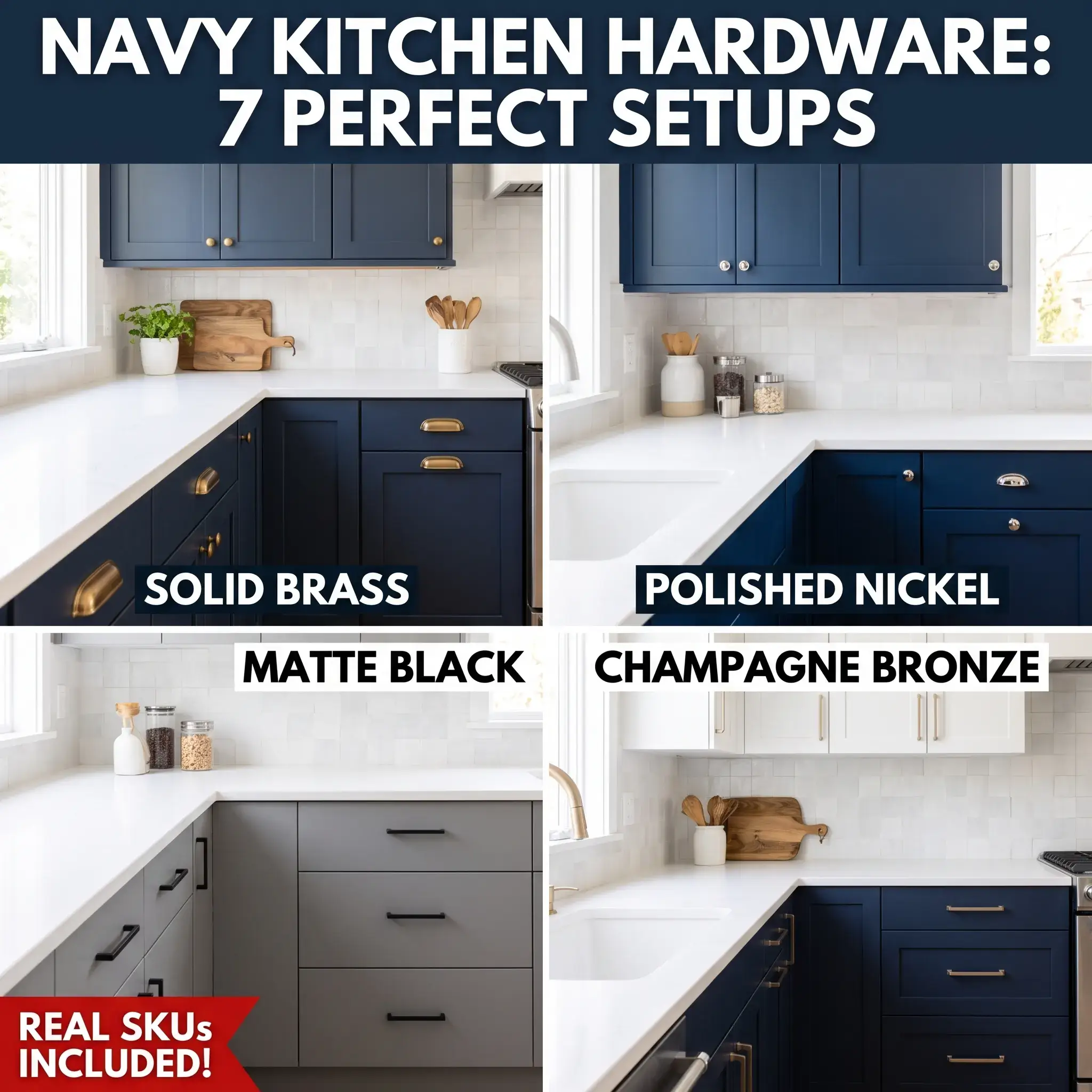
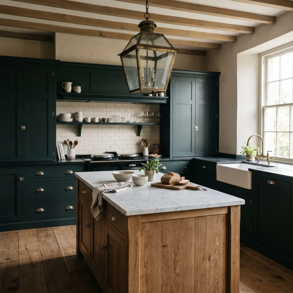
2. The English Heritage: Polished Nickel Hardware with Unlacquered Brass Lighting
This combination creates a classic, collected look. Polished nickel provides the crisp reflection of silver, but its subtle golden undertone keeps it warm. Unlacquered brass introduces a living surface that darkens naturally over time.
Install polished nickel knobs and latches on your cabinet doors and pantry drawers. Hang unlacquered brass pendant lanterns or library sconces over your sink and island. The nickel reflections tie into stainless steel appliances, while the brass fixtures bring vintage warmth.
- Dominant Finish (70%): Polished Nickel across cup pulls, cupboard latches, and the main faucet.
- Accent Finish (30%): Unlacquered Brass across island lanterns and wall picture lights.
- Ideal Cabinet Colors: Inky navy, heritage forest green, warm putty, and off-white.
Products Used in This Look
- Cabinet Knobs and Latches: Armac Martin Cotswold Polished Nickel Cupboard Latches and Bun Knobs
- Island Lighting: deVOL Tuscan Farmhouse Unlacquered Brass Lanterns
- Task Lighting: Visual Comfort Cabinet Makers Picture Light in Hand-Rubbed Brass
- Kitchen Faucet: Perrin and Rowe Georgian Era Polished Nickel Bridge Faucet
Check out more Modern Kitchen Ideas
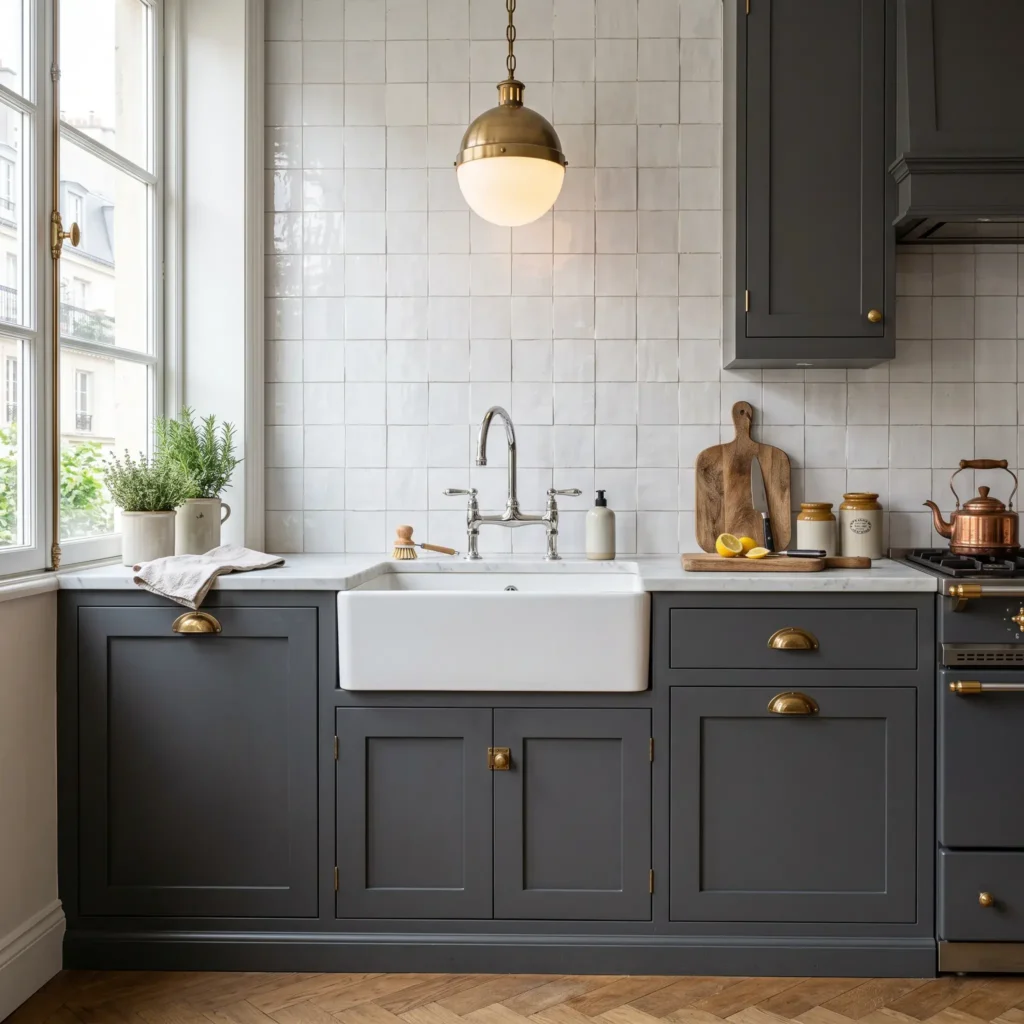
3. The Tailored Bistro: Burnished Brass Pulls with Polished Chrome Fixtures
Many homeowners worry that polished chrome looks clinical. Pairing chrome with burnished or antique brass captures the atmosphere of classic French brasseries.
Let polished chrome handle your working fixtures. Install a polished chrome bridge faucet and matching pot filler to echo your stainless steel range. Install burnished brass knobs and bin pulls across your cabinetry drawers. Overhead, hang brass-accented pendants with milk glass globes to soften the room.
- Dominant Finish (70%): Burnished or Antique Brass across bin pulls, pantry knobs, and shelf brackets.
- Accent Finish (30%): Polished Chrome across the bridge faucet, pot filler, and glass pendant hardware.
- Ideal Cabinet Colors: Charcoal, deep slate, warm gray, and crisp white.
Products Used in This Look
- Cabinet Hardware: Rejuvenation Mission Bin Pulls and Knobs in Burnished Antique Brass
- Island Lighting: Schoolhouse Donna 3-Light Chandelier with Polished Chrome Arm and Opal Shades
- Sink Faucet: Kohler Artifacts Gentleman Bridge Faucet in Polished Chrome
- Pot Filler: Newport Brass Chesterfield Wall Mount Pot Filler in Polished Chrome
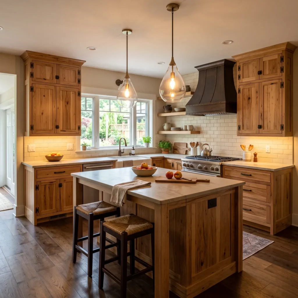
4. The Warm Craftsman: Oil-Rubbed Bronze Latches with Champagne Bronze Pendants
Pure black hardware can feel too harsh in kitchens with earthy palettes and rich wood stains. Oil-rubbed bronze provides a soft, deep chocolate base that grounds your lower cabinets.
Contrast the dark bronze hardware with champagne bronze lighting fixtures. Champagne bronze has a muted, brushed gold finish that reflects light without yellowing. This pairing brings rich warmth to natural wood grain, exposed brick, and warm stone counters.
- Dominant Finish (70%): Oil-Rubbed Bronze across base cabinet pulls, appliance handles, and window latches.
- Accent Finish (30%): Champagne Bronze across island pendants and articulating wall sconces.
- Ideal Cabinet Colors: Stained cherry, natural hickory, warm cream, and earthy sage.
Products Used in This Look
- Cabinet Pulls: Top Knobs Holland Bar Pulls in Oil-Rubbed Bronze
- Island Lighting: Kichler Everly 14 Inch Champagne Bronze Teardrop Pendants
- Accent Sconces: Hudson Valley Lighting Menlo Park Sconce in Champagne Gold
- Kitchen Faucet: Delta Broderick Pull-Down Faucet in Champagne Bronze
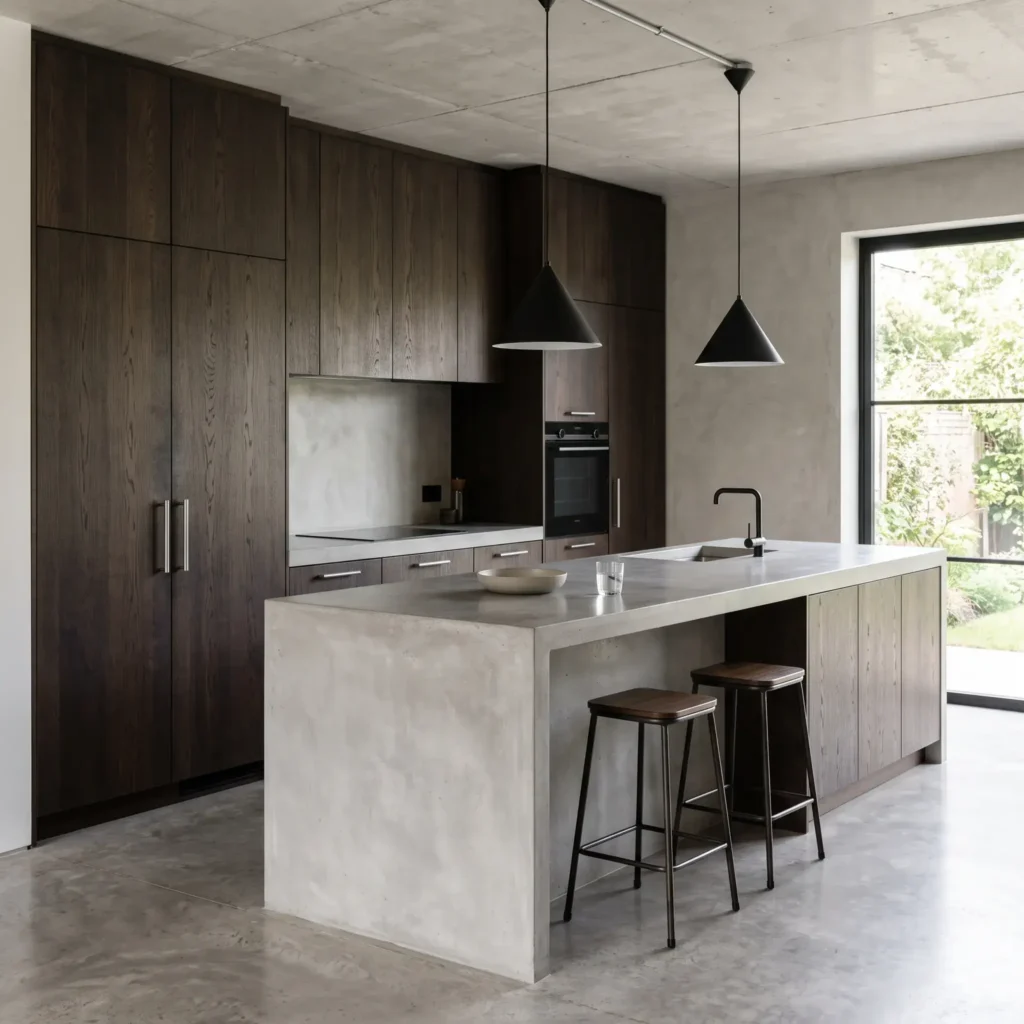
5. The Refined Industrial: Matte Black Linear Lights with Brushed Stainless Hardware
This combination removes decorative fuss to create an architectural, functional look. Brushed stainless steel hardware matches commercial appliances and withstands heavy daily use.
Pairing stainless steel with basic silver lighting can make a kitchen feel like an institutional workspace. Adding matte black overhead frames your room and adds visual structure. Use slim matte black linear suspension lights over your island. Pair them with clean stainless edge pulls or knurled handles on your cabinets.
- Dominant Finish (70%): Brushed Stainless Steel across cabinet edge pulls, commercial appliances, and bar sinks.
- Accent Finish (30%): Matte Black across linear island fixtures, shelf brackets, and range hood trim.
- Ideal Cabinet Colors: Flat-panel slab black, dark charcoal, rift-sawn oak, and concrete gray.
Products Used in This Look
- Cabinet Handles: Buster and Punch Cross Knurled Steel Furniture Pulls
- Island Lighting: CB2 Bell Matte Black Metal Pendant Lights
- Wall Lighting: Cedar and Moss Tier Flush Mount in Matte Black
- Kitchen Faucet: Kraus Bolden Commercial Style Pull-Down Faucet in Stainless Steel
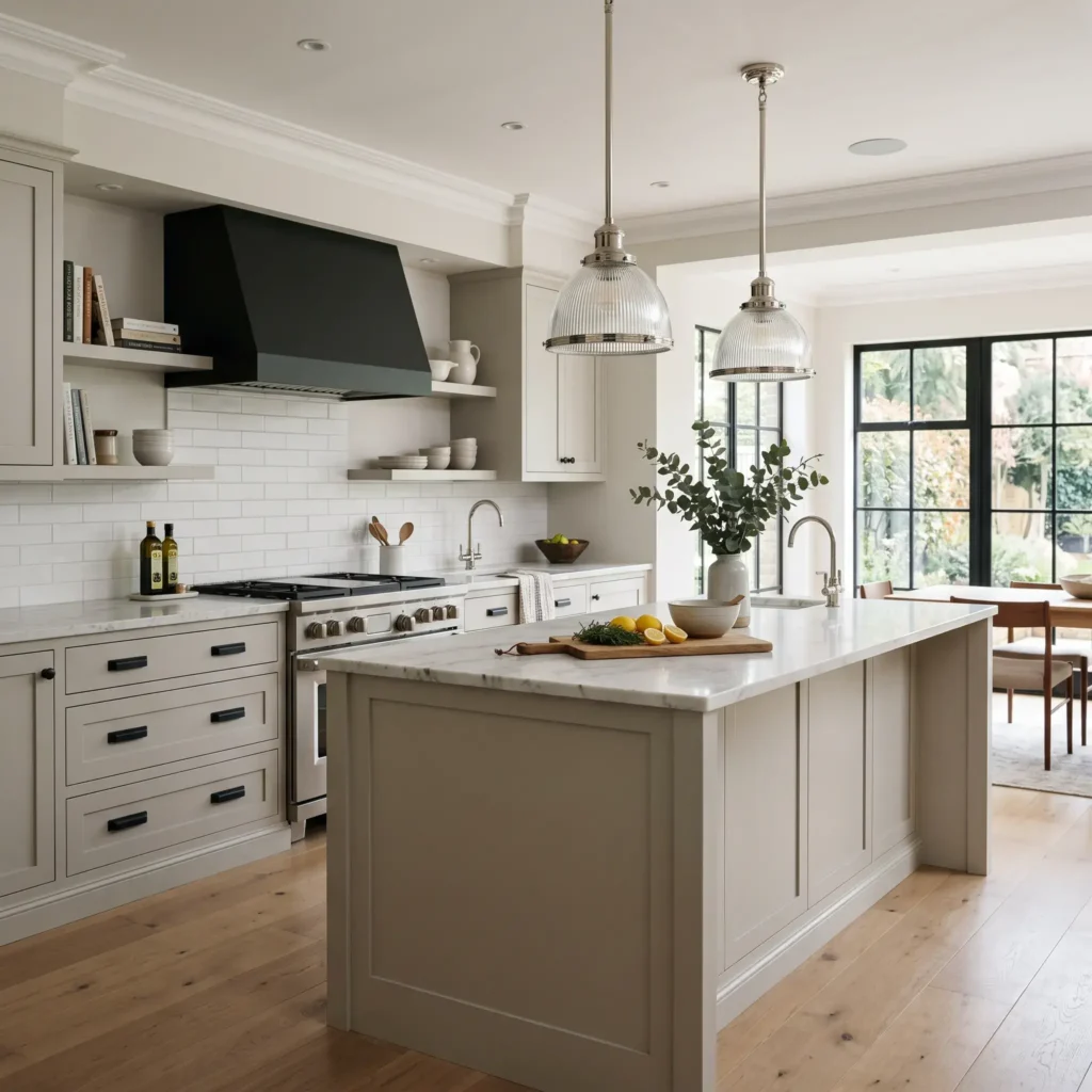
6. The Modern Classic: Matte Black Cabinet Hardware with Polished Nickel Lighting
If you want the punch of black hardware without a fully industrial look, pair it with polished nickel lighting. Matte black absorbs light, grounding your drawers and pantry doors. Polished nickel acts like jewelry overhead, reflecting ambient room light.
This pairing works exceptionally well when you have a stainless steel refrigerator and range. The polished nickel lighting coordinates with your silver appliances. At the same time, the black cabinet hardware keeps the kitchen grounded and crisp.
- Dominant Finish (70%): Matte Black across cabinet knobs, cup pulls, and interior door hardware.
- Accent Finish (30%): Polished Nickel across island pendants and gooseneck wall sconces.
- Ideal Cabinet Colors: Crisp white, light gray, soft greige, and natural maple.
Products Used in This Look
- Cabinet Hardware: Emtek Modern Rectangular Pulls in Matte Black
- Island Lighting: Visual Comfort Thomas O’Brien Hicks Pendants in Polished Nickel
- Wall Task Lights: Hudson Valley Lighting Garden City Sconce in Polished Nickel
- Kitchen Faucet: Moen Weymouth Pull-Down Faucet in Polished Nickel
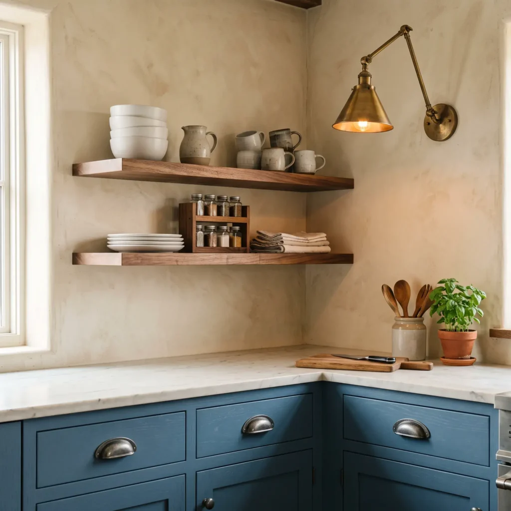
7. The Studio Eclectic: Pewter Cup Pulls with Antique Brass Sconces
Pewter brings a soft slate-gray luster that feels more relaxed than chrome or stainless steel. When paired with antique brass, it creates an inviting atmosphere found in historic homes.
Use pewter cup pulls and small round knobs across your perimeter base cabinets. Install adjustable antique brass sconces above open floating shelves or beside your range hood. The warm yellow-red tones of the brass stand out cleanly against the quiet gray presence of pewter.
- Dominant Finish (70%): Pewter or Gunmetal across cup pulls, cabinet latches, and small drawer knobs.
- Accent Finish (30%): Antique Brass across wall sconces, shelf brackets, and range hood bands.
- Ideal Cabinet Colors: Creamy off-white, walnut, dusty blue, and warm plaster.
Products Used in This Look
- Cabinet Hardware: Ashley Norton Cast Bronze Pulls in Pewter Finish
- Wall Task Lighting: Rejuvenation Cylinder Task Sconces in Burnished Antique Brass
- Island Lighting: Allied Maker Dome Pendants in Brass with Linen Cord
- Kitchen Faucet: Waterworks Easton Classic Two Hole Bridge Faucet in Pewter
The 70/30 Rule: How to Distribute Your Metals
The most common mistake homeowners make is splitting finishes evenly in a 50/50 ratio. When two contrasting metals cover the same amount of visual space, they compete with each other. This balance failure makes your kitchen look disorganized.
Instead, follow the 70/30 distribution rule:
- The Dominant Base Finish (70%): This finish forms your visual baseline. Assign it to high-frequency elements like base pulls, drawer handles, pantry latches, and appliance handles.
- The Accent Finish (30%): This finish acts as your sculptural feature. Place it on focal fixtures like island pendants, wall-mounted sconces, or your range hood trim.
Using this ratio lets the eye read the primary metal as part of the architecture. The secondary metal stands out as an intentional design choice.
The Touch vs. Sight Framework
Not every metal fixture in your kitchen experiences the same wear. To choose metals that last, separate your fixtures into Touch Zones and Sight Zones.
Touch Zones (Base Hardware)
Your cabinet knobs, drawer handles, and appliance pulls face constant physical contact every day.
- Best Finishes: Living metals like unlacquered brass, cast bronze, and forged pewter perform well here. Natural skin oils speed up wear on contact points, creating an authentic patina over time.
- If you prefer a clean look without patina, choose powder-coated matte black or PVD-coated stainless steel to prevent chipping.
Sight Zones (Lighting and High Fixtures)
Pendant shades, downrods, chandeliers, and picture lights sit out of arm’s reach. They gather dust, not finger oils.
- Best Finishes: Choose stable, sealed, or electroplated finishes like plated polished nickel, sealed antique brass, or powder-coated black.
- Avoid unlacquered, raw brass on high light fixtures. Climbing a ladder to hand-polish high light fixtures becomes an exhausting chore.
The Polished Nickel Bridge: Mastering Undertones
Metals fall into three undertone families:
- Warm Metals: Unlacquered brass, satin gold, and champagne bronze.
- Cool Metals: Polished chrome, brushed stainless steel, and cool pewter.
- Neutral Metals: Matte black, blackened iron, and dark oil-rubbed bronze.
Pairing a warm metal with a neutral metal is straightforward. Matte black paired with satin brass creates clean, obvious contrast.
The real challenge comes when mixing warm metals with silver tones. Many people pair standard polished chrome with warm brass, only to find the room feels cold and disjointed. Chrome carries an icy blue undertone that clashes sharply with warm yellow brass.
This is where polished nickel serves as an ideal bridge. Polished nickel goes through an electroplating process that leaves a subtle amber undertone. When placed beside unlacquered brass, its warm cast prevents clashing. At the same time, its silver reflection coordinates with stainless steel appliances.
Where Each Metal Belongs: Kitchen Spatial Zoning
To keep your kitchen balanced from floor to ceiling, distribute your finishes across these key zones:
| Kitchen Zone | Primary Metal Assignment | Secondary Metal Assignment | Design Rule |
|---|---|---|---|
| Cabinet Pulls and Knobs | Dominant (70%) | Accent (30%) on island only | Keep all perimeter cabinets in one uniform finish. Never switch finishes across the same cabinet run. |
| Island Pendants | Accent (30%) | Dominant (70%) matching base pulls | Choose a finish that contrasts clearly against your backsplash and wall color. |
| Wall Sconces | Accent Metal | Dominant Metal | Match sconce backplates to floating shelf brackets or coordinate with pendant stems. |
| Plumbing Fixtures | Dominant or Accent | Coordinate with Appliances | Never split finishes between your main sink faucet and your stove pot filler. |
| Range Hood Trim | Accent Metal | Architectural Black Iron | Tie range hood metal straps to pendant canopies, lighting downrods, or counter latches. |
The Golden Rule of Plumbing Consistency
Always keep your plumbing fixtures in a single finish.
Your main island faucet, prep sink tap, and stove pot filler must match completely. Installing a matte black sink faucet next to a brass pot filler looks like an uncoordinated installation. Keep all plumbing uniform, and let your cabinet handles and ceiling lights carry the two-tone contrast.
Light Temperature Changes Everything (Kelvin and CRI)
You can choose well-matched metal finishes, but incorrect light bulbs will ruin the result. Light bulbs emit specific color temperatures measured in Kelvin (K).
| Color Temperature | Light Quality | Effect on Warm Metals | Effect on Cool Metals | Best Application |
|---|---|---|---|---|
| 2700K (Warm White) | Amber, golden glow | Flatters brass and natural wood | Makes chrome, stainless, and white quartz look yellow | Low accent sconces and dining nooks |
| 3000K (Soft White) | Clean white light | Preserves warmth without orange tones | Keeps polished nickel, chrome, and quartz crisp | Island pendants, recessed cans, and task lights |
| 3500K to 4000K (Cool White) | Blue-white light | Dulls brass, making it look greenish | Accentuates blue reflections with harsh glare | Commercial spaces and utility pantries |
Why 3000K is Ideal for Mixed Metals
- At 2700K: The light casts a heavy yellow glow. While it flatters warm brass, it turns polished nickel, chrome, and white quartz countertops yellow and dingy.
- At 3000K: The light provides clean white clarity without feeling clinical. It preserves the authentic warmth of brass while keeping silver metals and white backsplashes crisp.
- At 3500K and Above: The light casts a cold blue hue. It flattens the warmth of gold and bronze, making brass fixtures look dull and greenish.
Check the Color Rendering Index (CRI)
When buying LED bulbs or fixtures with built-in LEDs, select a CRI rating of 90 or higher. High-CRI lighting reveals subtle metallic undertones, allowing you to clearly see the warmth of polished nickel compared to cool chrome.
3 Mistakes That Make Mixed Metals Look Accidental
1. The Near-Miss Finish Collision
Placing two metals from the same family that differ only slightly is a common mistake.
For instance, do not place polished chrome cabinet pulls next to brushed nickel lighting. Both are silver, but their different sheens make them look like a mismatched error. Similarly, avoid placing bright polished yellow gold right next to muted satin brass. Choose clear, deliberate contrast over subtle variations.
2. The Single-Instance Orphan
Never introduce an accent metal in just one spot.
If you hang a single brass pendant in a room where every pull, latch, faucet, and hinge is matte black, that pendant reads as an accident. Apply the Rule of Twos: every metal finish must appear at least twice across different areas. If your island pendants are brass, repeat that brass on open shelf brackets or a picture light over the sink.
3. Splitting the Faucet and Pot Filler
Your sink and your cooktop are high-visibility focal points. Do not install a black pull-down faucet on your island and a brass pot filler above your stove. Treat your plumbing suite as an unbroken team.
Frequently Asked Questions
Can cabinet hardware be different from light fixtures?
Yes. Designers frequently pair different finishes across cabinet hardware and lighting to add visual depth. Follow the 70/30 rule. Keep your cabinet hardware in one primary finish, and use a contrasting finish on your island pendants or wall sconces.
Do kitchen faucets have to match cabinet hardware or lighting?
No, your faucet does not have to match your cabinet handles. Many designers match the faucet to the lighting overhead while using a contrasting finish on the cabinet pulls. However, all faucets in the kitchen, including bar taps and pot fillers, must match each other.
What is the easiest two-tone metal pairing for beginners?
Matte black hardware paired with satin brass lighting is the most foolproof combination. Matte black acts as a complete neutral that grounds the cabinetry, while satin brass introduces warmth. This combination provides clear, high contrast that never looks accidental.
How do you handle stainless steel appliances in a mixed-metal kitchen?
Treat large stainless steel appliances as an architectural neutral rather than an active accent metal. You do not need to match your cabinet pulls to your oven or refrigerator. To connect them naturally, use polished nickel or chrome for your sink faucet, and use brass or black for your decorative hardware.
Will unlacquered brass hardware turn green in a kitchen?
Unlacquered brass naturally develops a darker, golden-brown patina over time through oxidation and handling. It will only turn green if exposed to standing water or harsh acidic cleaners. To maintain the finish, simply wipe pulls down with a damp microfiber cloth and dry them immediately.
Final Takeaway: How to Make Your Choice
Mixing kitchen metals does not require guesswork. Anchor your cabinets with a dominant 70% finish, introduce an accent 30% metal on your high lighting, and illuminate the space with 3000K high-CRI light bulbs.
Start by selecting your island lighting first, as statement fixtures often have the most distinct shapes and finishes. Once your lighting is locked in, choosing your complementary cabinet hardware becomes simple.