
Dusty Pink Bedroom Ideas: 8 Sophisticated Designs for Adults

Many people love the idea of a pink bedroom but worry it will look like a nursery. That fear is completely understandable. Bright bubblegum and sugary pastels can easily overwhelm a sleeping space.
Dusty pink works differently. It contains grey, clay, and brown undertones that soften its red primary base. In interior design, this shade functions as a warm architectural neutral rather than a loud statement. It brings warmth to your walls while keeping your room calm and mature.
Below are 8 practical, designer-approved concepts you can recreate at home. Each design includes the exact paint formulas, decor products, and styling notes to help you complete the look.
8 Practical Dusty Pink Bedroom Ideas
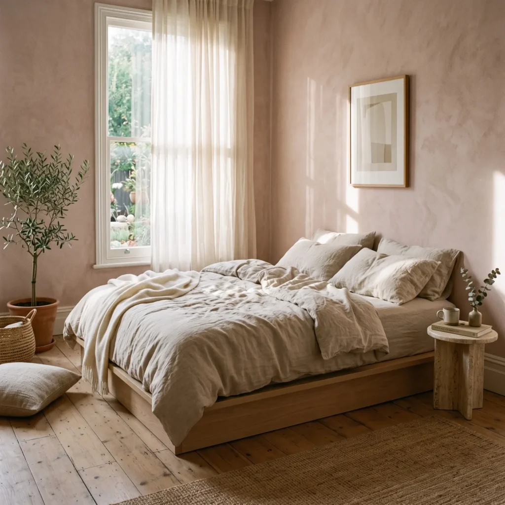
1. Modern Organic Sanctuary with White Oak
This design blends matte rose walls with pale timbers to create an earthy retreat. Raw textures stop the pink from feeling overly delicate. The look relies on natural light, clean lines, and unpolished surfaces.
- Paint Recommendation: Farrow & Ball Setting Plaster (No. 231). It has yellow-ochre undertones with an LRV of 55%.
- Products in This Look:
- Solid white oak platform bed frame with a low profile.
- Washed French flax linen duvet set in natural oatmeal.
- Ribbed clay ceramic bedside lamps with oatmeal linen shades.
- Off-white travertine stone side table.
- Jute and wool looped area rug.
2. High-Contrast Slate and Charcoal Anchor
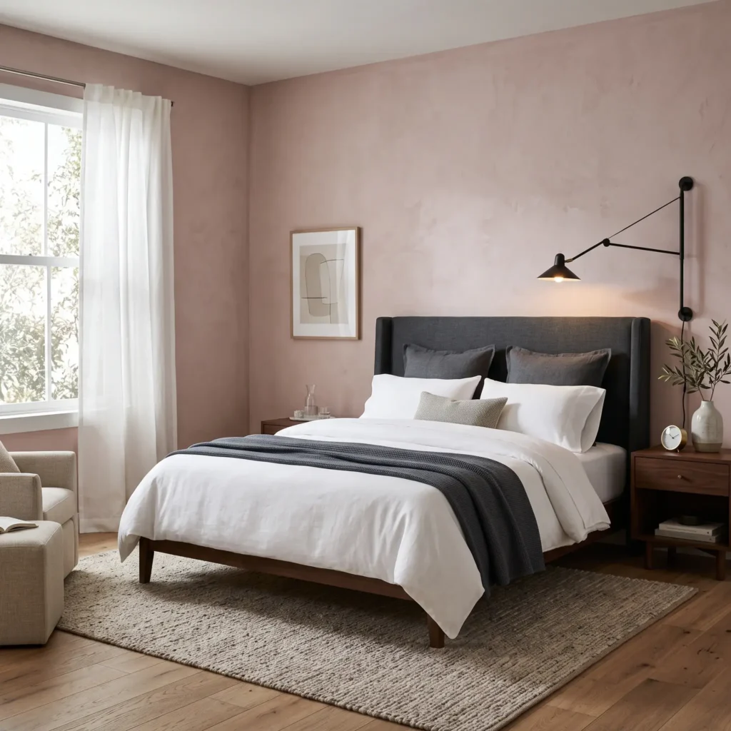
Pairing soft walls with dark, light-absorbing elements provides immediate structure. Charcoal grey grounds the blush tone and introduces a tailored, unisex balance that works well in shared master bedrooms.
- Paint Recommendation: Sherwin-Williams Chelsea Mauve (SW 6044). A cool taupe-rose with an LRV of 44%.
- Products in This Look:
- Dark charcoal upholstered headboard in textured woven wool.
- Matte black metal swing-arm wall sconces.
- Crisp white 400-thread-count cotton percale bedsheets.
- Slate grey waffle-knit bed runner.
- Black iron framed wall art with wide white matting.
Check out more Modern Bedroom Ideas
3. Biophilic Pairing with Muted Sage Green
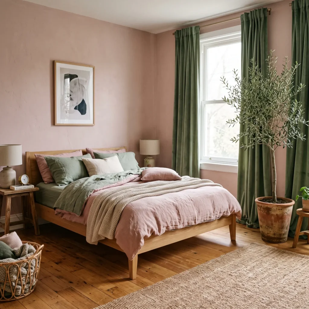
Pink and green sit opposite each other on the color wheel. This natural contrast brings the feeling of an outdoor garden indoors. Soft sage cuts through the warmth of dusty rose to keep the room feeling fresh and restful.
- Paint Recommendation: Benjamin Moore Monticello Rose (HC-63). A heritage mid-tone rose with an LRV of 46%.
- Products in This Look:
- Muted sage green velvet blackout curtains hung ceiling to floor.
- Large potted fiddle-leaf fig or olive tree in a terracotta planter.
- Soft sage washed linen pillow shams.
- Natural rattan or cane webbing accent chair.
- Brushed satin brass bedside clock and hardware.
4. Monochromatic Double-Drenched Envelope
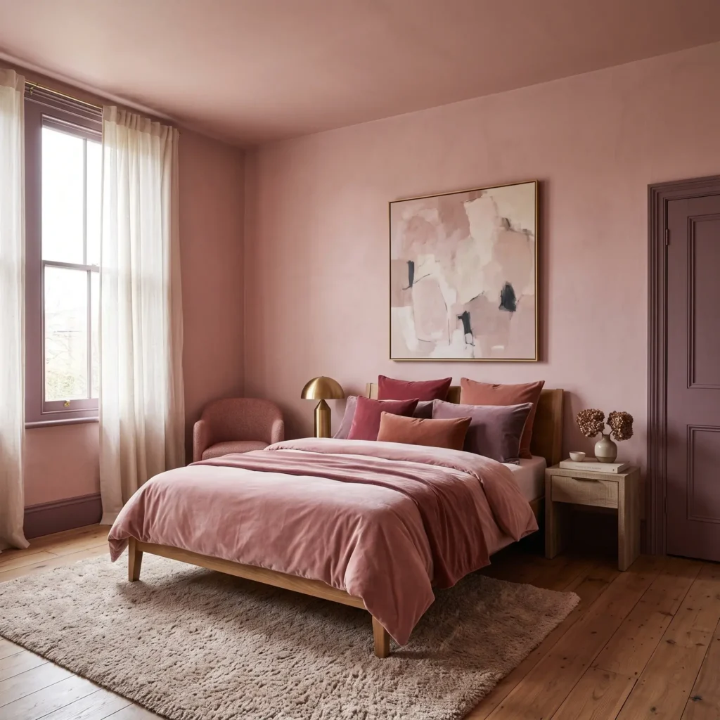
Color drenching wraps every surface in related shades. This technique eliminates harsh visual breaks from white trim. It makes small bedrooms feel larger and gives the room a cozy, hotel-style presence.
- Paint Recommendation (Walls and Ceiling): Little Greene Blush (No. 267).
- Paint Recommendation (Trim and Doors): Little Greene Hellebore (No. 275).
- Products in This Look:
- Built-in wardrobes painted in satin finish matching the wall color.
- Low-sheen painted picture rails and skirting boards.
- Dusky mauve silk-velvet bed throw.
- Frosted opal glass globe pendant light.
- Fluffy sheepskin accent rug in pale dusty mauve.
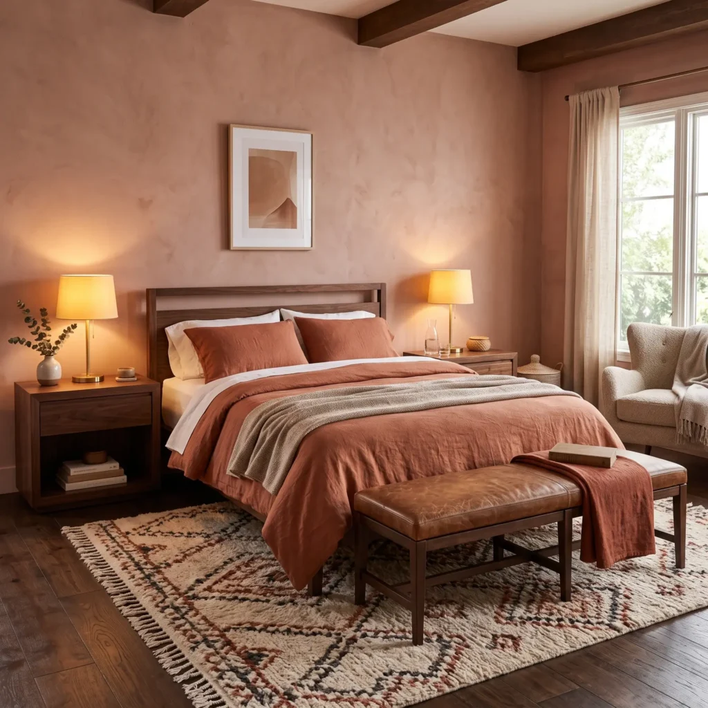
5. Warm Earth with Dark Walnut and Terracotta
This palette suits bedrooms that face cool north-eastern daylight. The clay undertones in the paint blend with the rich grain of dark walnut, creating an inviting space for unwinding in the evening.
- Paint Recommendation: Sherwin-Williams Sandbank (SW 6052). Warm beige-pink with an LRV of 40%.
- Products in This Look:
- Solid American walnut bedside tables with brass pulls.
- Terracotta washed linen duvet cover.
- Cognac leather bench at the foot of the bed.
- Burnt ochre bouclé lumbar cushion.
- Hand-knotted wool rug with rust and cream geometric patterns.
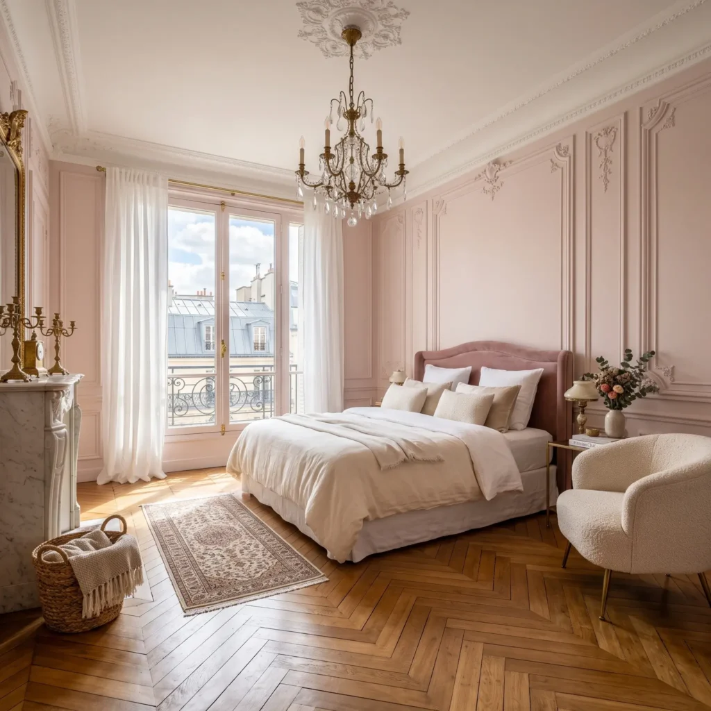
6. Parisian Modern with Wall Moulding
Wall panelling adds instant architecture to plain drywall. In this concept, classical picture-frame moulding introduces soft shadow lines that keep dusty pink from appearing flat or two-dimensional.
- Paint Recommendation: Farrow & Ball Peignoir (No. 286). A romantic grey-pink with an LRV of 62%.
- Products in This Look:
- Applied wood picture-frame wall moulding painted in the wall color.
- Unlacquered brass multi-arm chandelier.
- French herringbone oak parquet flooring.
- Cream bouclé curved accent armchair.
- Antiqued gilt-framed leaner mirror.
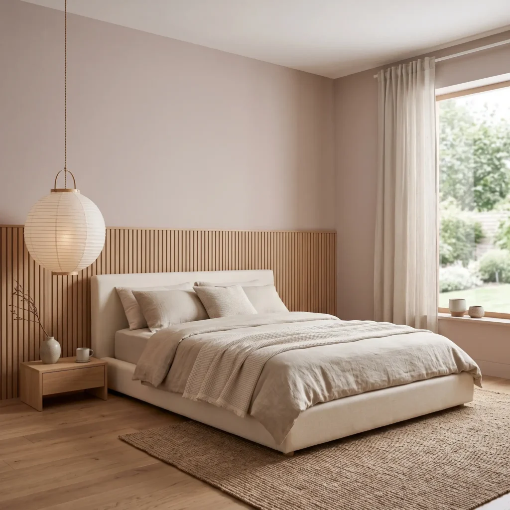
7. Japandi Slatted Headboard Feature
Japandi design values functional simplicity and natural timber. A slatted white oak half-wall behind the bed provides texture and acoustic dampening. The dusty pink background adds gentle warmth to an otherwise minimalist layout.
- Paint Recommendation: Benjamin Moore Charmeuse (AF-265). A light pink-greige with an LRV of 65%.
- Products in This Look:
- Half-height vertical acoustic oak wood wall slats.
- Floating minimalist bedside shelves.
- Japanese paper lantern pendant light (Akari style).
- Low platform bed with cream woven upholstery.
- Stoneware vase with dried lunaria stems.
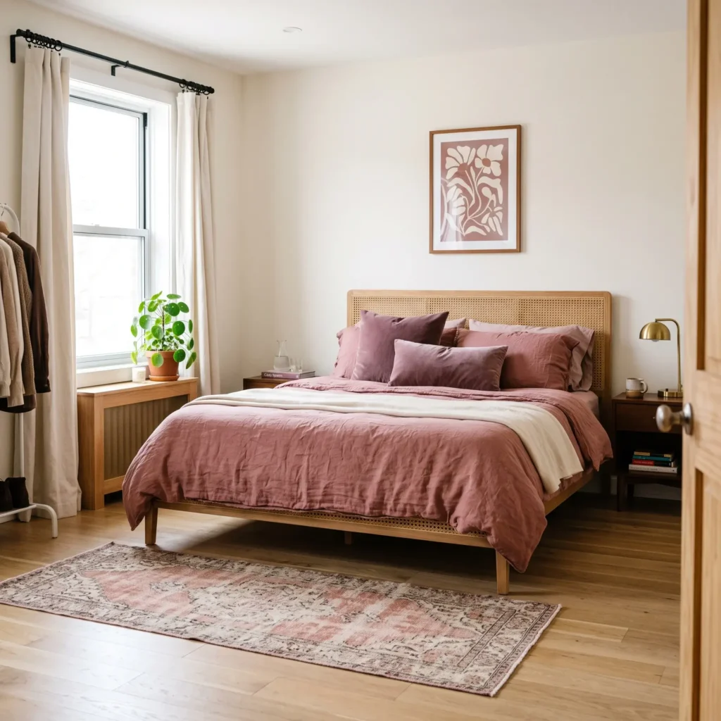
8. The Low-Commitment Textile Suite
If you live in a rental property or prefer white walls, you do not need paint to achieve this aesthetic. Keep your walls neutral and build the palette using layered textiles on the bed and windows.
- Wall Paint (Neutral Base): Sherwin-Williams Alabaster (SW 7008).
- Products in This Look:
- Washed French linen duvet cover in deep dusty rose.
- Heavy mauve velvet curtain panels with black curtain rod.
- Hand-woven vintage Turkish runner with faded pink and navy dyes.
- Natural cane headboard.
- Abstract framed canvas art with blush and charcoal brushstrokes.
How to Choose Your Shade Based on Natural Light
Paint looks different depending on the direction your bedroom windows face. Choosing the wrong undertone can make your walls appear cold or unpleasantly orange.
| Window Exposure | What the Natural Light Does | The Risk | What Undertone to Choose | Recommended Paint |
|---|---|---|---|---|
| North & East | Casts cool, blue-tinted light that flattens colors. | Paint turns chilly, muddy, or looks like hospital plaster. | Yellow ochre, raw umber, or warm clay bases. | Farrow & Ball Setting Plaster (No. 231) |
| South & West | Casts bright, warm, golden hour light all afternoon. | Warm pinks can look oversaturated or candy-like. | Slate, charcoal, and smoky grey bases. | Farrow & Ball Peignoir (No. 286) |
The 60-30-10 Rule for Dusty Pink
To prevent your room from feeling like a nursery, use this classic interior balance:
- 60% Dominant Color (Walls and Rugs): Use your chosen dusty pink or a warm off-white base.
- 30% Secondary Color (Bedding and Drapery): Layer neutral linen, oatmeal wool, or soft sage green.
- 10% Grounding Accent (Hardware and Small Furniture): Add matte black iron, dark walnut, or satin brass. This sharp 10% contrast creates an adult look.
The 5-Tier Bedding Layering System
A flat duvet makes a bedroom look unfinished. Designers build beds using five distinct layers to balance light and texture:
- The Base Sheet: Use 100% washed European flax linen. The natural slub diffuses room light and prevents glare.
- The Structural Coverlet: Add a waffle-weave or diamond-pique cotton coverlet in ivory or biscuit.
- The Core Duvet: Select an oversized down-alternative duvet wrapped in dusty pink linen. Let it drape near the floor.
- The End-of-Bed Runner: Fold a heavyweight cotton-velvet runner across the bottom third. Choose a shade two stops darker than your wall paint, such as deep plum or fig.
- Accent Pillows: Finish with two square velvet pillows and one central bouclé lumbar pillow in olive or charcoal.
Lighting Science: Protecting Your Sleep
Your bedroom visual environment impacts how easily you fall asleep. Bright colors and cool blue light stimulate the brain, raising heart rates. In contrast, low-saturation earth tones encourage physical relaxation.
Artificial bedroom lighting should follow these two rules:
- Color Temperature (2400K–2700K): Never use daylight bulbs (4000K or higher) in a dusty pink bedroom. Cool white light makes mauve pigments look dull and sickly. Warm white bulbs (2700K) draw out the warm red and ochre undertones for an inviting evening glow.
- Color Rendering Index (CRI 90+): Always check the light bulb box for CRI ratings. Standard LEDs wash out complex wall paints. A CRI of 90 or higher ensures your earthy pink looks rich and accurate after sunset.
Final Takeaway
Dusty pink behaves like an earthy neutral when given the right architectural support. Focus on desaturated paint formulas, balance the room with natural wood and black accents, and keep your lighting warm.
Start by ordering two paint sample pots with different undertones. Paint test swatches on both north and south walls, and watch how the color changes throughout the day before committing to a full tin.
Frequently Asked Questions
Will a dusty pink bedroom look childish?
No. Dusty pink contains grey, brown, or mauve pigments that mute its brightness. To keep the look mature, pair the color with natural timber, matte black hardware, and textured fabrics like linen and wool.
What is the best wood tone to pair with dusty pink?
Natural white oak works well for an airy, Scandinavian or Modern Organic style. For a moodier, formal aesthetic, dark American walnut provides rich contrast against soft pink walls.
Should I paint my ceiling dusty pink?
Yes. Painting the ceiling the same shade as your walls is called color drenching. It removes high-contrast lines between wall and ceiling, making small bedrooms feel taller and more cocooning.
What color curtains look best in a dusty pink room?
Floor-to-ceiling drapery in natural oatmeal linen, textured ivory bouclé, or deep sage green velvet works best. Avoid high-gloss white synthetic fabrics, which can look harsh against muted walls.
Is dusty pink suitable for shared master bedrooms?
Yes. When balanced with neutral elements like charcoal wool, slate grey, and dark timber, dusty pink reads as an earthy neutral rather than an overly feminine shade.