8 Timeless Two-Tone Kitchen Cabinet Combos for Real Homes
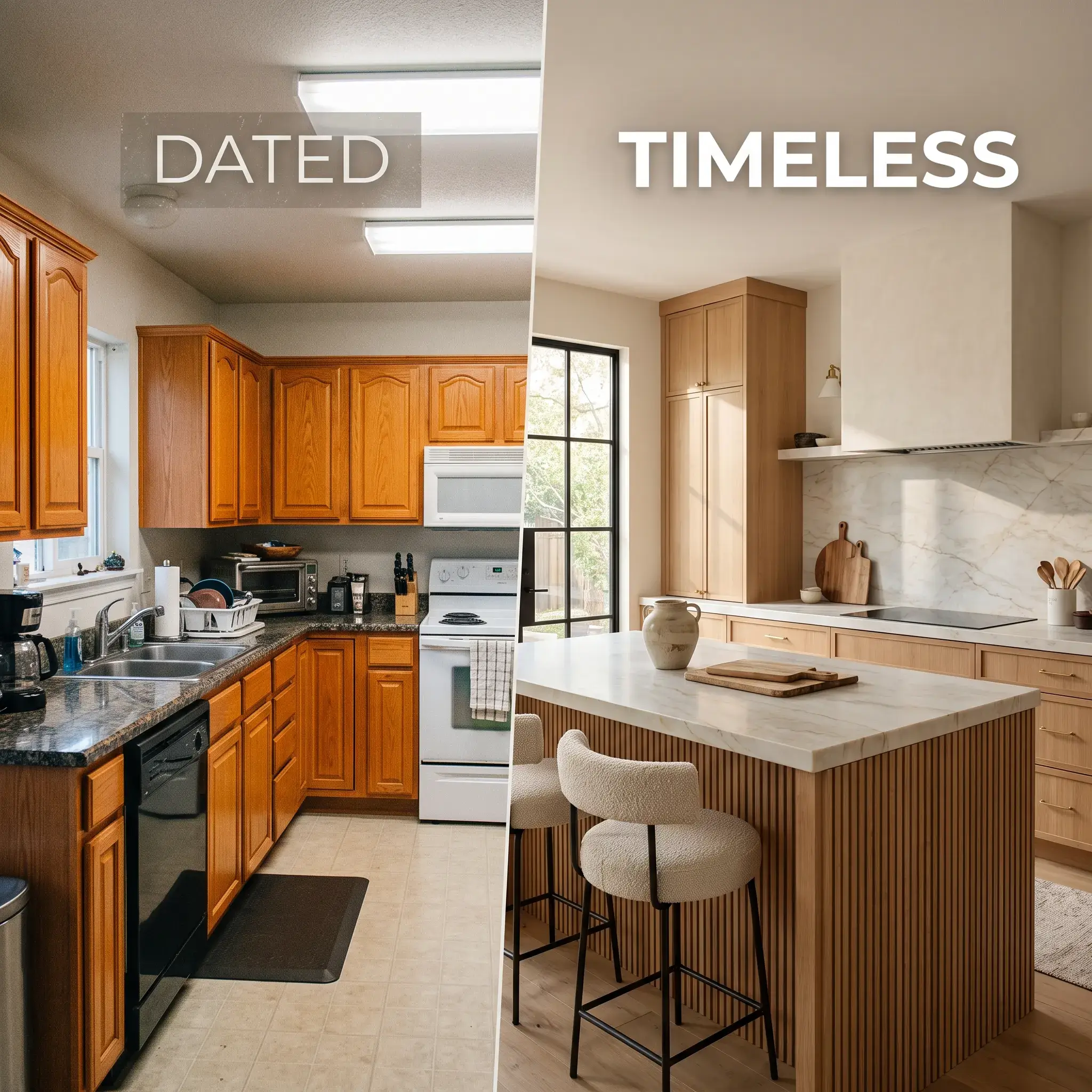
Single-color kitchens often feel cold, sterile, or flat. Dividing your cabinetry across two complementary finishes solves this issue immediately. It grounds lower base units, lifts standard eight-foot ceilings, and highlights focal features like an island or built-in pantry.
A balanced two-tone kitchen relies on strict undertone matching, identical door construction, and smart lighting. Below are eight practical color combinations tested by interior designers, complete with exact paint codes, countertop pairings, and execution rules.
1. Transitional Navy and Crisp Off-White
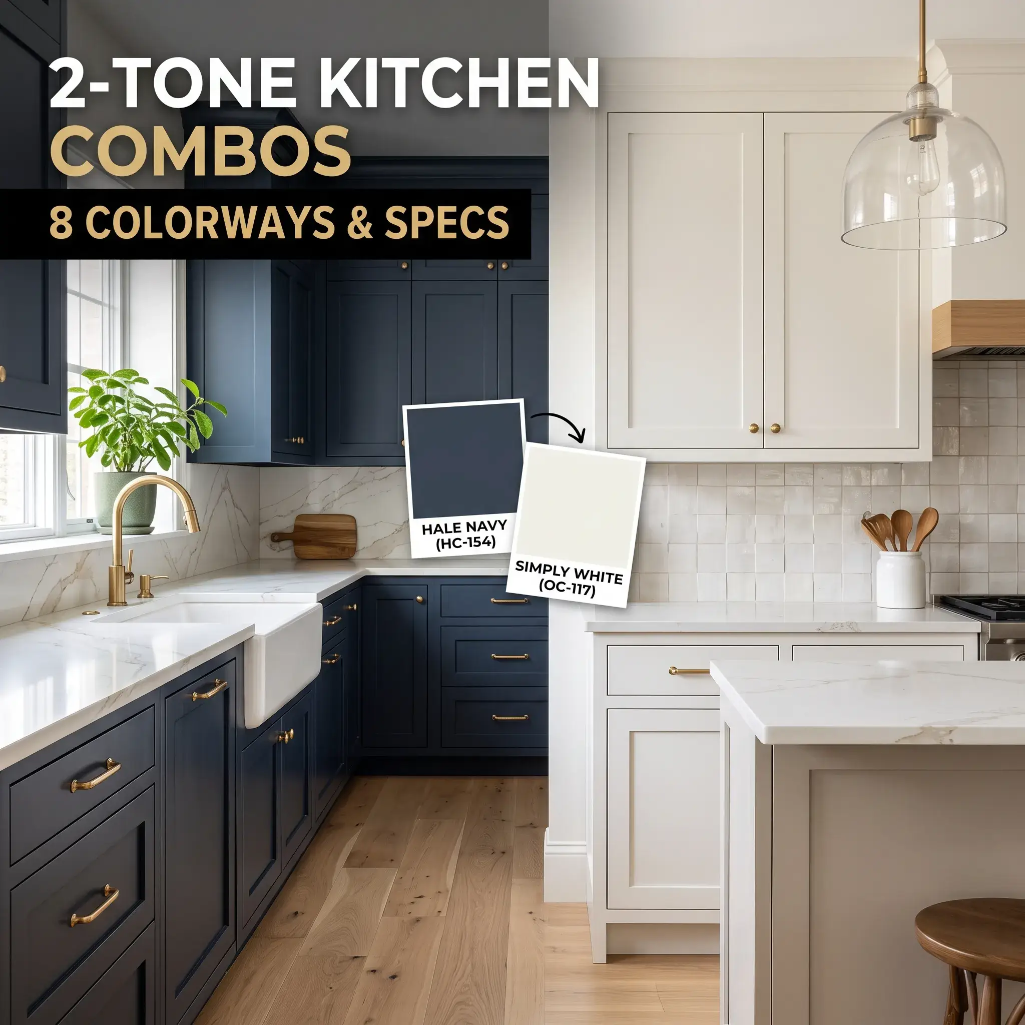
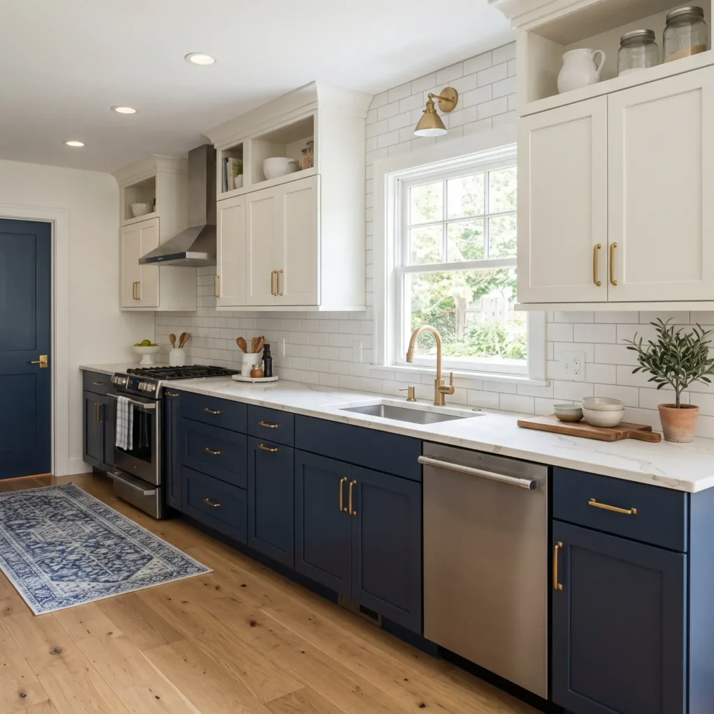
This combination remains the benchmark for transitional American homes. Hale Navy provides a deep base that hides scuffs, kicks, and food spills around prep areas. Simply White on upper wall cabinets bounces daylight across the room, making standard eight-foot ceilings feel higher.
- Best For: Classic suburban homes, transitional layouts, and rooms with medium natural daylight.
- Why It Works: Hale Navy contains slate gray undertones that keep it grounded. It never shifts purple under warm evening lights.
- Core Rule: Keep the door profile identical across both runs. Use standard five-piece Shaker doors on both sections.
Paint and Material Specifications
- Upper Cabinet Paint: Benjamin Moore Simply White (OC-117), Satin finish
- Lower Cabinet Paint: Benjamin Moore Hale Navy (HC-154), Satin finish
- Countertops: Calacatta Gold quartz with faint warm gray veining
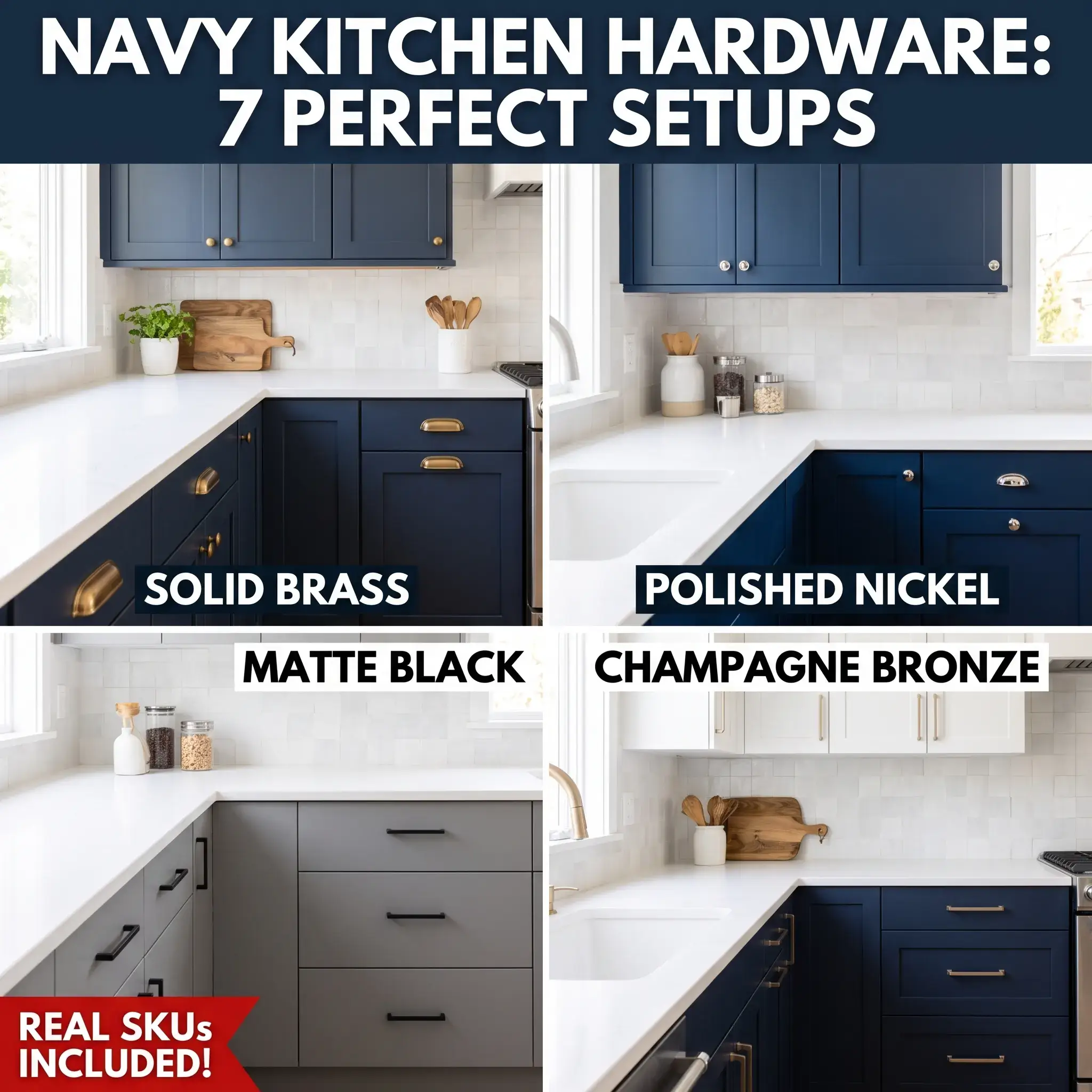
- Hardware: Satin brass rectangular pulls and round knobs
- Backsplash: 3×6 inch glossy white ceramic subway tile with soft gray grout
- Flooring: Wide-plank natural white oak with a matte clear coat
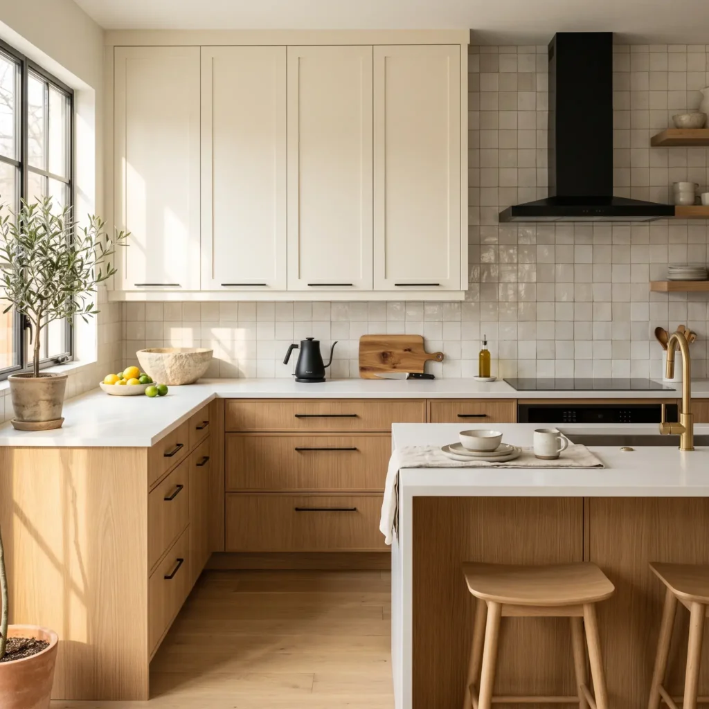
2. Modern Organic White Oak and Soft Cream
Modern organic design pairs the simplicity of painted wall cabinets with the warmth of real wood. Using rift-cut white oak on base units introduces tight, vertical grain lines that resist visible fingerprints.
- Best For: Modern organic, Scandinavian, and minimalist homes.
- Why It Works: Alabaster carries subtle beige undertones that mirror the tan fibers in natural oak. A cold, stark white creates a harsh contrast against warm wood.
- Core Rule: Coat the oak in a low-luster, non-yellowing conversion varnish to preserve its raw look over time.
Paint and Material Specifications
- Upper Cabinet Paint: Sherwin-Williams Alabaster (SW 7008), Satin finish
- Lower Cabinet Material: Rift-cut natural white oak with a clear matte seal
- Countertops: Honed pure white composite stone
- Hardware: Matte black slim wire pulls and low-profile finger tabs
- Backsplash: Handcrafted off-white zellige square tiles with organic surface variation
- Plumbing Fixture: Matte black gooseneck pull-down kitchen faucet
Check out more Modern Kitchen Ideas
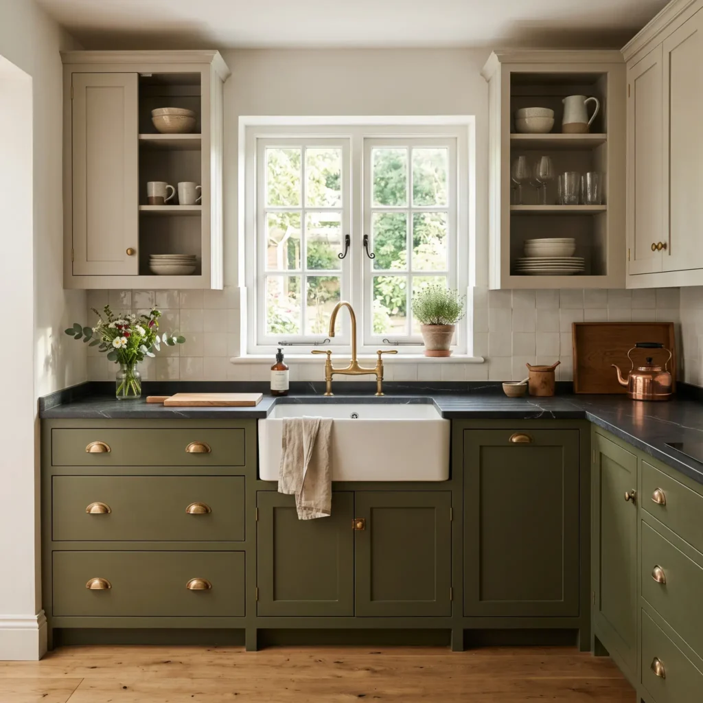
3. Earthy Olive Green and Muted Putty
Earthy schemes replace sharp contrast with soft botanical tones. Cushing Green acts as a deep neutral that links the kitchen to outdoor spaces. Pairing it with a muted putty tone on upper runs keeps the room open and comfortable.
- Best For: Modern farmhouses, cottages, and traditional homes.
- Why It Works: Accessible Beige combines gray and beige pigments that sit naturally beside the olive-gray base of Cushing Green.
- Core Rule: Mount under-cabinet task LEDs rated between 3500K and 4000K. This prevents green cabinets from looking muddy at night.
Paint and Material Specifications
- Upper Cabinet Paint: Sherwin-Williams Accessible Beige (SW 7036), Satin finish
- Lower Cabinet Paint: Benjamin Moore Cushing Green (HC-125), Satin finish
- Countertops: Honed soapstone with light white mineral veins
- Hardware: Unlacquered brass cup pulls and round cabinet knobs
- Backsplash: Cream beadboard vertical paneling or handmade light putty tile
- Sink: White fireclay apron-front farmhouse sink
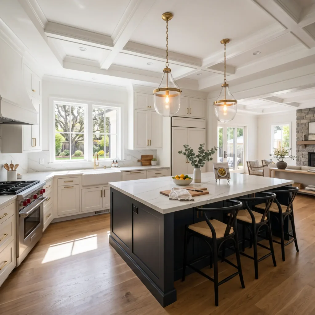
4. Autonomous Blue-Black Island with Warm White Perimeter
This layout treats your center island as a distinct furniture piece. Uniform perimeter millwork blends quietly into surrounding walls, while the deep charcoal island serves as the central anchor.
- Best For: Open-concept floor plans with dedicated center islands.
- Why It Works: Railings contains graphite and navy undertones, which look softer and richer than flat pitch black.
- Core Rule: Save this contrast for islands measuring at least seven linear feet. Applying dark colors to smaller islands makes them look like disconnected blocks.
Paint and Material Specifications
- Perimeter Cabinet Paint: Sherwin-Williams Pure White (SW 7005), Satin finish
- Island Cabinet Paint: Farrow & Ball Railings (No. 31), Estate Eggshell
- Countertops: Bianco Superiore quartzite running across both island and perimeter
- Hardware: Brushed nickel pulls across all cabinet doors
- Pendant Lights: Clear glass dome pendants with matte black and nickel accents
- Island Seating: Woven leather counter stools with natural wood legs
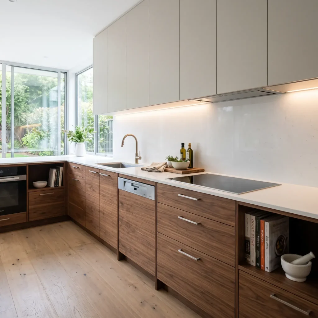
5. Contemporary American Walnut and Light Greige
This pairing brings mid-century warmth into sleek modern rooms. American black walnut provides deep chocolate tones and distinct grain patterns. Pairing it with a soft mineral greige on wall cabinets keeps the workspace feeling light.
- Best For: Mid-century modern homes, urban lofts, and contemporary remodels.
- Why It Works: Revere Pewter serves as a flexible bridge between dark wood grains and stainless steel appliances.
- Core Rule: Use flat-slab doors across every cabinet. Mixing flat walnut lowers with framed Shaker uppers creates an unplanned look.
Paint and Material Specifications
- Upper Cabinet Paint: Benjamin Moore Revere Pewter (HC-172), Ultra-Matte finish
- Lower Cabinet Material: American black walnut veneer with horizontal grain matching
- Countertops: Pure white engineered quartz with eased edges
- Hardware: Integrated J-pull channels or ultra-slim black edge pulls
- Backsplash: Full-height matching white quartz slab extending to upper cabinets
- Appliances: Paneled built-in refrigerator with flush stainless steel wall ovens
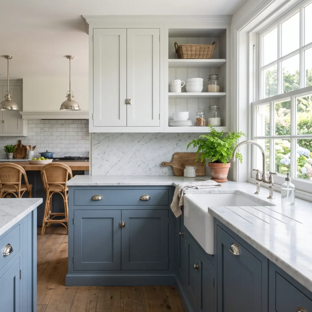
6. Coastal Slate Blue and Chalk White
This pairing delivers coastal character without feeling themed. De Nimes is a weathered slate blue with heavy gray pigment. Cornforth White on upper runs softens the contrast, avoiding the stark glare of pure white.
- Best For: Coastal, traditional, and Cape Cod homes.
- Why It Works: The gray pigments in De Nimes conceal lower-cabinet scuffs while coordinating with cool metal finishes.
- Core Rule: Pair this palette with polished nickel hardware. The metal’s warm reflection complements slate paint.
Paint and Material Specifications
- Upper Cabinet Paint: Farrow & Ball Cornforth White (No. 228), Modern Eggshell
- Lower Cabinet Paint: Farrow & Ball De Nimes (No. 299), Modern Eggshell
- Countertops: Polished Carrara marble or marble-look quartz
- Hardware: Polished nickel cup pulls and traditional turn latches
- Backsplash: White glazed subway tile with subtle surface wave
- Flooring: Medium-brown engineered white oak floor planks
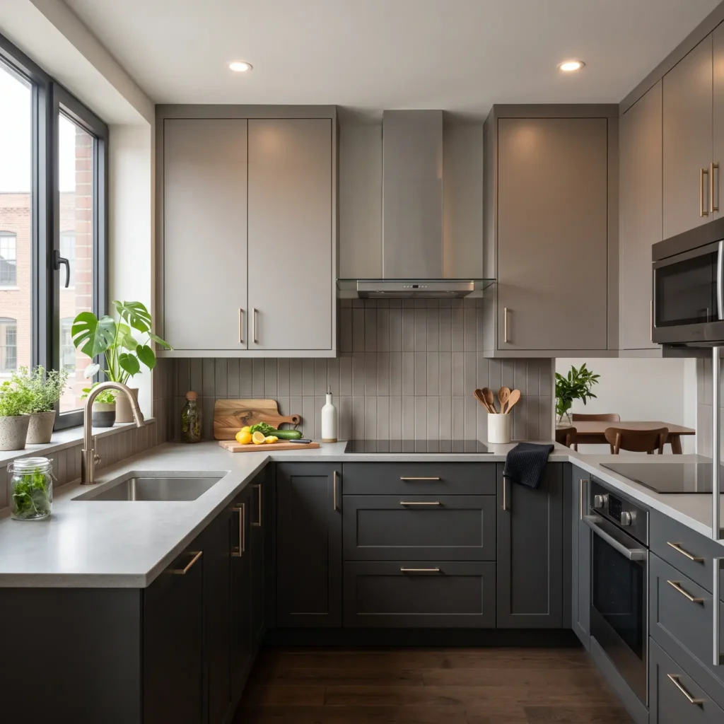
7. Moody Charcoal and Warm Taupe
For a cozy, tailored room without using pure black, pair charcoal and taupe. Iron Ore is a rich charcoal with warm slate undertones. Paired with taupe on upper cabinets, it creates a balanced, inviting space.
- Best For: Contemporary townhomes, lofts, and urban apartments.
- Why It Works: Taupe contains brown pigments that mirror the soft undertones in Iron Ore, preventing harsh color breaks.
- Core Rule: Keep countertops light and quiet. Dark countertops over dark lower cabinets absorb too much light, darkening your workspace.
Paint and Material Specifications
- Upper Cabinet Paint: Sherwin-Williams Taupe Tone (SW 7038), Satin finish
- Lower Cabinet Paint: Sherwin-Williams Iron Ore (SW 7069), Satin finish
- Countertops: Light gray composite stone or honed white quartz
- Hardware: Satin champagne bronze straight bar pulls
- Lighting: Architectural surface-mount spotlights in matte black
- Flooring: Polished light concrete or large-format gray porcelain tile
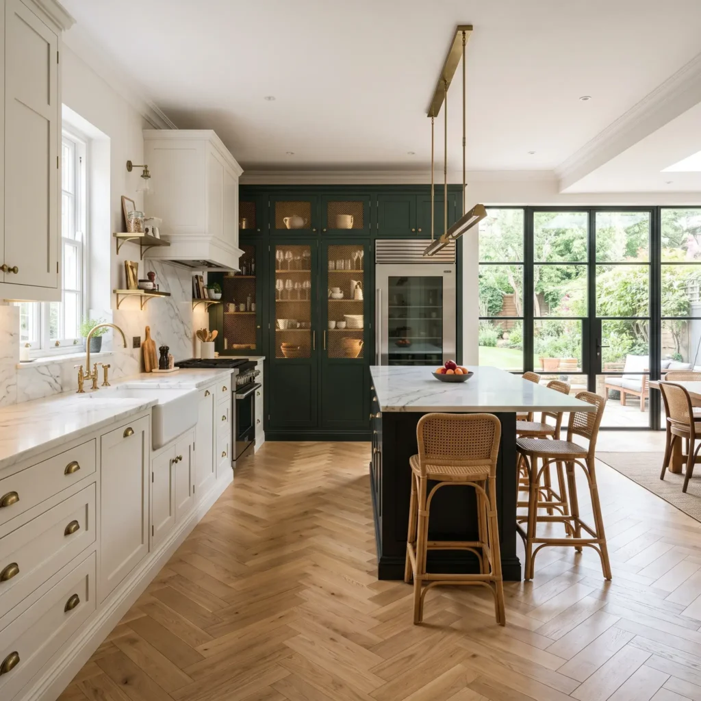
8. Vertical Larder Accent with Neutral Perimeter
Vertical zoning moves away from standard counter-height color splits. Instead of changing colors horizontally, you finish a full-height millwork unit, like a pantry wall or coffee station, in an accent shade.
- Best For: Kitchens with nine-foot ceilings or natural architectural recesses.
- Why It Works: Studio Green reads almost black in dim light, showing deep botanical tones when lit. Treating tall storage as an accent makes it look like built-in custom furniture.
- Core Rule: Confine the bold accent to a single continuous cabinetry run. Spreading accent colors across disconnected walls fragments your sightlines.
Paint and Material Specifications
- Perimeter Cabinet Paint: Benjamin Moore White Dove (OC-17), Satin finish
- Pantry Accent Paint: Farrow & Ball Studio Green (No. 93), Estate Eggshell
- Countertops: Warm white quartzite with faint taupe veining
- Hardware: Antiqued bronze wire pulls on all units
- Interior Cabinetry: Natural birch plywood interiors with integrated warm LED strips
- Flooring: Herringbone patterned European white oak flooring
Practical Rules for Two-Tone Cabinets
Choosing two cabinet colors involves more than picking paint swatches. You must balance visual mass, light reflection, and material undertones across the entire room.
1. Apply the 60-30-10 Proportional Rule
Distribute your finishes carefully to maintain balance:
- 60% Primary Tone: Your lower base cabinets and main perimeter run carry the foundation color.
- 30% Secondary Tone: Upper wall cabinets or a contrasting island provide balance.
- 10% Unifying Accent: Metal hardware, plumbing fixtures, and lighting tie both halves together.
Avoid an even 50-50 color split across the room. Equal color splits divide sightlines, making the space feel smaller and crowded.
2. Follow the Single Countertop Rule
Your countertop serves as the horizontal dividing plane between upper and lower cabinetry.
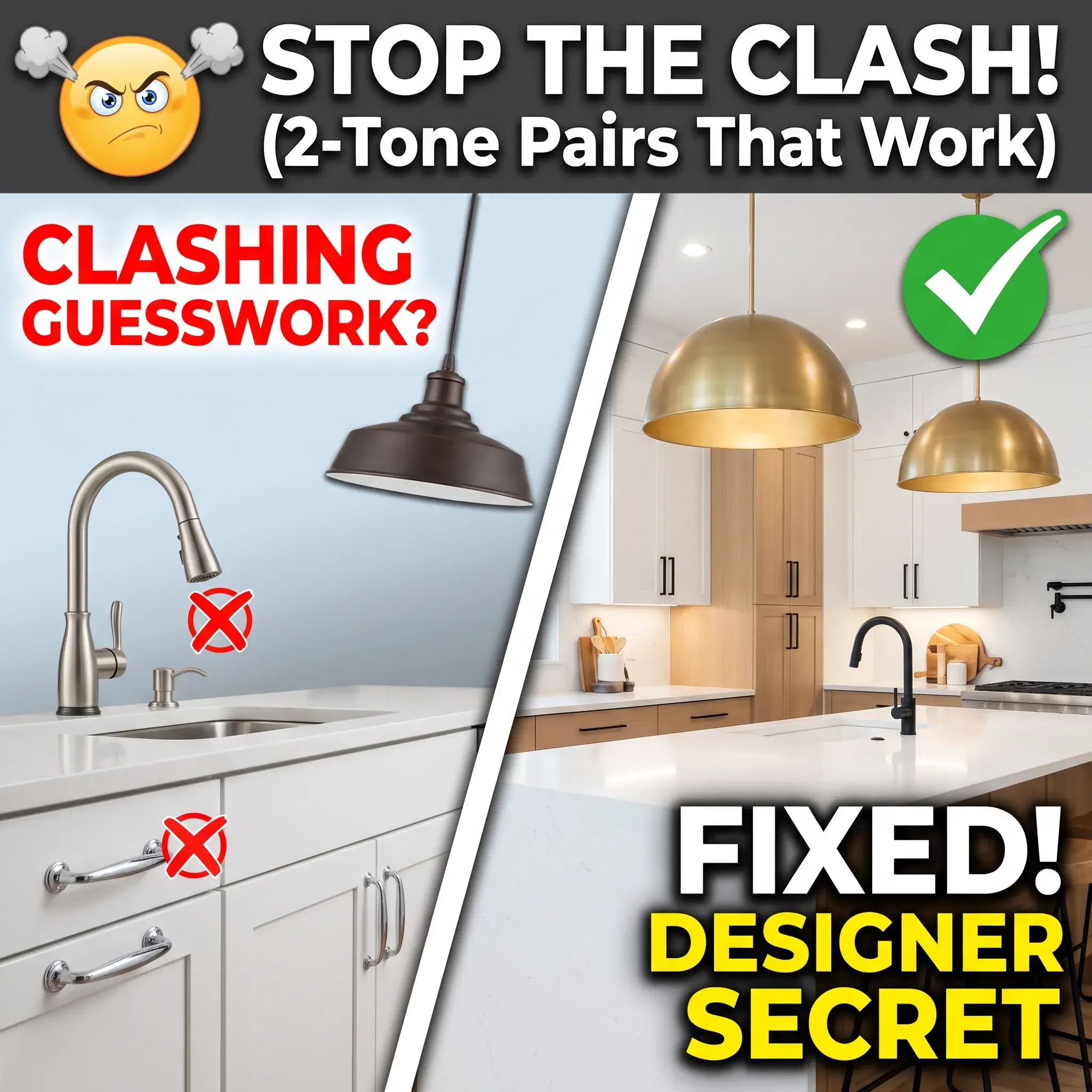
Use one matching stone slab across both the perimeter bases and the island. Repeating the same quartz or quartzite brings contrasting cabinets into a unified design.
If you choose two countertop materials, like butcher block on an island and stone on the perimeter, keep one surface solid and quiet. Only one surface should feature prominent veining or movement.
3. Use the White-Card Test for Undertones
Undertone conflicts are the main cause of failed two-tone kitchens. Pairing a cool blue-gray base with a warm cream upper makes the lighter cabinets look dirty and aged.
Test your materials on site before placing cabinet orders:
- Place a sheet of pure white printer paper next to your paint swatches and wood samples.
- Check the pairing in natural morning sunlight and under artificial evening lighting.
- The white paper reveals hidden base pigments. Warm finishes show yellow, red, or peach casts. Cool finishes show blue, slate, or gray casts.
- Keep all cabinetry selections within the same color temperature family, or use a neutral greige to bridge them.
Lighting Guidelines for Saturated Finishes
Dark cabinet finishes like navy, charcoal, and forest green absorb significant ambient light. Without proper lighting, dark lower cabinets lose their color depth and look like flat black boxes.
- Color Rendering Index (CRI): Choose LED bulbs with a 90+ CRI rating. High CRI bulbs show true paint pigments without dulling surface coats.
- Ambient Lighting: Set general ceiling downlights between 2700K and 3000K to preserve warmth across wood grains and off-whites.
- Task Lighting: Set under-cabinet task LEDs between 3500K and 4000K. This temperature keeps countertops bright and prevents upper cabinets from casting yellow shadows across dark bases.
Budgeting and Ordering Considerations
Ordering two-tone cabinetry typically adds a 5% to 10% premium over single-color orders for semi-custom and custom millwork. Cabinet shops charge this upcharge to cover:
- Running separate finishing lines in the paint shop
- Tracking matching door profiles across two finishes
- Staging separate assembly lines for painted units versus clear-coated wood
This upcharge delivers clear functional value. Installing stained hardwood or dark paint on lower cabinets conceals foot scuffs, pet marks, and cooking spills. Meanwhile, light upper cabinets reflect natural light, keeping your kitchen bright for daily living.
Frequently Asked Questions
Do two-tone kitchen cabinets hurt resale value?
Classic two-tone combinations hold their resale value well. Neutral pairings like white uppers with navy bases, or warm white paired with natural white oak, appeal broadly to homebuyers. To protect resale value, avoid bright primary colors and keep door profiles consistent across the kitchen.
Can you use two different door styles in a two-tone kitchen?
No. Keep the door profiles identical across both finishes. Combining traditional five-piece Shaker uppers with modern flat-panel lowers creates conflicting design styles. Keep door construction uniform so the color palette remains the clear focus.
Where should you split colors in a small kitchen?
In compact kitchens, use the horizontal tuxedo split. Keep dark, light-absorbing colors strictly below the countertop level. Finish upper cabinets and surrounding walls in light-reflective shades with an LRV of 70 or higher to make the ceiling feel taller.
Should base cabinets always be darker than upper cabinets?
Yes, in standard residential layouts. Grounding base units with darker tones matches natural visual expectations. Placing dark cabinets above light bases makes the room feel top-heavy, which only works in spaces with ceilings nine feet or higher and large windows.
How do you match hardware across two cabinet colors?
Use the same hardware collection, shape, and metal finish across all cabinet doors. A single hardware finish, like satin brass or matte black, acts as a visual link that ties contrasting cabinets together.