7 Bookshelf Styling Ideas: Designer Layouts and Simple Rules
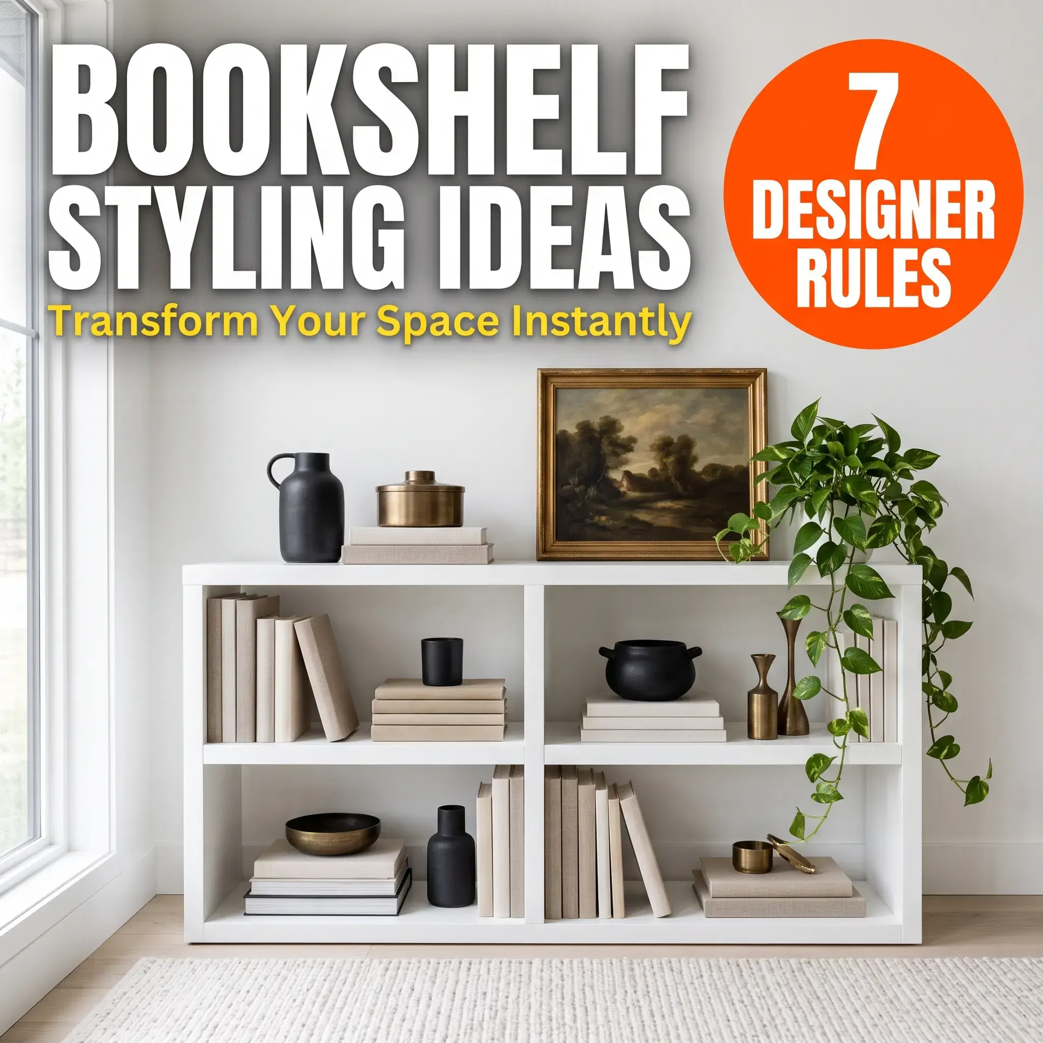
Styling a bookshelf comes down to one core ratio: 60% books, 30% decor objects, and 10% open space.
Most people pack their shelves until every inch disappears. Others scatter tiny souvenirs across empty rows. Both habits create visual clutter or make a bookcase feel sterile.
A well-styled bookcase anchors your room. It balances physical mass, highlights quality materials, and keeps your favorite books accessible.
Here are 7 practical bookshelf styling ideas you can use in your home, followed by the exact rules interior designers use to arrange them.
7 Practical Bookshelf Styling Ideas
1. The Modern Organic Built-In
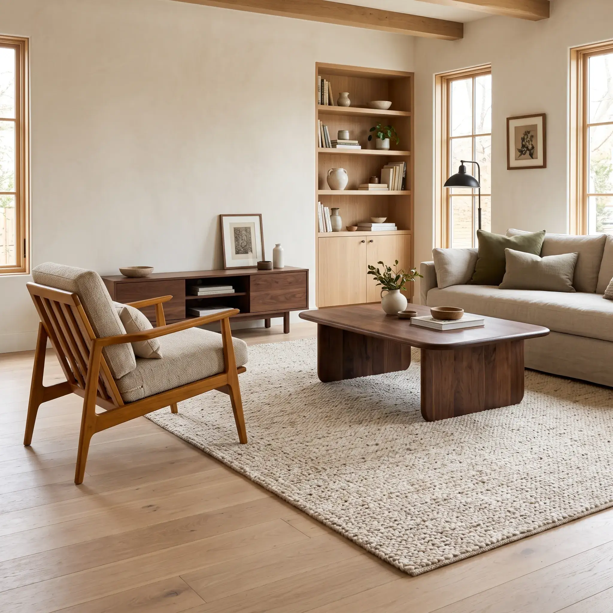
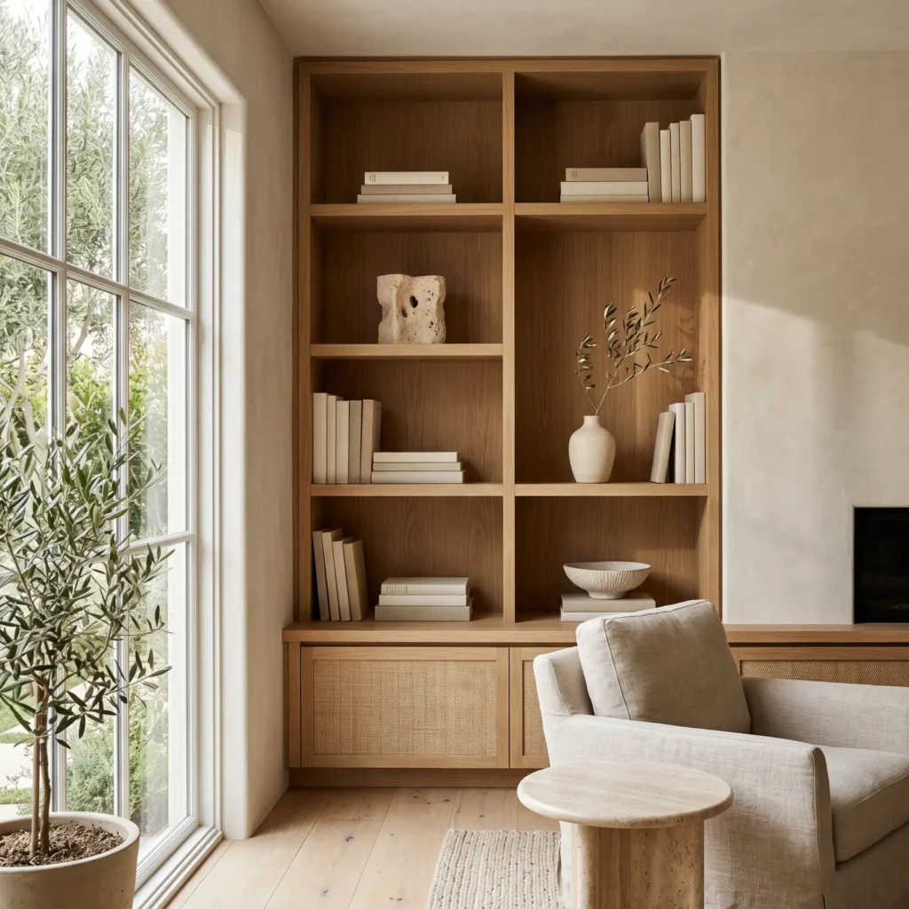
This layout focuses on warm minimalism and earthy textures. It works best on wide built-ins flanking a living room fireplace.
The strategy relies on low-contrast items. Remove brightly colored paper dust jackets to expose natural cloth book boards in cream, tan, and gray. Alternate vertical book runs with horizontal stacks. Use those stacks as small pedestals for raw stoneware bowls and travertine knots. Keep at least 35% of each shelf empty so the textures stand out.
- Products Used in This Look:
- Bleached linen decorative book sets with neutral spines
- Honed travertine sculptural knot or chain links
- Matte unglazed terracotta vessel (8 inches tall)
- Dried olive branches or preserved bunny tails
- Ribbed stoneware catchall bowl
2. The Functional Reader’s Library
This design is for people with large book collections who want an organized look without hiding their favorite titles.
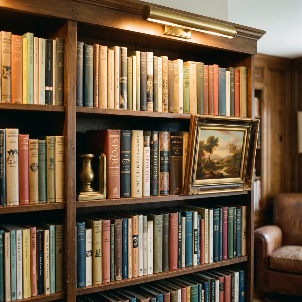
Fill 75% to 80% of the shelf volume with books. Sort books by genre first, then group them by spine color within each section. This technique prevents a chaotic look while keeping titles easy to find. Group vertical books in tight blocks of eight to twelve. Add heavy, unlacquered brass bookends to hold them upright. Place framed horizontal art prints directly on top of deep book rows to add depth.
- Products Used in This Look:
- Solid unlacquered brass L-shaped bookends
- Vintage 5×7 framed oil landscape painting with a gilded frame
- Plug-in or hardwired brass picture light (warm 2700K LED)
- Heavy linen-bound classic literature hardcovers
Check out more Living Room Ideas
3. The Japandi Minimalist Alcove
Japandi styling pairs Scandinavian function with Japanese wabi-sabi simplicity. It works exceptionally well in small living rooms or bedroom reading corners.
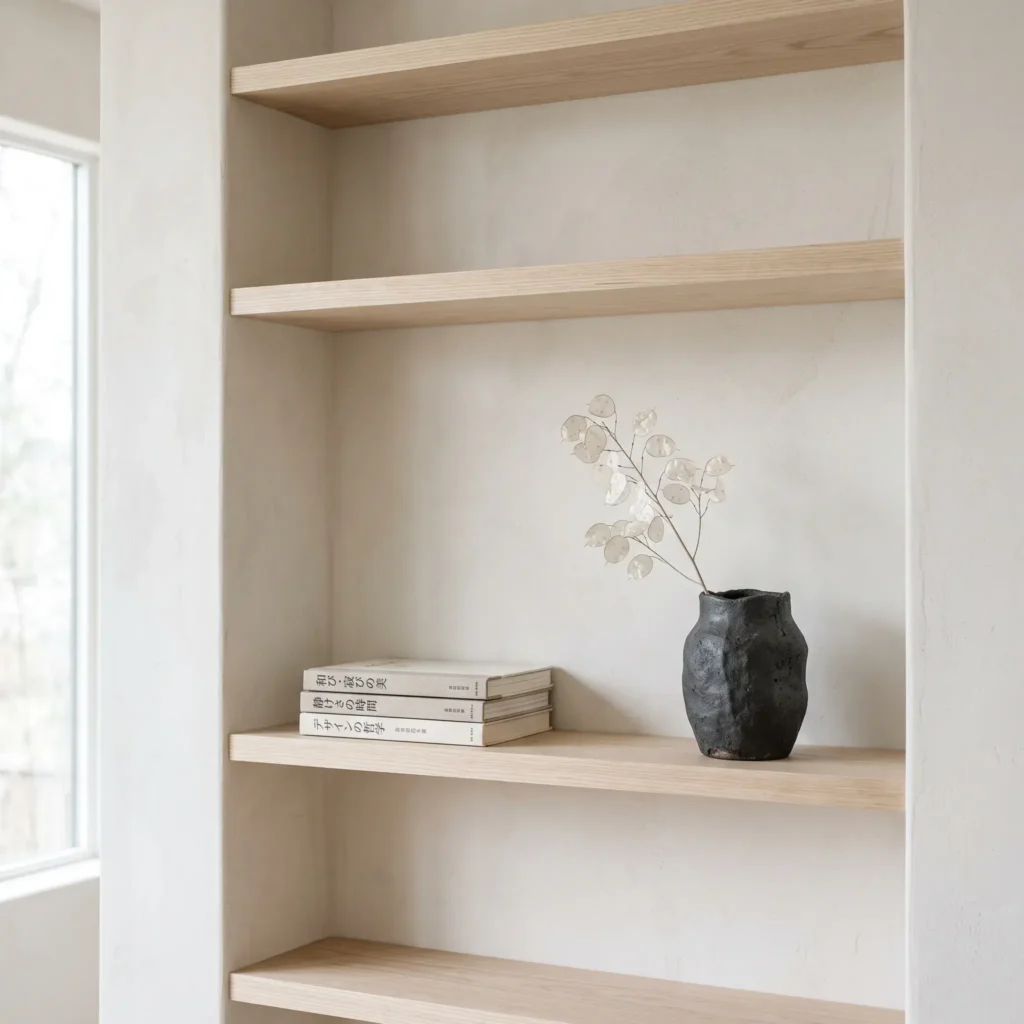
Leave 40% of the shelf volume completely open. Center a single earthenware vase on one shelf. On the shelf below, place a single horizontal stack of three architectural monographs topped with a raw cast-iron tea dish. Restrict your color palette to chalk white, charcoal, warm beige, and natural ash wood.
- Products Used in This Look:
- Wabi-sabi matte black textured ceramic vase
- Japanese architecture and design monographs
- Cast iron dish or incense holder
- Pale bleached ash book risers
4. The Moody Dark Academia Library
Dark Academia brings an intellectual, historical atmosphere to a study or formal living room.
Use dark-stained cabinetry like walnut or mahogany, or paint your shelves in forest green, charcoal, or deep oxblood. Display antique, leather-bound books alongside vintage brass compasses, magnifying glasses, and miniature classical plaster busts. Keep the lighting low and warm. Use small, cordless rechargeable lamps with pleated fabric shades directly on deep shelves.
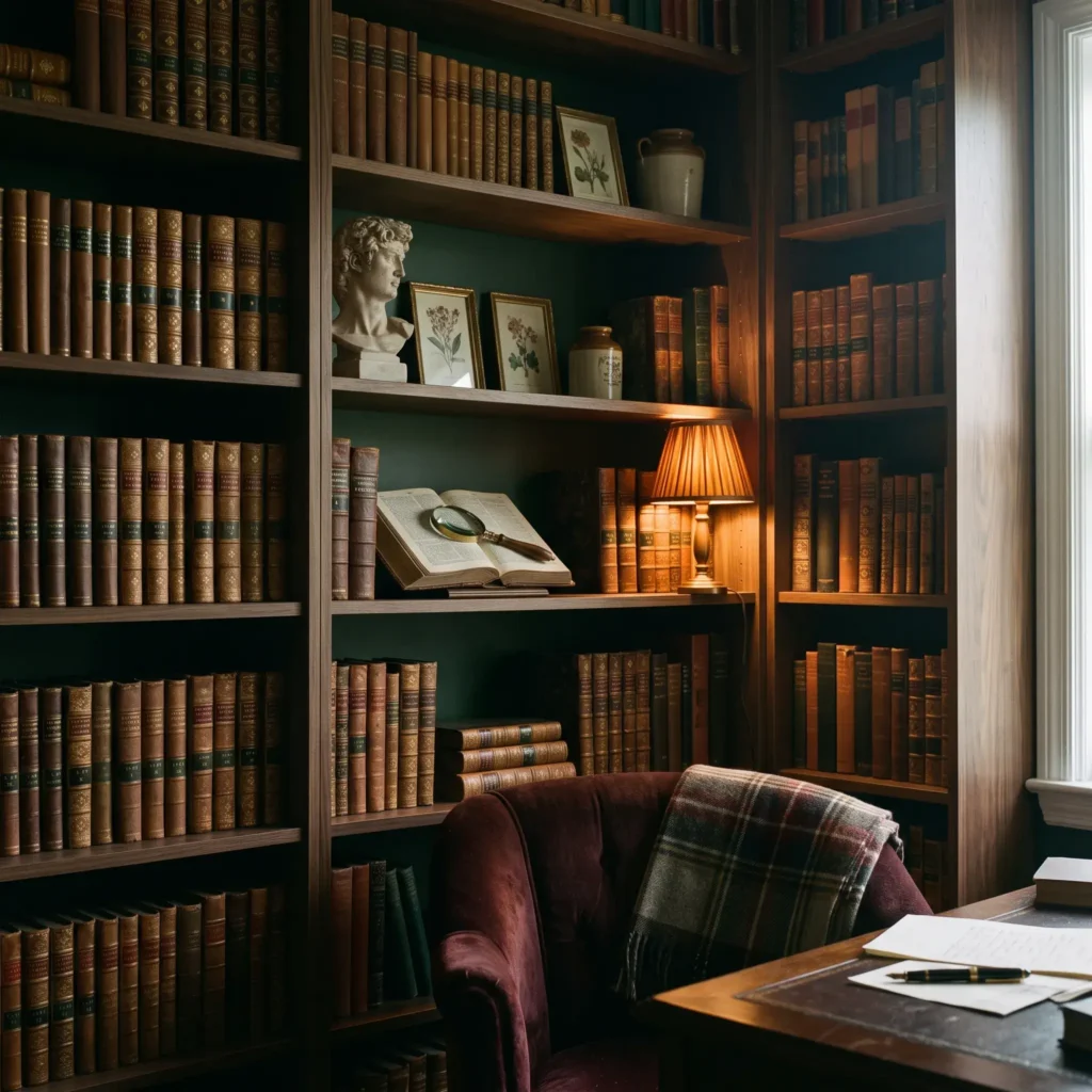
- Products Used in This Look:
- Antique leather-bound or vintage cloth book sets
- Classical miniature resin or plaster bust (6 to 8 inches)
- Solid brass decorative magnifying glass with a horn handle
- Rechargeable cordless accent lamp with a pleated fabric shade (2200K amber LED)
- Antiqued brass armillary sphere or small desk globe
5. Symmetrical Fireplace Built-Ins with Asymmetric Balance
If you have built-in bookcases flanking both sides of a fireplace or television, avoid mirror-image styling. Mirroring makes a room feel stiff and commercial.
Create asymmetrical balance instead. If the left bookcase has a heavy run of vertical books on its third shelf, place a horizontal stack topped with a wide ceramic bowl on the right bookcase at that same level. Repeat matching materials like black iron, aged brass, and split-cane baskets across both sides in a zig-zag pattern. This technique ties the two units together naturally.
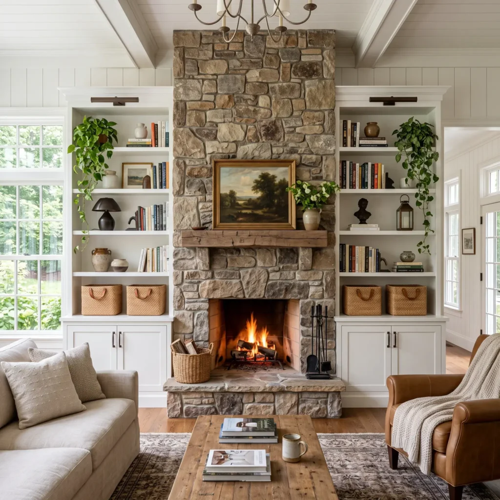
- Products Used in This Look:
- Split-cane or woven seagrass storage baskets for lower shelves
- Cast bronze or matte black iron geometric bookends
- Ceramic planter with trailing English ivy
- Textured white stoneware bowls
- Hardcover coffee table books on art and architecture
6. The Mid-Century Modern Modular Wall
Mid-Century Modern styling focuses on clean geometric lines, warm teak wood, and retro accents.
Use modular wall units or ladder shelving with slim black steel uprights. Mix vertical rows of vintage vinyl records with hardcovers. Place retro pottery in mustard yellow, avocado green, and burnt orange next to functional items like analog cameras, walnut clocks, or small record players. Keep the spacing open and structured.
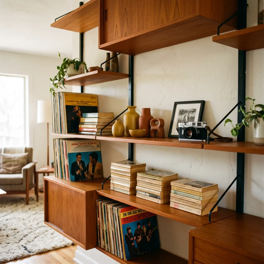
- Products Used in This Look:
- Vintage 12-inch vinyl records with retro spine art
- Mid-century studio ceramic bud vases in mustard and terracotta
- Retro walnut analog desk clock
- Black wire record divider rack
7. The Small-Space Floating Shelf Vignette
Floating shelves in tight spaces or hallways need a light touch so they do not overpower the wall.
Do not pack floating shelves edge to edge. Lean a single framed 8×10 print against the wall as your anchor. Add a small run of four to five books beside it, held in place by a simple stone bookend. Place a trailing houseplant like a Golden Pothos on the top shelf so its leaves drape softly past the shelf edge. This draws the eye upward and softens hard horizontal lines.
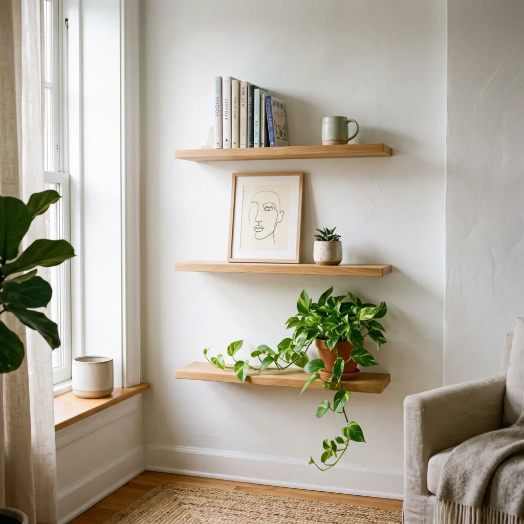
- Products Used in This Look:
- Natural white oak floating shelves with hidden brackets
- Minimalist framed line art or black-and-white sketch
- Small potted Golden Pothos in a drainage pot with a saucer
- Solid marble block bookend
The Core Formulas of Shelf Composition
Great bookshelf styling follows measurable spatial rules. When shelves look messy or disorganized, it is almost always because these visual guidelines were skipped.
The 60-30-10 Volumetric Rule
Think of your bookcase as an open grid. Divide the space into three categories:
- 60% Books: Books are the structural backbone. They provide visual mass, straight lines, and color stability across every tier.
- 30% Sculptural Accents: Vases, frames, stones, and organic shapes. These elements break up the rigid grid and introduce new textures.
- 10% Negative Space: Completely open space. Without this open space, individual items lose their presence and turn into clutter.
Planar Depth: Background, Midground, and Foreground
Amateur styling often pushes every item flat against the back panel or lines everything up along the front lip. Professional styling uses three layers of depth on every shelf:
- The Background Layer: Flat objects placed directly against the rear wall. Use framed art, woven trays, or shallow decorative plates.
- The Midground Layer: The main structural pieces. This is where vertical book rows, horizontal stacks, and primary vases belong.
- The Foreground Layer: Small accents positioned near the front edge. Use low stone bowls, brass trinket boxes, or small specimens resting in front of leaning frames.
The Spatial Triangle (The Zig-Zag Path)
The human eye tracks repeating colors and materials across a room. If you place all your brass accents on the middle shelf, that shelf will look too heavy.
Instead, arrange similar finishes in an asymmetrical triangle across different shelf levels. Place a brass bowl on the top left shelf, a brass frame on the middle right shelf, and a brass candlestick on the bottom left shelf. This zig-zag pattern guides the eye naturally across the entire bookcase.
How to Arrange Your Books
Books should look structured, not chaotic. Use these guidelines to keep your arrangements balanced.
The 60/40 Directional Ratio
Keep 60% of your books standing vertically and 40% stacked horizontally.
- Vertical Runs: Group vertical books in clusters of five to ten volumes. Vary the spine heights slightly to prevent flat, rigid lines. Keep the spines pulled forward, roughly one inch from the front edge of the shelf.
- Horizontal Plinths: Stack books horizontally in groups of two to four. These stacks serve as built-in pedestals for small decorative objects.
The Tapered Pyramid Rule
Always build horizontal stacks from the bottom up. Place the widest and heaviest book at the base, followed by progressively smaller books on top. Stacking a large book on top of a smaller one makes the pile look unstable.
Spine Management: The Practical Alternative to Backward Books
Turning book spines backward to show only white pages creates a calm, neutral look on camera, but it ruins the bookcase for everyday reading.
Try these practical alternatives instead:
- Remove Modern Dust Jackets: Pull glossy paper jackets off modern hardcovers. You will often find understated cloth or paper boards in navy, oatmeal, gray, and black underneath.
- Color Grouping by Section: Keep your books arranged by subject or author, but group similar spine tones together on each shelf.
- Use Closed Storage Boxes: Place brightly colored paperbacks on lower shelves inside fabric or woven storage bins, keeping neutral hardcovers on display at eye level.
Decor Object Selection: The Grapefruit Rule
The most common styling mistake is using too many small trinkets. Small figurines, travel souvenirs, and tiny candles look messy from across a room.
Follow the grapefruit rule: do not place any standalone object on a shelf unless it is at least as large as a grapefruit (roughly five to six inches in diameter or height). If you want to display smaller keepsakes, group them inside a low stone bowl or on a small tray.
Pair Contrasting Materials
Every display needs contrasting textures to catch the eye. Pair hard and soft surfaces together:
- Rough, matte terracotta beside polished, unlacquered brass
- Raw, open-grain oak next to smooth, glazed porcelain
- Hand-blown clear glass against woven split-cane baskets
- Heavy, veined marble holding up fabric-bound books
Always group decorative accents in odd numbers, especially groups of three. Pair one tall vertical item, one wide horizontal item, and one low organic item together to create balance.
Low-Light Plants for Bookshelves
Living plants bring soft, organic curves to the sharp right angles of shelf joinery. Because bookcases are usually set back from windows, choose houseplants that tolerate low to medium indirect light.
| Plant Specimen | Growth Form | Light Requirement | Best Shelf Placement |
|---|---|---|---|
| Golden Pothos (Epipremnum aureum) | Trailing, cascading vine | Low to medium indirect light | Upper or mid-level shelf edges so vines can drape downward. |
| ZZ Plant (Zamioculcas zamiifolia) | Upright, structural glossy stems | Deep shade to low indirect light | Middle tiers; pairs well beside low, horizontal book stacks. |
| Snake Plant (Dracaena trifasciata) | Rigid, vertical architectural blades | Low to bright indirect light | Outer edges of middle shelves; adds height without taking up width. |
| Heartleaf Philodendron (P. hederaceum) | Cascading heart-shaped leaves | Low to medium ambient light | Shelf corners; softens transitions beside tall, dense book runs. |
| Preserved Botanicals (Eucalyptus, Banksia) | Rigid, structural dried stems | No light or water needed | Top shelves or deep alcoves away from natural daylight. |
Bookshelf Lighting Specifications
Good lighting turns dark shelf niches into warm focal points. Avoid cool, clinical lighting that washes out rich wood and colorful book spines.
- Color Temperature (CCT): Use 2700K (Warm White) across all shelf lighting. For moody, dark academia settings, drop to 2200K to 2400K (Candlelight Warmth). Never use 4000K or 5000K bulbs on residential shelves.
- Color Rendering Index (CRI): Choose fixtures with a CRI of 90 or higher. High-CRI lighting keeps book cloth, warm wood stains, and oil paintings looking rich and accurate.
- Under-Shelf COB LED Tape: If installing hidden strip lighting, choose continuous Chip-on-Board (COB) LED tape delivering 150 to 300 lumens per foot. Mount the tape inside an angled aluminum channel with a frosted diffuser behind the front shelf lip. This eliminates visible diode dots.
- Top-Mounted Picture Lights: Center picture lights on the upper header of built-in bookcases. Angle the fixture head at 30 degrees toward the shelves to illuminate the top three tiers without creating glare.
The 4-Phase Staging Protocol
Rearranging items on full shelves rarely works. You simply shuffle clutter from one shelf to another. Follow this four-phase system to style your bookcase from scratch.
Phase 1: Total Clear-Out and Inventory Sort
Empty the entire shelving unit. Move every book, frame, and accessory onto a nearby table. Clean and dust the empty shelves.
Sort your items into three distinct piles:
- Books you love and want to display.
- Large architectural accents, art, and vessels.
- Extra clutter, paperbacks, and small trinkets that belong in closed storage.
Select a simple materials palette for the bookcase: two or three finishes that will repeat throughout the unit, such as bleached oak, matte ceramic, and aged brass.
Phase 2: Ground the Base and Place Art
Start at the bottom. Anchor the lowest shelves with heavy visual mass: large woven baskets, wooden file boxes, or stacks of oversized art folios.
Next, place your background art. Lean medium and large framed prints directly against the rear panels across the middle shelves. Stagger these frames across the unit in a zig-zag pattern.
Phase 3: Set Book Runs and Build Vignettes
Add your primary vertical book runs on the middle and upper tiers, alternating between the left and right sides of each shelf.
Add horizontal book stacks into the open spaces. Top these horizontal stacks with mid-sized sculptural items. Add your low-light plants to soften the corners, and place small bowls or brass accents in the foreground.
Phase 4: Optical Diagnostic Tests
Step back and test your composition using these two objective checks:
- The 8-Foot Squint Test: Stand eight feet back from the bookcase and squint until the details blur. Look at the general shapes and dark patches. If all the dark books or heavy objects are bunched on one side, shift them to rebalance the unit.
- The Smartphone Flattening Test: Take a straight-on photo of the bookcase with your phone. Compressing the three-dimensional shelves into a flat, two-dimensional photo instantly reveals crooked stacks, overcrowded shelves, and empty gaps that your eyes overlook in person.
- The 10% Subtraction Rule: Remove 10% to 20% of your decorative objects. Taking away just a few unnecessary pieces gives the remaining items the breathing room they need.
5 Common Bookshelf Styling Mistakes to Avoid
- Scattering Small Trinkets: Filling shelves with tiny souvenirs creates visual clutter. Group small keepsakes in bowls or keep them off the shelves entirely.
- Mirror-Image Symmetry: Placing matching vases and matching bookends on opposite shelves looks stiff and dated. Focus on asymmetrical balance instead.
- Putting Heavy Art Folios on Top Shelves: Oversized, heavy books belong on bottom tiers. Placing them on upper shelves makes the unit look top-heavy and can cause shelves to bow over time.
- Ignoring Negative Space: Packing every cubic inch makes a room feel cramped. Keep at least 25% to 35% of each shelf tier open.
- Pushing Everything Against the Back Panel: Pull your book runs forward so their spines sit roughly one inch from the front edge. This adds depth and keeps the shelves from looking flat.
Frequently Asked Questions
What is the 60-30-10 rule for bookshelf styling?
The 60-30-10 rule is a spatial formula used to balance bookcases. Fill 60% of the shelf volume with books, 30% with decorative accents like vessels, artwork, and plants, and leave the remaining 10% as open negative space to prevent visual clutter.
How do you style a bookshelf with too many books?
Focus on organization and visual breathing room. Group books by genre, then sort them by spine color within each section to reduce visual chaos. Alternate vertical runs with horizontal stacks. Use closed storage baskets on the bottom shelves to store paperbacks, and keep spines aligned one inch from the shelf edge.
How do you mix vertical and horizontal books on a shelf?
Follow a 60/40 ratio: keep 60% of your books standing vertically and 40% stacked horizontally. Group vertical books in runs of five to ten volumes. Arrange horizontal books in tapered pyramids of two to four volumes, placing the widest, heaviest book at the bottom. Use horizontal stacks as risers for small decorative bowls or stones.
What should you not put on a bookshelf?
Avoid displaying items smaller than a grapefruit unless they are corralled inside a tray or bowl. Do not display flimsy paperbacks with damaged spines on eye-level shelves. Avoid heavy, oversized art folios on high tiers, as they can cause physical shelves to sag and look top-heavy.
The most inviting bookshelves balance practical reading with intentional design. Clear off your shelves, set your heavy anchors at the base, and alternate your book runs with contrasting ceramics and warm lighting. Use the squint test when you finish to make sure your space feels balanced, functional, and personal.