Pink Bedroom Ideas: 8 Mature, Designer-Approved Spaces

Pink is no longer just for nurseries. When paint makers blend red pigments with yellow ochre, raw umber, or mineral grey, pink turns into a complex neutral. It softens harsh shadows. It flatters skin tones in morning light. It also adds warmth to rooms that receive cold daylight.
Many homeowners avoid pink because they fear their room will look like a toy store. You can prevent that mistake by choosing muddy, earthy tones. Balance those shades with heavy textures, dark woods, and structured metals.
Below are eight practical room designs that prove pink belongs in modern adult homes. Each concept includes exact paint codes, styling notes, decor sources, and photographic prompts you can use to build your vision.
1. The Scandinavian Plaster Suite
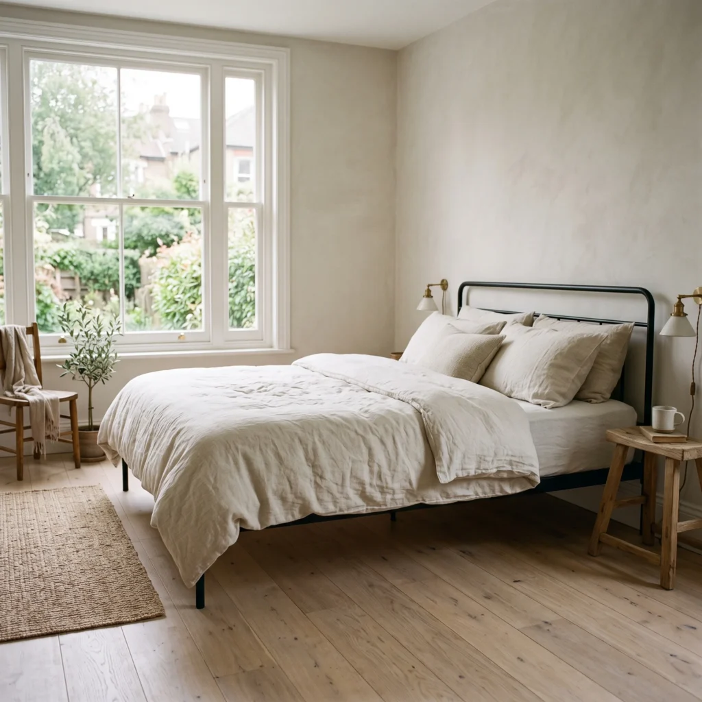
This design uses pink as a light-diffusing neutral rather than a bright accent. A powdery plaster shade covers all four walls. The chalky finish absorbs glare from large windows. Natural materials anchor the pale color so the space feels calm and grounded.
Keep the bed styling clean and relaxed. Bleached pine floors run across the room. A slender black steel bed frame introduces a crisp outline against the soft wall. Unwashed linen sheets add texture without creating clutter.
- Products in This Design:
- Wall Paint: Farrow & Ball Setting Plaster No. 231 (Dead Flat finish)
- Bed Frame: Matte black powder-coated iron platform frame
- Bedding: Unbleached Belgian flax linen duvet set in natural oatmeal
- Nightstand: Solid round bleached-oak side stool
- Flooring: Wide-plank white oak with a matte white-oil seal
2. Sulking Rose with Charcoal Millwork
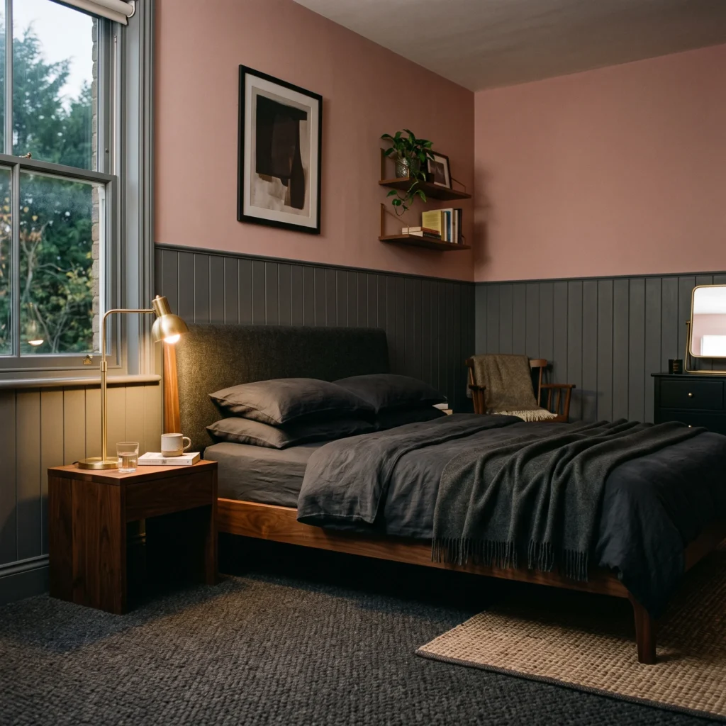
This room leans into rich, moody undertones. A dusty rose with deep brown pigment covers the upper walls. The lower portion of the wall features vertical tongue-and-groove paneling painted in deep charcoal.
The dark wainscoting grounds the rose hue. Solid American walnut furniture adds visual weight. Heavy wool drapery blocks outside light and gives the room acoustic quiet. This combination creates an intimate, secure environment for sleep.
- Products in This Design:
- Upper Wall Paint: Farrow & Ball Sulking Room Pink No. 295
- Lower Paneling Paint: Farrow & Ball Railings No. 31
- Furniture: Solid American walnut low-profile platform bed
- Lighting: Antiqued unlacquered brass adjustable wall sconce
- Floor Covering: 100 percent natural charcoal wool loop-pile carpet
Check out more Modern Bedroom Ideas
3. The Earthy Terracotta-Blush Retreat
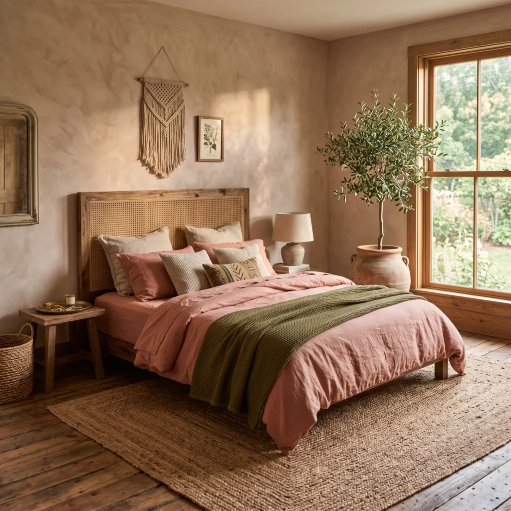
Clay and burnt-orange undertones turn pink into a warm, grounded earth tone. This room relies on Roman clay or limewash paint to create subtle movement across the walls. The textured finish keeps the surface from feeling flat or synthetic.
Rattan, woven jute, and live greenery bring nature indoors. The potted olive tree provides an organic green contrast that sits naturally against the clay walls. An unvarnished oak dresser shows its authentic grain, balancing the warm wall color with honest craft.
- Products in This Design:
- Wall Finish: Roman Clay tinted to Sherwin-Williams Redend Point SW 9081
- Headboard: Natural woven cane and solid ash wood frame
- Textiles: Olive-green stone-washed cotton waffle blanket
- Floor Rug: Hand-braided natural jute rug
- Planter: Hand-thrown unglazed terracotta urn
4. Chalky Mauve and Antiqued Brass
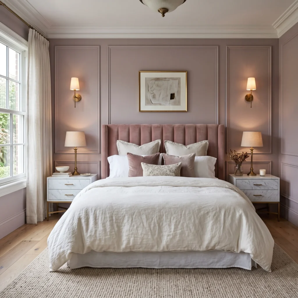
Mauve contains a cool grey-purple undertone that feels tailored and historic. This space uses classic picture-frame wall moulding to add shadow and depth. Both the wall face and the raised trim share the exact same dead-flat paint.
Antiqued brass provides the warm metallic contrast needed to wake up cool mauve walls. Sconces mounted directly on the moulding cast warm pools of light downward. Slubby cotton velvet on the headboard adds a soft surface to lean against while reading.
- Products in This Design:
- Wall Paint: Farrow & Ball Peignoir No. 286 (Dead Flat finish)
- Headboard: Custom vertical channel-tufted cotton velvet headboard
- Lighting: Aged unlacquered brass wall-mounted articulating sconces
- Nightstand: Honed Carrara marble-top nightstand with brass legs
- Bedding: Crisp long-staple cotton percale duvet in chalk white
5. Muted Rose and Sage Green Harmony
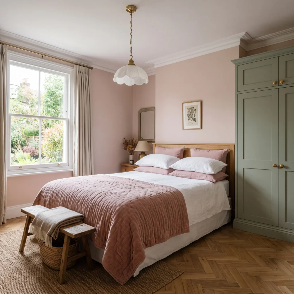
Pink and green sit opposite each other on the color wheel. This natural opposition creates visual balance when both colors share the same muted intensity. Instead of candy tones, this room pairs soft petal pink with earthy sage millwork.
The built-in wardrobes feature shaker doors painted in soft sage. The remaining drywall stays a warm, light-reflecting blush. Natural white oak accents in the flooring and bedside tables tie the two colors together without visual friction.
- Products in This Design:
- Wall Paint: Farrow & Ball Pink Ground No. 202
- Cabinetry Paint: Farrow & Ball French Gray or Calke Green
- Flooring: European white oak herringbone parquet
- Lighting: Fluted milk glass pendant with brass fittings
- Hardware: Solid unlacquered brass cabinet knobs
6. Attic Bedroom Color Drenching
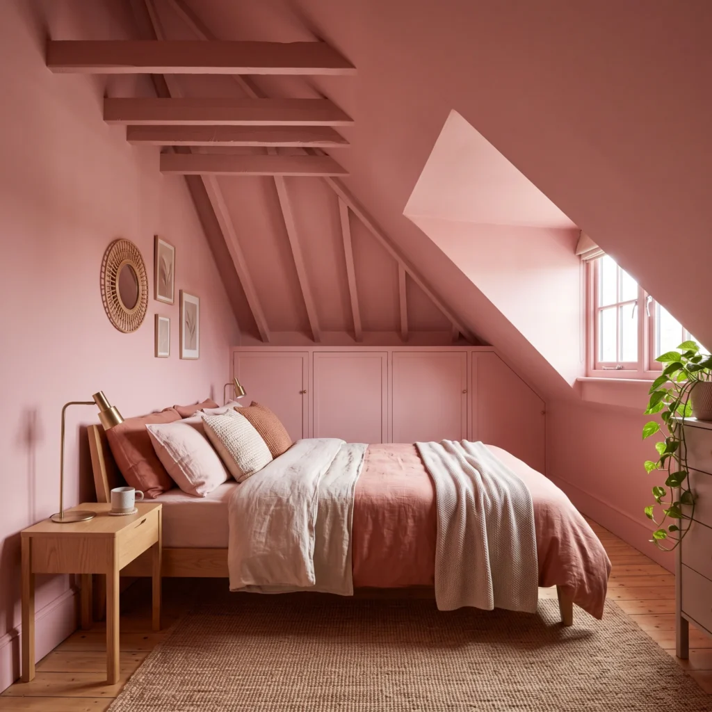
Sloped ceilings and awkward dormer angles can make an attic room feel fragmented. This room solves that problem with color drenching. One single pigment covers the baseboards, walls, slanted dormer drywall, and ceiling.
Eliminating white trim lines tricks the eye. The boundaries disappear, making the compact space feel like an intentional jewel box. Low-profile furniture keeps the vertical space open and clear.
- Products in This Design:
- Wall and Ceiling Paint: Farrow & Ball Templeton Pink No. 303 (Modern Emulsion)
- Bed Frame: Low-clearance solid clear-pine platform base
- Window Coverings: Custom inside-mount linen roman shades in chalk white
- Textiles: Boiled wool throw blanket in warm rust
- Lighting: Recessed ceiling spot with warm-dim 2700K LED module
7. Modern Minimalist Plaster and Honed Marble
This space treats pink as a crisp architectural material. Instead of traditional paint, the feature wall uses polished Venetian plaster with subtle grey marbling. The low sheen reflects light gently without looking glossy or wet.
A custom floating nightstand carved from honed Calacatta marble provides a clean horizontal line. Brushed chrome reading lights provide a modern silver contrast that cools down the pink wall. Minimal decor leaves the focus on raw surface textures.
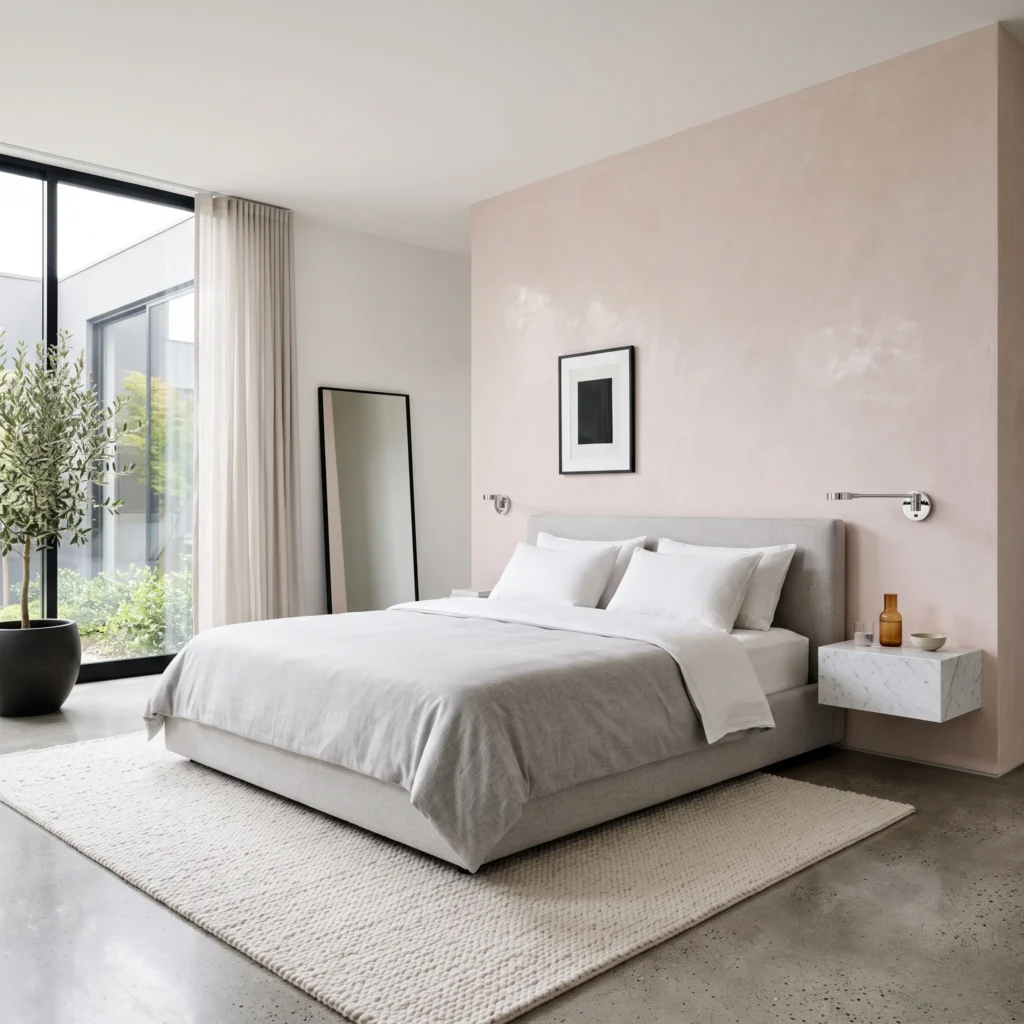
- Products in This Design:
- Wall Treatment: Venetian plaster with mineral wax finish in pale flesh pink
- Bed Frame: Tailored grey wool low-profile upholstered frame
- Nightstand: Custom wall-hung floating honed Calacatta marble shelf
- Lighting: Minimalist polished chrome cylindrical LED reading light
- Flooring: Honed poured concrete with a protective matte sealant
8. Barely-There Petal with Belgian Flax
This design suits anyone who wants the gentlest touch of color. The walls wear a high-reflectance white with a tiny drop of red-yellow pigment. Under midday sun, the walls look crisp white. Under evening lamplight, the room glows with a warm, rosy blush.
Layered textiles carry the visual weight here. Heavy slub linen curtains hang from ceiling tracks. A ribbed wool bench sits at the foot of the bed. Everything stays tonal, quiet, and deeply restful.
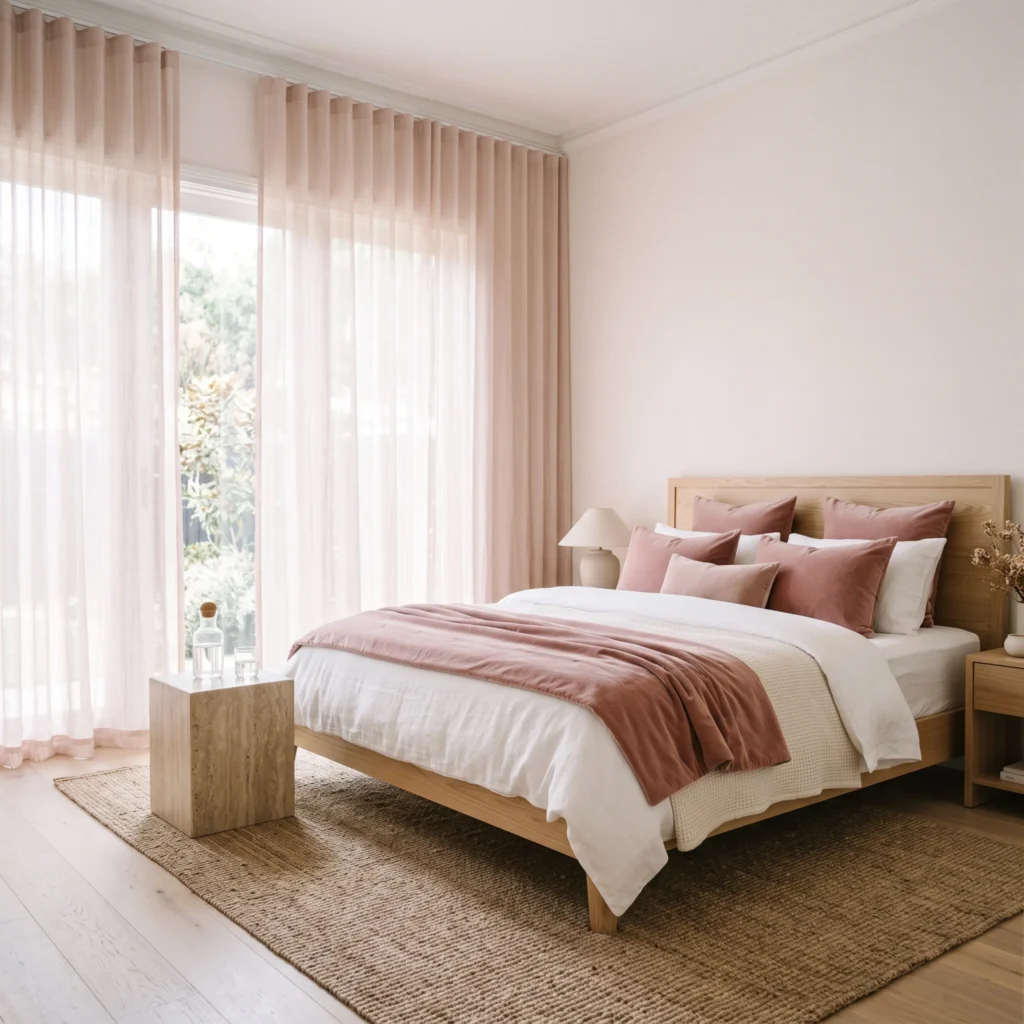
- Products in This Design:
- Wall Paint: Sherwin-Williams Intimate White SW 6322
- Window Coverings: Custom ceiling-recessed sheer linen drapery in soft blush
- Bedside Furniture: Solid honed travertine block nightstand
- Bench: Fluted oak bench with an off-white bouclé upholstered seat
- Rug: High-pile hand-knotted New Zealand wool rug in cream
The 60-30-10 Rule for Rosy Bedrooms
Balancing colors keeps a room feeling mature. When decorating with pink, follow this classic interior design formula to keep your palette grounded.
| Ratio | Layer Name | Where to Apply It | Recommended Materials |
|---|---|---|---|
| 60% | Dominant Foundation | Perimeter walls, large area rugs, or color-drenched ceilings | Muted blush or dusty rose paint in dead-flat sheens |
| 30% | Secondary Materials | Major furniture pieces, case goods, and window drapery | Natural white oak, American walnut, sage linen, cream wool |
| 10% | Contrast Accents | Hardware, reading lights, picture frames, and small decor | Matte black iron, unlacquered brass, charcoal wool |
1. The 60 Percent Foundation
This is your primary backdrop. It covers the main drywall surfaces, large area rugs, or the color-drenched ceiling. Choose complex, low-saturation paints like Setting Plaster or Pink Ground. These paints carry enough grey or beige to act like neutrals.
2. The 30 Percent Secondary Layer
This layer provides contrast so the pink does not overwhelm the room. Use this ratio for large furniture pieces and window treatments. Solid oak, walnut, sage green upholstery, and oatmeal wool drapes break up the pink planes naturally.
3. The 10 Percent High-Contrast Accent
This small slice anchors the space. Without dark accents, pale rooms can look washed out. Use thin matte black light armatures, unlacquered brass drawer pulls, or charcoal throw pillows to define the boundaries of the room.
Matching Pink Paint to Your Room’s Daylight
Natural daylight changes color based on window direction. A paint that looks warm in a store can turn cold and dull inside your house.
| Window Exposure | Natural Light Quality | Recommended Paint Shade | Undertone Profile | Practical Reason |
|---|---|---|---|---|
| North-Facing | Cool, blue-tinted, weak | Farrow & Ball Setting Plaster | High yellow ochre and warm beige | Cancels cool blue light; stops walls from looking concrete grey. |
| South-Facing | Intense, golden, warm all day | Farrow & Ball Sulking Room Pink | Heavy grey and raw umber | Lower LRV of 38 absorbs bright rays; prevents glare in full sun. |
| East-Facing | Bright morning sun, cool afternoons | Sherwin-Williams Redend Point | Balanced clay, taupe, and mauve | Adapts smoothly as warm morning light shifts to cool afternoon shade. |
| Low-Light / Small | Dim, limited window surface | Sherwin-Williams Intimate White | Petal white base with warm red tint | High LRV of 74 bounces light across the room without feeling sterile. |
Always paint large sample boards on thick poster card. Move the boards to different walls at 9 AM, 1 PM, and 7 PM before buying full paint cans.
Artificial Lighting Rules: Kelvin and CRI
Artificial lighting makes or breaks pink paint. Light bulbs emit different color temperatures measured in Kelvin. Choosing the wrong bulb will ruin your paint job.
| Kelvin Range | Visual Result on Pink Paint | Best Use Case |
|---|---|---|
| Below 2400K | Casts an heavy orange-yellow glow. Turns subtle blush into muddy terracotta. | Decorative candle flicker only. Avoid for primary bedroom lighting. |
| 2700K to 3000K | The ideal warm white range. Preserves delicate undertones and flatters skin tones. | Bedside table lamps, recessed ceiling downlights, wall sconces. |
| Above 3500K | Emits cold blue wavelengths. Turns warm blush walls into dingy, purple-toned cement. | Avoid completely in adult bedrooms. |
Equally important is the Color Rendering Index, or CRI. Standard hardware store LED bulbs carry an 80 CRI rating, which flattens complex pigments. Choose bulbs with a 90 CRI rating or higher. High-CRI light sources render delicate undertones accurately after sundown.
Layer your light sources across three levels:
- Low Level: Concealed 2700K LED tape set into aluminum channels behind the headboard for an ambient glow.
- Mid Level: Bedside reading lamps fitted with fabric shades that cast light horizontally.
- High Level: Dimmable central ceiling pendants for general visibility during cleaning or dressing.
Wall Treatments Beyond Flat Paint
Flat drywall can look empty when coated in a single color. Adding dimensional woodwork or mineral plasters introduces natural shadow lines that elevate the design.
Potassium-Silicate Limewash
Standard latex paint forms a plastic film over drywall. Limewash penetrates the surface and cures through carbonation. As you apply it with criss-cross brush strokes, the mineral crystals create a soft, suede-like texture. The finish shifts subtly in different light, giving pink walls the weathered charm of historic European villas.
Two-Tone Millwork Proportions
Installing wainscoting or board-and-batten breaks up tall walls. When planning a two-tone wall, follow these steps:
- Paint the lower 40 percent of the wall, roughly 36 to 42 inches from the floor, in a grounding color like charcoal, moss green, or dark walnut stain.
- Paint the upper 60 percent in your chosen blush or plaster pink.
- This distribution lowers the visual center of gravity, making high-ceiling rooms feel cozy and restful.
Frequently Asked Questions
What color goes best with pink in a bedroom?
Sage green and olive are the most natural complementary colors for pink. They sit opposite the red spectrum on the color wheel. This botanical pairing prevents eye fatigue. For modern spaces, pair blush with slate grey, matte black, or warm unlacquered brass.
How do you make a pink bedroom look adult and mature?
Avoid synthetic, high-saturation magenta and bubblegum shades. Choose paints with grey, brown, or yellow undertones, such as dusty rose or terracotta-blush. Pair the paint with substantial materials: solid walnut, heavy linen, and brushed metal hardware.
Is pink a good color for bedroom sleep quality?
Muted pinks encourage physical rest. Complex blush tones with low Light Reflectance Values absorb glare and reduce visual stress. Soft rose tones also mimic the natural warm light of dusk, helping the brain wind down for sleep.
Should I paint the ceiling pink?
Yes. Painting the ceiling pink, known as color drenching, works well in compact rooms or attics with sloped walls. It eliminates the stark contrast lines where walls meet white ceilings. The room wraps around you like a cocoon and casts a warm, flattering glow downward.
Designing an adult pink bedroom comes down to discipline with undertones and materials. Skip neon pigments in favor of plaster, clay, and muted rose. Ground those soft colors with dark wood, heavy woven linen, and 2700K warm lighting. Test your paint swatches against your natural window exposure, layer your textures thoughtfully, and you will create an enduring, restful retreat.