Stop Buying Matching Sets: How to Mix Wood Tones in Your Living Room
You do not need to buy matching furniture suites to make your living room look intentional. Matching every wood table to your floor makes a room feel flat, rigid, and dated. Layering different wood species adds warmth, character, and visual depth.
The secret to mixing wood tones comes down to three rules:
- Establish one dominant wood tone for 60 to 70 percent of the space.
- Pair pieces that share the same undertone temperature (warm, cool, or neutral).
- Create clear value contrast between light and dark pieces rather than settling for near matches.
Here are 7 practical living room designs you can copy, followed by the foundational rules that make them work.
7 Living Room Designs That Mix Wood Tones
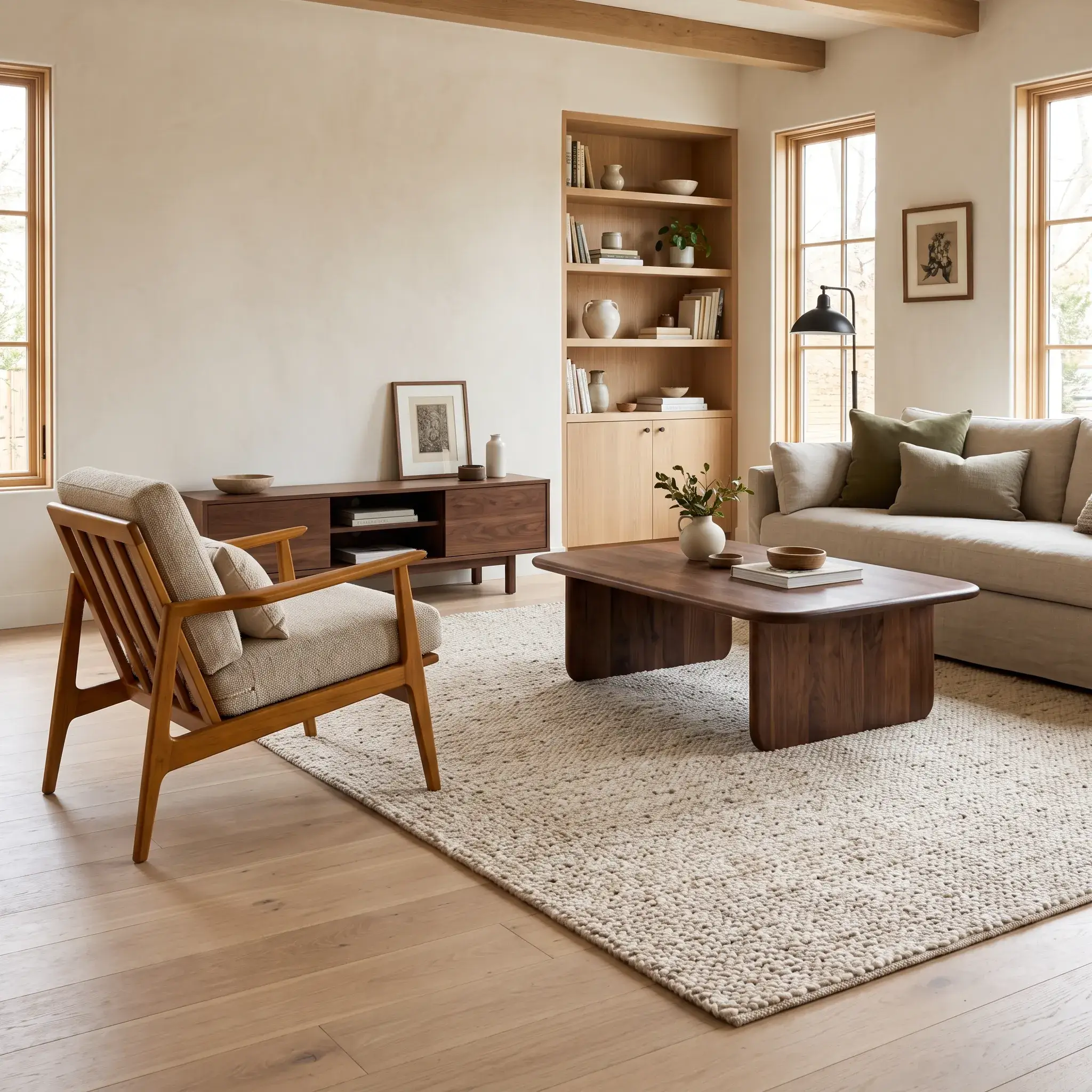
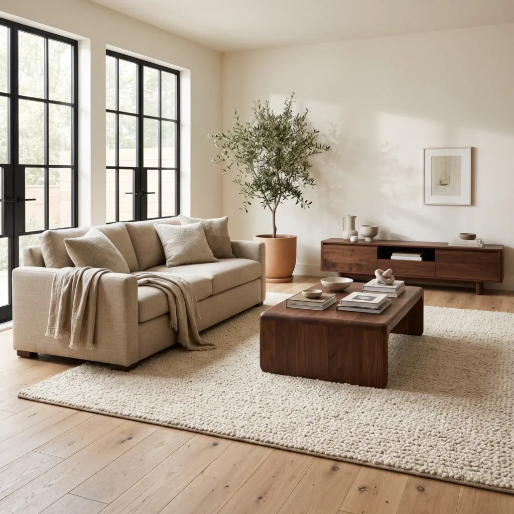
1. The White Oak Floor and Dark Walnut Anchor
This layout pairs pale white oak flooring with a dark American walnut coffee table and credenza. The wide gap in brightness creates deliberate contrast. Because natural white oak has a neutral undertone, it accommodates the cooler chocolate tones of walnut without clashing.
Why It Works: Decisive value contrast. The dark furniture lifts cleanly off the light floor plane instead of looking like a failed color match.
Key Products Used:
- European white oak wide-plank engineered flooring with a matte finish
- Solid American walnut rectangular coffee table with rounded corners
- Low walnut media credenza with slatted sliding doors
- Warm cream wool loop area rug
- Matte black iron floor lamp
- Off-white linen three-cushion sofa
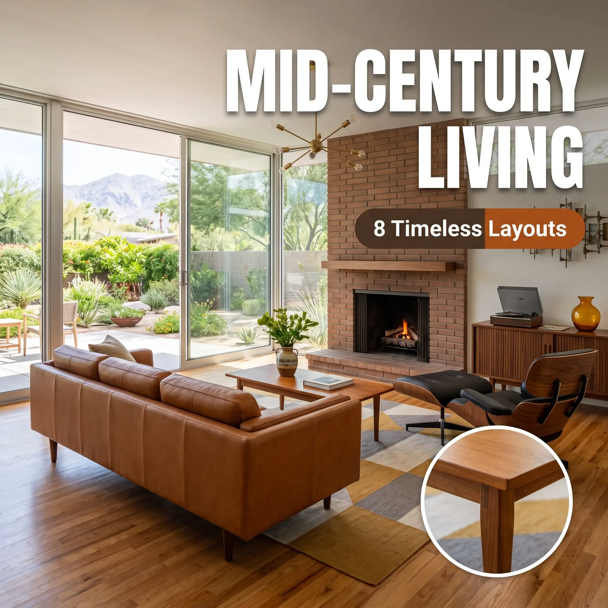
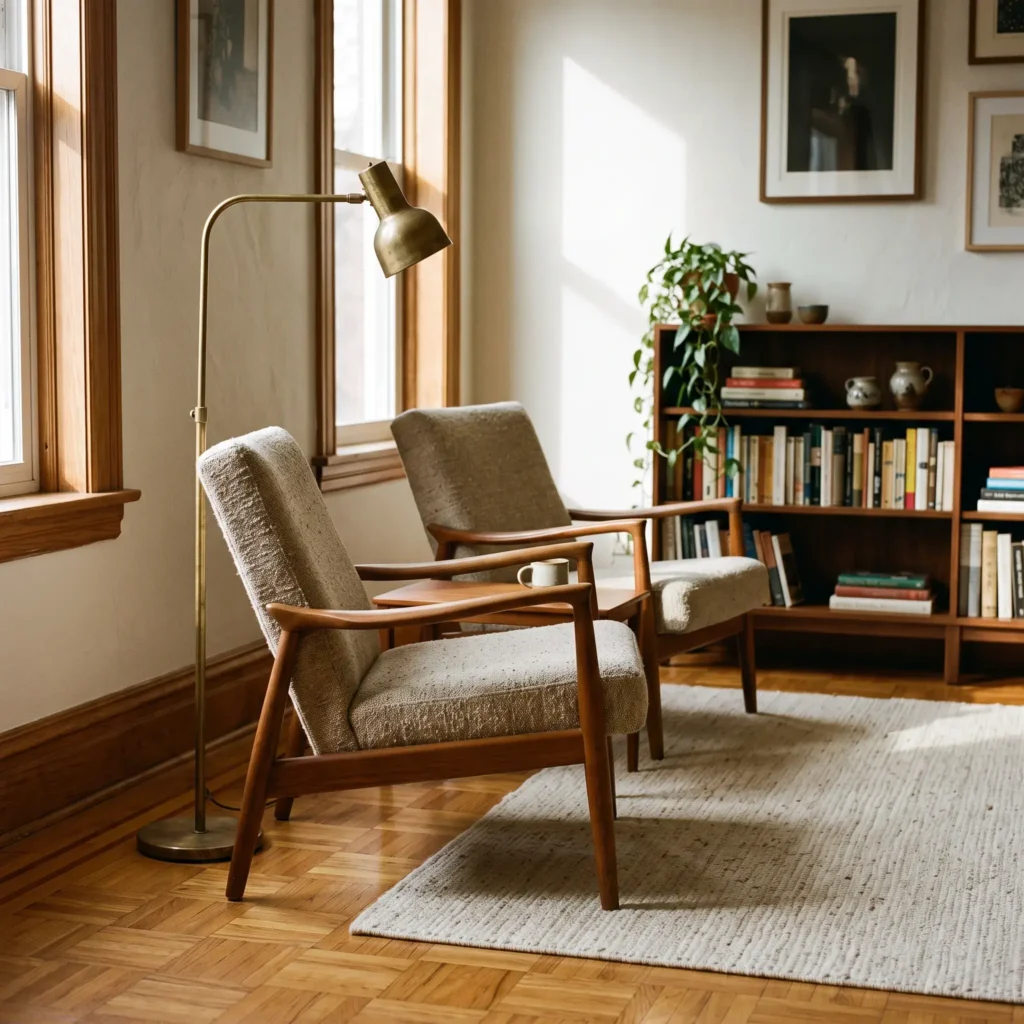
2. The Mid-Century Teak and Warm Walnut Blend
This design blends golden amber teak accent seating with a deep walnut console table. Both woods belong to the warm undertone family. The orange-amber resin in the teak connects naturally with the warm brown heartwood of the walnut.
Why It Works: Undertone harmony. Although the woods have different grain structures, their shared warm color temperature unites them.
Key Products Used:
- Danish teak lounge chairs with oatmeal wool cushions
- Walnut open-shelf bookcase
- Medium honey oak parquet flooring
- Ivory and gray flatweave geometric rug
- Unlacquered satin brass task lamp
- Cognac leather accent pillows
Check out more Living Room Ideas
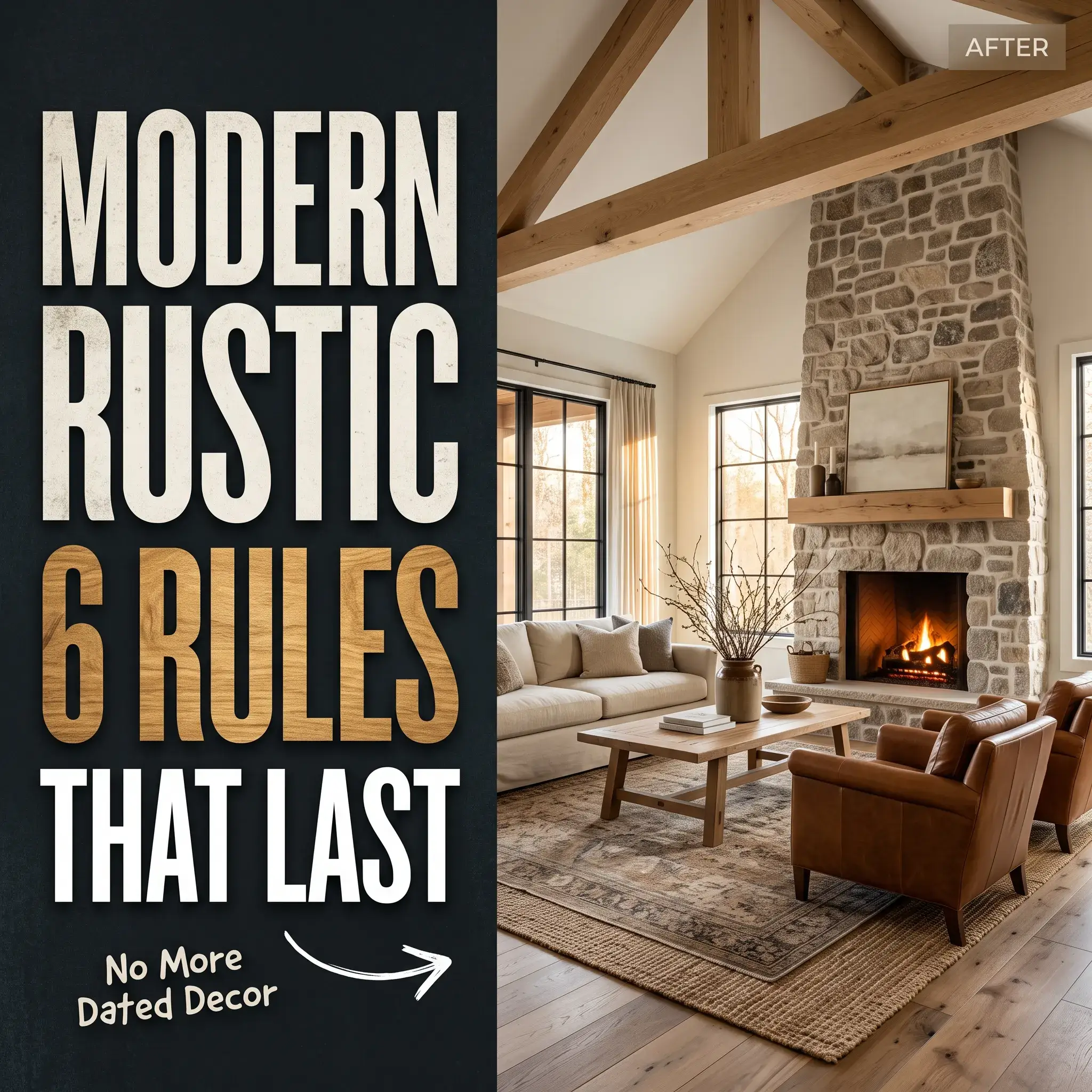
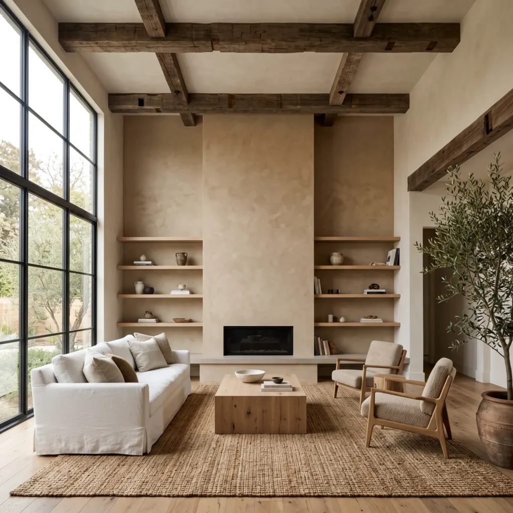
3. The Modern Rustic Reclaimed Beams and White Oak Scheme
This space balances heavy, rough-sawn ceiling beams with clean, smooth rift-sawn white oak millwork. The rustic wood provides visual weight and texture, while the smooth oak keeps the room tailored.
Why It Works: Grain and texture balance. Smooth, tight-grained wood calms down the aggressive knots and cracks of reclaimed lumber.
Key Products Used:
- Hand-hewn reclaimed barnwood decorative ceiling beams
- Custom rift-sawn white oak floating shelves
- Natural white oak coffee table plinth
- Textured limewash plaster fireplace surround
- Charcoal gray slate tile hearth
- Slipcovered Belgian linen sectional in warm chalk
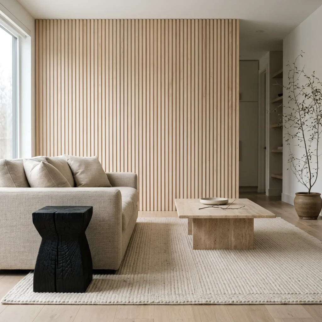
4. The Japandi Pale Ash and Charred Black Wood Contrast
Inspired by Japanese minimalism and Scandinavian craft, this room pairs pale European ash with black charred timber (yakisugi). The stark color gap creates graphic focus without introducing messy intermediate brown tones.
Why It Works: Extreme value separation. Using black wood as an accent creates strong borders that frame soft, pale timbers.
Key Products Used:
- Pale ash wood slatted accent wall
- Natural ash spindle-back armchairs
- Charred cedar yakisugi side tables
- Matte black ebonized wood decorative bowl
- Honed travertine stone cocktail table
- Ribbed beige wool area rug
5. The Honey Oak Rental Floor Rescue with Walnut and Black Accents
This layout solves the most common rental dilemma: bright orange or honey oak flooring paired with modern furniture. Instead of trying to match the orange tone, this room uses a neutral rug buffer, walnut casegoods, and black metal accents to ground the space.
Why It Works: Physical separation. An oversized rug covers 80 percent of the floor, preventing the furniture legs from touching the yellow-orange wood directly.
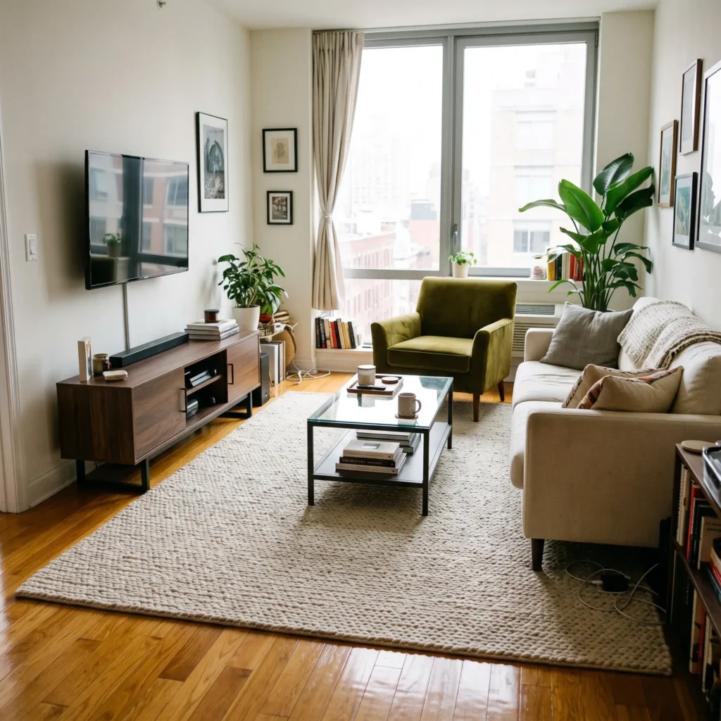
Key Products Used:
- Standard apartment honey oak strip flooring
- Large 9×12 un-dyed braided jute area rug
- Dark walnut media console on black metal legs
- Matte black steel frame coffee table with clear glass top
- Olive green velvet accent chair
- Brushed brass table lamp
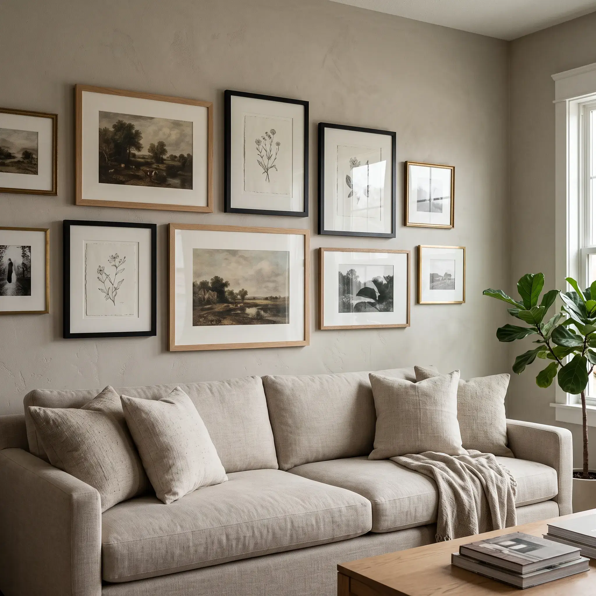
6. The Antique Mahogany and Bleached Oak Eclectic Mix
This room integrates inherited traditional mahogany furniture into a contemporary space with bleached oak floors. Repeating the reddish tone in small accessories prevents the dark heirloom from looking like an accident.
Why It Works: The repetition rule. The dark mahogany cabinet is echoed across the room through mahogany picture frames and turned-wood bowls.
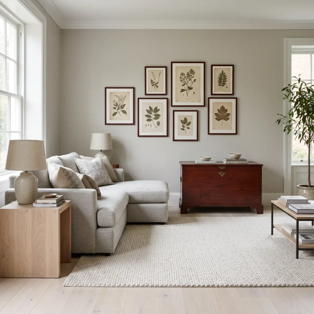
Key Products Used:
- Bleached white oak wide-plank flooring
- Antique ribbon-stripe mahogany storage cabinet
- Bleached oak pedestal side table
- Custom mahogany gallery wall picture frames
- Charcoal gray wool-blend sofa
- Subtle olive green linen curtains
7. The Scandinavian Birch and Smoked Oak Living Room
This space uses pale Scandinavian birch and fumed smoked oak. Smoked oak carries a cool taupe-gray undertone created by ammonia treatment. Birch provides a clean, neutral background that lets the gray-brown wood stand out as an architectural statement.
Why It Works: Shared cool-neutral undertones. Neither wood produces orange or yellow reflections, keeping the palette calm and unified.
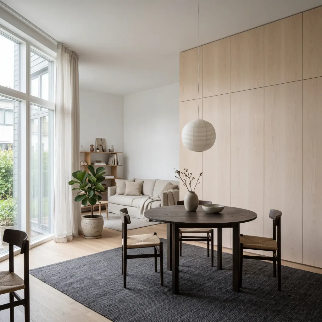
Key Products Used:
- Clear-finished natural birch plywood wall paneling
- Fumed smoked oak circular dining and work table
- Smoked oak open display shelf
- Chalky off-white painted drywall
- Charcoal flatweave rug
- Matte white ceramic table lamps
The Core Rules for Mixing Wood Tones
Achieving a clean look across different wood finishes requires simple, repeatable rules. Follow these four design principles to avoid visual chaos.
1. Apply the 60-30-10 Tonal Rule
Distribute your wood finishes by surface area rather than buying equal amounts of each tone:
- 60 Percent (The Dominant Anchor): This is your primary wood surface. In most living rooms, this is your hardwood floor. In rooms with carpet or tile, it is your largest furniture piece, such as a full wall of bookshelves. The dominant wood establishes the base undertone for the room.
- 30 Percent (The Secondary Contrast): This tier introduces intentional contrast through major furniture pieces. Use it on your coffee table, credenza, or accent chair frames. Make this tone distinctly lighter or darker than your floor.
- 10 Percent (The Accent Bridge): This layer adds character through small details like picture ledges, mirror frames, or sculptural stools. You can use high-contrast woods here, such as ebonized ash or raw burl, without throwing off the balance of the room.
2. Match Undertones, Vary Value
Wood finishes carry underlying temperatures that sit beneath the surface color. Clashes happen when competing temperatures fight for attention:
- Warm Undertones: Woods with yellow, orange, or red casts. Examples include cherry, red oak, mahogany, and honey pine.
- Cool Undertones: Woods with gray, charcoal, taupe, or violet-ash casts. Examples include weathered gray oak, smoked oak, and driftwood finishes.
- Neutral Undertones: Woods with pale wheat, soft beige, or muted cream colors. Examples include natural white oak, hard maple, and birch.
The core rule is simple: keep your dominant and secondary woods within the same temperature family. If your hardwood floors carry a warm golden undertone, pick secondary furniture with warm amber or warm brown tones. If you want to pair a warm wood with a cool wood, use a neutral species like natural white oak to bridge the transition.
3. Choose Value Contrast Over “Near Matches”
The most common decorating mistake is buying furniture that is almost the same color as the floor, but not quite.
When two wood finishes share the same brightness level but have slightly different undertones, the human eye registers the pairing as a mistake. You can fix this by creating a noticeable gap in brightness. Pair very light floors like bleached oak with medium or dark furniture like walnut. Pair very dark floors like espresso stain with light furniture like natural beech or maple. Clear contrast looks intentional.
4. Balance Grain Patterns and Sheen Levels
Wood species feature two distinct grain types:
- Open Grains (Ring-Porous Hardwoods): Red oak, white oak, and ash feature open vascular tubes that create bold cathedral patterns and heavy grain lines.
- Tight Grains (Diffuse-Porous Hardwoods): Maple, cherry, and walnut have fine, evenly spaced pores that produce smooth, satiny surfaces.
Do not pair two different woods that both have loud, competing cathedral grains. Pair an expressive, open-grain wood floor with a smooth, tight-grained walnut or maple table.
Keep your surface sheen consistent. Glossy polyurethane finishes reflect light like mirrors, making differences in undertone look much worse. Use matte, satin, or hardwax oil finishes on all pieces to tie different woods together naturally.
Wood Species and Undertone Compatibility Guide
Use this reference table to identify the natural undertones, grain styles, and ideal pairings for common furniture and flooring woods:
| Wood Species | Base Undertone | Grain Pattern | Best Wood Partner | Recommended Finish |
|---|---|---|---|---|
| White Oak | Neutral beige, muted olive | Pronounced cathedral or rift | American walnut, ebonized ash | Ultra-matte oil (under 10 GU) |
| American Walnut | Cool chocolate, subtle taupe | Flowing, soft figure | White oak, hard maple | Satin or hand-rubbed oil |
| Teak | Warm golden amber | Dense, linear stripes | Warm walnut, dark mahogany | Natural penetrating oil |
| Hard Maple | Neutral creamy yellow | Fine, closed, uniform | Dark walnut, smoked oak | Low-luster matte lacquer |
| American Cherry | Warm red, oxidizes darker | Closed, satiny surface | Natural white oak, dark maple | Satin or low-sheen lacquer |
| Smoked Oak | Cool charcoal, deep taupe | Open grain with gray cast | Natural birch, pale white oak | Dead-matte hardwax oil |
| Red Oak | Warm salmon pink | Heavy, open cathedral grain | Dark espresso oak, neutral maple | Matte protective sealant |
Fixed Architectural Trim, Doors, and Ceiling Beams
Freestanding furniture can move, but architectural woodwork stays in place. Follow these guidelines to coordinate structural elements without chopping up the room.
The 9-Foot Ceiling Beam Rule
Ceiling beams demand careful planning based on vertical clearance:
- Ceilings Under 9 Feet: Do not use dark-stained beams against a pale floor. Dark overhead beams compress the space downward, making standard eight-foot ceilings feel heavy and low. Paint low beams in your ceiling color, or stain them in a pale, desaturated finish matching your light floors.
- Vaulted or Ceilings Over 9 Feet: Staining ceiling beams to match the dominant hardwood flooring creates a balanced bookend effect. This anchors the room and draws the eye upward comfortably.
Baseboards, Window Casings, and Doors
Never introduce a third, unrelated wood stain on your baseboards and door frames. Architectural trim outlines the borders of the room. Trim finishes should follow one of two paths:
- Match the hardwood floor species and stain exactly.
- Paint the trim in your wall color or a soft architectural white.
Painting your baseboards eliminates competing wood lines at the perimeter, allowing your furniture silhouettes to stand out cleanly.
The Buffer Toolkit: Rugs, Metals, and Paint
If you have two wood pieces that fight each other, you do not need to replace them. Use intermediary materials to break direct visual contact and calm the room down.
1. Large Area Rug Buffers
Placing a wood table directly onto a clashing wood floor creates instant visual friction. Placing a large woven wool, berber, or un-dyed jute rug under the seating zone decouples the furniture legs from the floor planking. The rug breaks the line of sight, allowing both woods to look balanced in the same room.
2. Neutral Accent Metals
Non-wood accents give the eye a resting place between timber surfaces:
- Matte Black Steel and Iron: Acts as an outline pencil for your room. Black chair legs, hardware pulls, and lamp stems frame warm and cool woods cleanly.
- Unlacquered Brass: Pairs naturally with warm woods like teak, honey oak, and cherry, pulling out their golden qualities.
3. Tested Wall Paint Matches
Wall paint acts as the backdrop that reflects ambient light onto your wood finishes. These specific paint formulas balance wood undertones effectively:
- Benjamin Moore Swiss Coffee OC-45: A balanced off-white with creamy warmth. It softens high-contrast woods like walnut and cherry without looking sterile.
- Benjamin Moore Revere Pewter HC-172: A versatile greige that sits between gray and beige. It bridges the gap between cool-toned ash and warm-toned oak.
- Sherwin-Williams Evergreen Fog SW 9130: A desaturated, earthy green. Green sits opposite red and orange on the color wheel, making it an ideal wall color to neutralize brassy honey oak or red cherry.
4. Lighting Color Temperature
Artificial lighting alters how wood undertones look in your living room:
- 2700K (Warm White): Adds heavy yellow and orange light. This exaggerates golden oak and cherry stains, often making them look overly brassy.
- 3000K to 3500K (Neutral Soft Daylight): Provides a clean, neutral color rendering base. This temperature allows warm walnut and pale oak to sit side by side without shifting into yellow or muddy tones.
5 Common Wood Mixing Mistakes and How to Fix Them
If your living room feels disorganized, you are likely dealing with one of these five common layout mistakes.
1. The Near-Match Collision
- The Problem: Your coffee table is almost the same shade as your hardwood floor, but one is slightly redder and the other is slightly yellower. It looks like an accidental buying mistake.
- The Fix: Increase value contrast. Swap the table for a piece that is noticeably darker or lighter. If you cannot replace the table, slip an opaque, textured area rug directly underneath it to break physical contact with the floor.
2. The Orphaned Finish
- The Problem: You have a room filled with pale white oak and black accents, but one solitary mahogany side table sits alone in the corner. The isolated piece looks like leftover clutter.
- The Fix: Use the repetition rule. Introduce that same mahogany wood tone in at least one other spot. Add a mahogany wall mirror, picture frames, or a decorative turned-wood bowl across the room to show intent.
3. The Monolithic Clustering Error
- The Problem: You place your dark walnut desk, a tall walnut credenza, and a dark bookshelf along the same wall, leaving the rest of the room in light oak. The room feels physically tilted and bottom-heavy.
- The Fix: Distribute visual weight evenly. Move the dark credenza to the opposite wall. Bring the darker wood tone upward onto lighter walls using floating picture ledges or hanging sconce backplates.
4. Undertone Temperature Clash
- The Problem: You place a cool gray-washed oak console directly over warm orange pine flooring. The gray finish makes the floor look aggressively orange, while the floor makes the gray furniture look muddy.
- The Fix: Insert a neutral buffer. Paint the wall behind the console in a desaturated green like Sherwin-Williams Sea Salt or Benjamin Moore October Mist to tone down the orange reflection. Add matte black hardware to focus the eye on clean lines.
5. Grain and Sheen Overload
- The Problem: You combine high-gloss lacquer tables, deeply grooved rustic barnwood beams, and wavy open oak grains. The room feels chaotic and overwhelming.
- The Fix: Standardize your sheens. Coat shiny surfaces with a dead-matte or satin protective wax. Balance loud, expressive cathedral grains with quiet, smooth woods like maple, birch, or painted surfaces.
Frequently Asked Questions
Can you mix oak and walnut in the same living room?
Yes. White oak and American walnut are one of the most reliable wood pairings in interior design. Natural white oak provides a light, neutral background, while walnut introduces deep, cool-chocolate contrast. For best results, use white oak on the broad floor plane and walnut on prominent freestanding pieces like the coffee table or credenza.
What is the golden rule for mixing wood tones?
The golden rule is to match undertones rather than surface darkness. Combine warm woods with warm woods and cool woods with cool woods. Always make sure your finishes have distinct differences in brightness to prevent near-match mistakes.
How many different wood tones can you have in one room?
Limit your living room to two or three distinct wood tones. Using four or more different species creates visual clutter and removes the clear hierarchy of the room. Designate one wood as the 60 percent dominant anchor, one as the 30 percent secondary contrast, and one as a 10 percent accent.
Should your coffee table match your hardwood floors?
No. Your coffee table should not match your hardwood floors. Placing an identical wood table directly on matching floors creates a flat, monotone look. Choose a coffee table that steps decisively darker or lighter than your flooring, or place an area rug beneath it to create visual separation.
How do you fix wood furniture that clashes with rental flooring?
Lay down an oversized, neutral area rug made of jute, sisal, or wool to cover the majority of the floor. This separates your furniture legs from the rental flooring. Keep your lighting between 3000K and 3500K to prevent yellow bulbs from exaggerating unwanted floor undertones.
Practical Action Checklist
Mixing wood tones successfully comes down to restraint and deliberate contrast:
- Identify your floor’s undertone first: Check whether it pulls warm orange, cool gray, or neutral beige under natural daylight.
- Choose your secondary contrast piece: Buy a coffee table or credenza that is noticeably lighter or darker than the floor.
- Repeat every new wood finish twice: Never leave an introduced wood tone isolated on a single piece of furniture.
- Use rugs to break direct contact: Separate competing wood grains with textured natural fibers.
- Stick to matte sheens: Keep your protective coats low-luster to eliminate distracting reflections.
Layering your wood finishes intentionally creates a relaxed, collected living room that looks curated over years rather than purchased in a single afternoon. Focus on matching undertones, give your furniture room to breathe with textile buffers, and let contrast do the work.